Benvenuto nelle Font Più Popolari — dove popolarità e qualità si incontrano. Qui trovi i font più scaricati e usati dell'anno. Se cerchi scelte sicure per logo, web o social, inizia da qui.
Ogni font top si distingue per equilibrio, leggibilità e versatilità. Troverai sans serif moderne, script eleganti, serif vintage e display minimalisti.
-
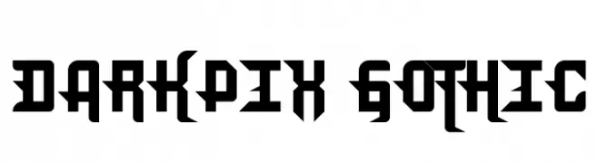
Caratteri di JuanCasco. For commercial use please contact the owner.
( Fonts by Juan Casco - www.juancasco.net )
A bold, gothic-inspired font with sharp angles and geometric shapes.
 Scaricare 274 Downloads@WebFont
 -
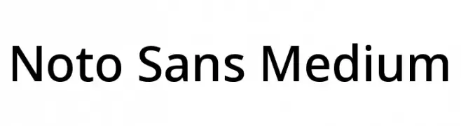
( Fonts by Google )
A clean and modern sans-serif typeface with uniform stroke width and excellent readability.
![Noto Sans Medium font caratteri gratis]() Scaricare 274 Downloads@WebFont
Scaricare 274 Downloads@WebFont -
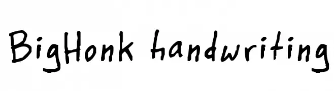
( Fonts by www.fontpanda.com. Personal-use only. For commercial use please contact owner. )
A playful, casual handwritten font with irregular strokes.
![BigHonk handwriting font caratteri gratis]() Scaricare 274 Downloads@WebFont
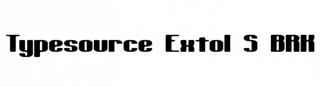
Scaricare 274 Downloads@WebFont -
![Typesource Extol S BRK font caratteri gratis]() Scaricare 274 Downloads@WebFont
Scaricare 274 Downloads@WebFont -
( Fonts by Reguler Studio )
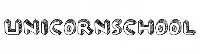
A playful, hand-drawn font with a sketch-like, three-dimensional effect.
![UNICORN SCHOOL font caratteri gratis]() Scaricare 274 Downloads@WebFont
Scaricare 274 Downloads@WebFont -
-
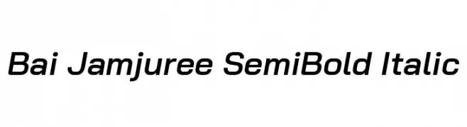
( Copyright 2018 Bai Jamjuree (https://github.com/cadsondemak/Bai-Jamjuree) )
A modern, semi-bold italic sans-serif font with smooth strokes and medium contrast.
![Bai Jamjuree SemiBold Italic font caratteri gratis]() Scaricare 274 Downloads@WebFont
Scaricare 274 Downloads@WebFont -
![Floral 2 font caratteri gratis]() Scaricare 274 Downloads@WebFont
Scaricare 274 Downloads@WebFont -
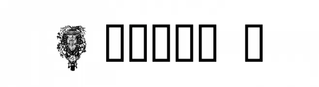
( گالری فانت فارسی پژوهش آريانا - only compatible with Farsi and Arabic )
A bold, geometric font with a modern and impactful design.
![Zan font caratteri gratis]() Scaricare 274 Downloads@WebFont
Scaricare 274 Downloads@WebFont -
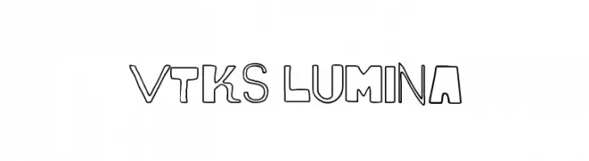
( Fonts by Douglas Vitkauskas - www.vtksdesign.com. Personal-use only. For commercial use please contact owner. )
A bold, artistic font with a mix of solid and outlined characters, perfect for creative projects.
![vtks lumina font caratteri gratis]() Scaricare 274 Downloads@WebFont
Scaricare 274 Downloads@WebFont -
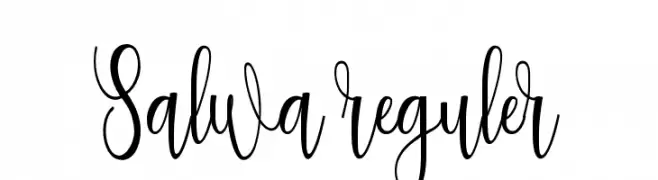
( Rahmat Hidayat )
An elegant, flowing script font with intricate loops and slender letterforms.
![Salwa reguler font caratteri gratis]() Scaricare 274 Downloads@WebFont
Scaricare 274 Downloads@WebFont

Quali sono i font più popolari adesso?
Poppins, Roboto, Montserrat, Open Sans e Lato sono molto usati per le forme pulite e l'ampia applicabilità — dall'identità di marca alle landing page e ai poster.
Quali font si usano spesso nei loghi?
Le sans serif geometriche (es. Poppins, famiglie in stile Gotham) sono scelte comuni per un branding pulito e scalabile. Per un tocco personale restano valide script e stili manoscritti. Abbina un display deciso per i titoli a un corpo testo neutro per riconoscibilità ed equilibrio.
Ogni quanto si aggiorna la lista?
Con regolarità, in base ai download e all'attività reale. Torna spesso per scoprire in anticipo le nuove preferite.
💡 Consiglio: aggiungi ai preferiti — le tendenze cambiano in fretta e i font top di oggi possono ispirare il rebranding di domani.