Benvenuto nelle Font Più Popolari — dove popolarità e qualità si incontrano. Qui trovi i font più scaricati e usati dell'anno. Se cerchi scelte sicure per logo, web o social, inizia da qui.
Ogni font top si distingue per equilibrio, leggibilità e versatilità. Troverai sans serif moderne, script eleganti, serif vintage e display minimalisti.
-
( Fonts by a Max Infeld - XEROGRAPHER FONTS - xerographer.blogspot.com . Personal-use only. For commercial use please contact owner. )
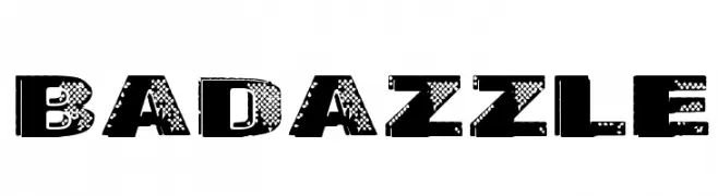
A bold, distressed font with a textured, rugged appearance.
 Scaricare 273 Downloads@WebFont
 -
( Fonts by tiagopompeu.carbonmade.com - Tiago Pompeu )
A bold, geometric font with a futuristic and modern design.
![CEAB font caratteri gratis]() Scaricare 273 Downloads@WebFont
Scaricare 273 Downloads@WebFont -
( Roch Art )
A bold, brush-style font with an artistic, hand-drawn appearance.
![Abalone font caratteri gratis]() Scaricare 273 Downloads@WebFont
Scaricare 273 Downloads@WebFont -
![Belgedes font caratteri gratis]() Scaricare 273 Downloads@WebFont
Scaricare 273 Downloads@WebFont -
( Preston Racette - www.prestonracette.com )
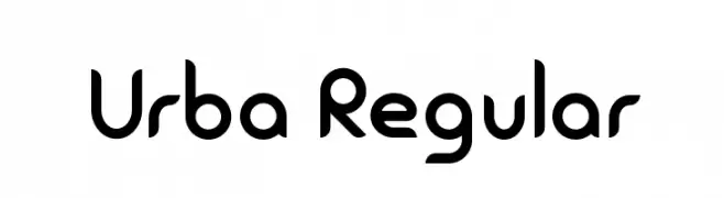
A modern, rounded font with smooth curves and a clean aesthetic.
![Urba Regular font caratteri gratis]() Scaricare 273 Downloads@WebFont
Scaricare 273 Downloads@WebFont -
-
( Fonts by Khurasan™ )
A playful, handwritten font with smooth, rounded edges and a friendly appearance.
![Midfriend font caratteri gratis]() Scaricare 273 Downloads@WebFont
Scaricare 273 Downloads@WebFont -
( Fonts by Greg Smith )
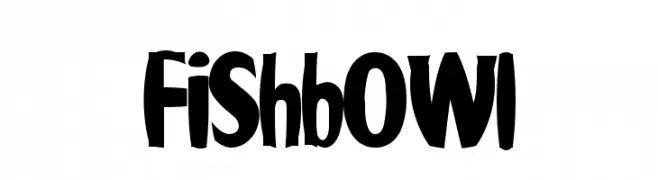
A bold, playful font with exaggerated curves and a whimsical style.
![Fishbowl font caratteri gratis]() Scaricare 273 Downloads@WebFont
Scaricare 273 Downloads@WebFont -
( Fonts by Edric Studio - Personal-use only. For commercial use please contact owner. )
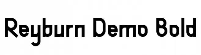
A bold, geometric font with a modern and structured design.
![Reyburn Demo Bold font caratteri gratis]() Scaricare 273 Downloads@WebFont
Scaricare 273 Downloads@WebFont -
( Fonts by Zetafonts - Personal-use only. For commercial use please contact owner. )
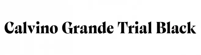
A bold, high-contrast serif font with sharp serifs and a dramatic style.
![Calvino Grande Trial Black font caratteri gratis]() Scaricare 273 Downloads@WebFont
Scaricare 273 Downloads@WebFont -
( Fonts by David Rakowski )
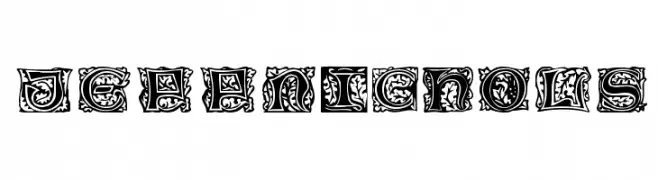
An ornate, decorative font with intricate patterns and a medieval flair.
![JeffNichols font caratteri gratis]() Scaricare 273 Downloads
Scaricare 273 Downloads


Quali sono i font più popolari adesso?
Poppins, Roboto, Montserrat, Open Sans e Lato sono molto usati per le forme pulite e l'ampia applicabilità — dall'identità di marca alle landing page e ai poster.
Quali font si usano spesso nei loghi?
Le sans serif geometriche (es. Poppins, famiglie in stile Gotham) sono scelte comuni per un branding pulito e scalabile. Per un tocco personale restano valide script e stili manoscritti. Abbina un display deciso per i titoli a un corpo testo neutro per riconoscibilità ed equilibrio.
Ogni quanto si aggiorna la lista?
Con regolarità, in base ai download e all'attività reale. Torna spesso per scoprire in anticipo le nuove preferite.
💡 Consiglio: aggiungi ai preferiti — le tendenze cambiano in fretta e i font top di oggi possono ispirare il rebranding di domani.