Benvenuto nelle Font Più Popolari — dove popolarità e qualità si incontrano. Qui trovi i font più scaricati e usati dell'anno. Se cerchi scelte sicure per logo, web o social, inizia da qui.
Ogni font top si distingue per equilibrio, leggibilità e versatilità. Troverai sans serif moderne, script eleganti, serif vintage e display minimalisti.
-
![cheek2cheek [black!] by shk.dezign font caratteri gratis](https://d144mzi0q5mijx.cloudfront.net/img/C/H/cheek2cheek-black-by-shkdezign.webp) Scaricare 269 Downloads
Scaricare 269 Downloads -
( Fonts by Manfred Klein. Free for private and charity use. Free for commercial with donation to organizations )
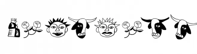
A whimsical and decorative font with playful, cartoonish illustrations.
![WacObats font caratteri gratis]() Scaricare 269 Downloads@WebFont
Scaricare 269 Downloads@WebFont -
( Fonts by David Rakowski )
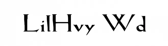
A sharp, angular font with a medieval gothic flair, perfect for decorative use.
![LilHvy Wd font caratteri gratis]() Scaricare 269 Downloads@WebFont
Scaricare 269 Downloads@WebFont -
( Fonts by www.studiotypo.com - Personal-use only. For commercial use please contact owner. )
A bold, italic, modern font with geometric shapes and medium contrast.
![Typo Square Bold Italic Demo font caratteri gratis]() Scaricare 269 Downloads@WebFont
Scaricare 269 Downloads@WebFont -
( Fonts by Style-7 - www.styleseven.com - Personal-use only. For commercial use please contact owner. )
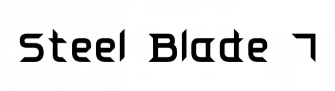
A bold, angular font with a futuristic and geometric design.
![Steel Blade 7 font caratteri gratis]() Scaricare 269 Downloads@WebFont
Scaricare 269 Downloads@WebFont -
-
( Fonts by Mans Greback - www.mawns.com )
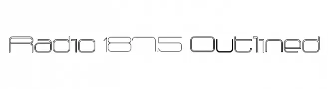
A modern, outlined geometric font with a futuristic aesthetic.
![Radio 187.5 Outlined font caratteri gratis]() Scaricare 269 Downloads@WebFont
Scaricare 269 Downloads@WebFont -
![LJ Studios MFJH font caratteri gratis]() Scaricare 269 Downloads@WebFont
Scaricare 269 Downloads@WebFont -
( Fonts by Mans Greback - Personal-use only. For commercial use please contact owner. )
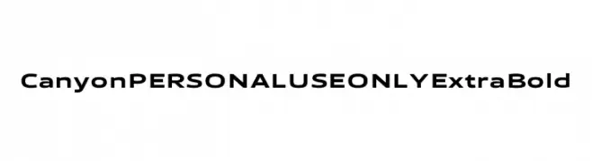
A bold, modern font with clean, geometric lines and versatile characters.
![Canyon PERSONAL USE ONLY ExtraBold font caratteri gratis]() Scaricare 269 Downloads@WebFont
Scaricare 269 Downloads@WebFont -
( Fonts by Graham Meade - GemFonts )
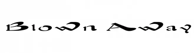
A dynamic, flowing font with sweeping curves and elegant forms.
![Blown Away font caratteri gratis]() Scaricare 269 Downloads@WebFont
Scaricare 269 Downloads@WebFont -
( Fonts by Daniel Zadorozny - www.iconian.com - Free for personal use )
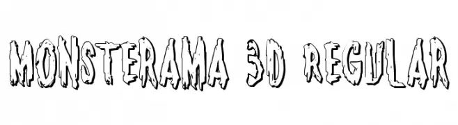
A bold, 3D font with a dripping, playful, and eerie style.
![Monsterama 3D Regular font caratteri gratis]() Scaricare 269 Downloads@WebFont
Scaricare 269 Downloads@WebFont


Quali sono i font più popolari adesso?
Poppins, Roboto, Montserrat, Open Sans e Lato sono molto usati per le forme pulite e l'ampia applicabilità — dall'identità di marca alle landing page e ai poster.
Quali font si usano spesso nei loghi?
Le sans serif geometriche (es. Poppins, famiglie in stile Gotham) sono scelte comuni per un branding pulito e scalabile. Per un tocco personale restano valide script e stili manoscritti. Abbina un display deciso per i titoli a un corpo testo neutro per riconoscibilità ed equilibrio.
Ogni quanto si aggiorna la lista?
Con regolarità, in base ai download e all'attività reale. Torna spesso per scoprire in anticipo le nuove preferite.
💡 Consiglio: aggiungi ai preferiti — le tendenze cambiano in fretta e i font top di oggi possono ispirare il rebranding di domani.