Benvenuto nelle Font Più Popolari — dove popolarità e qualità si incontrano. Qui trovi i font più scaricati e usati dell'anno. Se cerchi scelte sicure per logo, web o social, inizia da qui.
Ogni font top si distingue per equilibrio, leggibilità e versatilità. Troverai sans serif moderne, script eleganti, serif vintage e display minimalisti.
-
( Fonts by Fontfabric - Svetoslav Simov - Personal-use only. For commercial use please contact owner. )
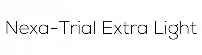
A clean, modern sans-serif font with a geometric and minimalist design.
 Scaricare 268 Downloads@WebFont
 -
( Fonts by Måns Grebäck )
A bold, dynamic serif font with sharp serifs and exaggerated curves.
![Qraxy font caratteri gratis]() Scaricare 268 Downloads@WebFont
Scaricare 268 Downloads@WebFont -
( Fonts by www.smeltery.net )
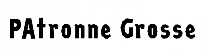
A bold, geometric font with angular, blocky characters.
![PAtronne Grosse font caratteri gratis]() Scaricare 268 Downloads@WebFont
Scaricare 268 Downloads@WebFont -
( Personal-use only. For commercial use please contact owner. )
A modern geometric font with consistent stroke width and elegant numerals.
![MRT_Talat font caratteri gratis]() Scaricare 268 Downloads@WebFont
Scaricare 268 Downloads@WebFont -
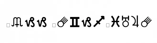
![Carr AstroDings font caratteri gratis]() Scaricare 268 Downloads@WebFont
Scaricare 268 Downloads@WebFont -
-
( Fonts by Arkandis Digital Foundry )
An elegant serif typeface with a classic italic style and moderate contrast.
![AccanthisADFStd-Italic font caratteri gratis]() Scaricare 268 Downloads@WebFont
Scaricare 268 Downloads@WebFont -
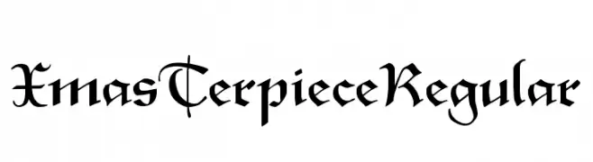
![XmasTerpieceRegular font caratteri gratis]() Scaricare 268 Downloads@WebFont
Scaricare 268 Downloads@WebFont -
( Fonts by CloutierFontes )
A bold, classic serif font with strong strokes and elegant serifs.
![CF PetersonPERSONAL Regular font caratteri gratis]() Scaricare 268 Downloads@WebFont
Scaricare 268 Downloads@WebFont -
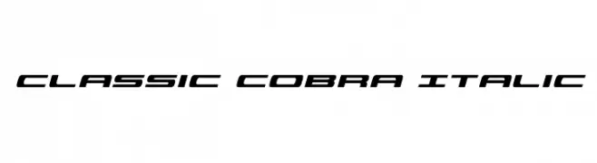
( Iconian Fonts - Daniel Zadorozny - www.iconian.com )
A modern, italicized font with a sleek and dynamic style.
![Classic Cobra Italic font caratteri gratis]() Scaricare 268 Downloads@WebFont
Scaricare 268 Downloads@WebFont -
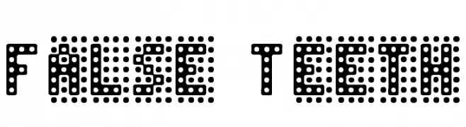
( Fonts by Jacob Fisher - www.pizzadude.dk )
A decorative, dotted font with a digital, pixelated style.
![False Teeth font caratteri gratis]() Scaricare 268 Downloads@WebFont
Scaricare 268 Downloads@WebFont


Quali sono i font più popolari adesso?
Poppins, Roboto, Montserrat, Open Sans e Lato sono molto usati per le forme pulite e l'ampia applicabilità — dall'identità di marca alle landing page e ai poster.
Quali font si usano spesso nei loghi?
Le sans serif geometriche (es. Poppins, famiglie in stile Gotham) sono scelte comuni per un branding pulito e scalabile. Per un tocco personale restano valide script e stili manoscritti. Abbina un display deciso per i titoli a un corpo testo neutro per riconoscibilità ed equilibrio.
Ogni quanto si aggiorna la lista?
Con regolarità, in base ai download e all'attività reale. Torna spesso per scoprire in anticipo le nuove preferite.
💡 Consiglio: aggiungi ai preferiti — le tendenze cambiano in fretta e i font top di oggi possono ispirare il rebranding di domani.