Benvenuto nelle Font Più Popolari — dove popolarità e qualità si incontrano. Qui trovi i font più scaricati e usati dell'anno. Se cerchi scelte sicure per logo, web o social, inizia da qui.
Ogni font top si distingue per equilibrio, leggibilità e versatilità. Troverai sans serif moderne, script eleganti, serif vintage e display minimalisti.
-
 Scaricare 267 Downloads@WebFont
 -
( www.cloutierfontes.ca/ )
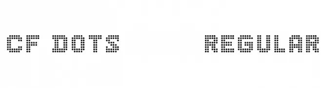
A dot matrix style font with a geometric and digital appearance.
![CF Dots 521 Regular font caratteri gratis]() Scaricare 267 Downloads@WebFont
Scaricare 267 Downloads@WebFont -
( Fonts by Iconian Fonts )
A bold, shadowed font with a distressed, horror-themed style.
![Carnival Corpse Shadow font caratteri gratis]() Scaricare 267 Downloads@WebFont
Scaricare 267 Downloads@WebFont -
( Fonts by MagicType - Jaikishan Patel - Personal-use only. For commercial use please contact owner. )
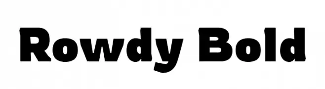
A bold, modern font with thick strokes and a strong presence.
![Rowdy Bold font caratteri gratis]() Scaricare 267 Downloads@WebFont
Scaricare 267 Downloads@WebFont -
( Fonts by David Kerkhoff - www.hanodedphotography.com )
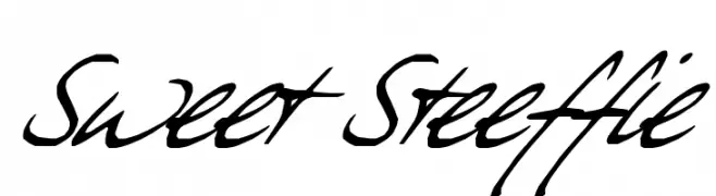
A bold, cursive script font with dynamic, sweeping strokes and a handwritten feel.
![Sweet Steeffie font caratteri gratis]() Scaricare 267 Downloads@WebFont
Scaricare 267 Downloads@WebFont -
-
![Kremlin Kourier II font caratteri gratis]() Scaricare 267 Downloads@WebFont
Scaricare 267 Downloads@WebFont -
![NeoBulletin Outline font caratteri gratis]() Scaricare 267 Downloads@WebFont
Scaricare 267 Downloads@WebFont -
( Fonts by ONG Type )
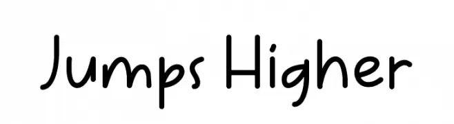
A playful, handwritten font with smooth, rounded edges and a casual style.
![Jumps Higher font caratteri gratis]() Scaricare 267 Downloads@WebFont
Scaricare 267 Downloads@WebFont -
( Fonts by Kong Font - https://fontkong.com/ - Personal-use only. For commercial use please contact owner. )
A bold, playful font with rounded strokes and a friendly appearance.
![Mutchin font caratteri gratis]() Scaricare 267 Downloads@WebFont
Scaricare 267 Downloads@WebFont -
Caratteri di spideraysfonts. For commercial use please contact the owner.
( AMAZING FONTASY )
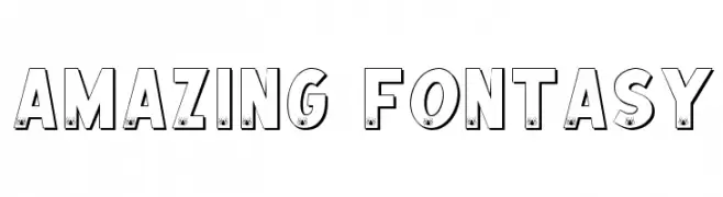
A bold, playful font with spider icons for a whimsical touch.
![AMAZING FONTASY font caratteri gratis]() Scaricare 267 Downloads@WebFont
Scaricare 267 Downloads@WebFont


Quali sono i font più popolari adesso?
Poppins, Roboto, Montserrat, Open Sans e Lato sono molto usati per le forme pulite e l'ampia applicabilità — dall'identità di marca alle landing page e ai poster.
Quali font si usano spesso nei loghi?
Le sans serif geometriche (es. Poppins, famiglie in stile Gotham) sono scelte comuni per un branding pulito e scalabile. Per un tocco personale restano valide script e stili manoscritti. Abbina un display deciso per i titoli a un corpo testo neutro per riconoscibilità ed equilibrio.
Ogni quanto si aggiorna la lista?
Con regolarità, in base ai download e all'attività reale. Torna spesso per scoprire in anticipo le nuove preferite.
💡 Consiglio: aggiungi ai preferiti — le tendenze cambiano in fretta e i font top di oggi possono ispirare il rebranding di domani.