Benvenuto nelle Font Più Popolari — dove popolarità e qualità si incontrano. Qui trovi i font più scaricati e usati dell'anno. Se cerchi scelte sicure per logo, web o social, inizia da qui.
Ogni font top si distingue per equilibrio, leggibilità e versatilità. Troverai sans serif moderne, script eleganti, serif vintage e display minimalisti.
-
( Fonts by PressGang Studios )
A bold, italicized font with sharp, angular strokes and dynamic energy.
 Scaricare 267 Downloads@WebFont
 -
![Timuz Roman font caratteri gratis]() Scaricare 267 Downloads@WebFont
Scaricare 267 Downloads@WebFont -
( Fonts by Cristiano Sobral - Personal-use only. For commercial use please contact owner. )
A modern, medium-weight sans-serif font with an italic style and clean lines.
![Cheyenne Sans Medium Italic font caratteri gratis]() Scaricare 267 Downloads@WebFont
Scaricare 267 Downloads@WebFont -
( Here Be Monsters - monsterswithin.com )
A bold, geometric font with dynamic cut-out patterns and a modern aesthetic.
![Razed Galerie font caratteri gratis]() Scaricare 267 Downloads@WebFont
Scaricare 267 Downloads@WebFont -
( HackFonts - hackfonts.blogspot.com.co/ )
A modern serif font with sharp, edgy serifs and a balanced contrast.
![Fontastic Beast font caratteri gratis]() Scaricare 267 Downloads@WebFont
Scaricare 267 Downloads@WebFont -
-
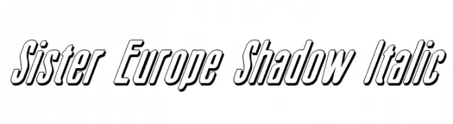
( Fonts by Daniel Zadorozny - www.iconian.com )
A bold, italicized font with a shadow effect, perfect for dynamic designs.
![Sister Europe Shadow Italic font caratteri gratis]() Scaricare 267 Downloads@WebFont
Scaricare 267 Downloads@WebFont -
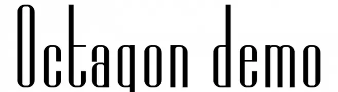
( Fonts by nariswari_creative - Taufik Dwi Purnomo - Personal-use only. For commercial use please contact owner. )
A modern, condensed font with elongated, narrow letterforms and consistent stroke thickness.
![Octagon demo font caratteri gratis]() Scaricare 267 Downloads@WebFont
Scaricare 267 Downloads@WebFont -
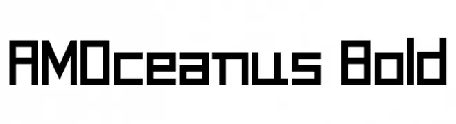
( Free for personal use - www.angelamichanitzi.com )
A bold, geometric font with a modern, digital aesthetic.
![AMOceanus Bold font caratteri gratis]() Scaricare 267 Downloads@WebFont
Scaricare 267 Downloads@WebFont -
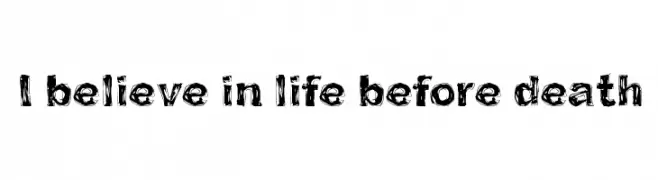
( Fonts by junkohanhero )
A bold, hand-drawn font with a rough, sketch-like appearance.
![I believe in life before death font caratteri gratis]() Scaricare 267 Downloads@WebFont
Scaricare 267 Downloads@WebFont -
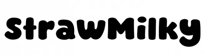
( Fonts by MJType )
A bold, rounded font with a playful and whimsical style.
![Straw Milky font caratteri gratis]() Scaricare 267 Downloads@WebFont
Scaricare 267 Downloads@WebFont

Quali sono i font più popolari adesso?
Poppins, Roboto, Montserrat, Open Sans e Lato sono molto usati per le forme pulite e l'ampia applicabilità — dall'identità di marca alle landing page e ai poster.
Quali font si usano spesso nei loghi?
Le sans serif geometriche (es. Poppins, famiglie in stile Gotham) sono scelte comuni per un branding pulito e scalabile. Per un tocco personale restano valide script e stili manoscritti. Abbina un display deciso per i titoli a un corpo testo neutro per riconoscibilità ed equilibrio.
Ogni quanto si aggiorna la lista?
Con regolarità, in base ai download e all'attività reale. Torna spesso per scoprire in anticipo le nuove preferite.
💡 Consiglio: aggiungi ai preferiti — le tendenze cambiano in fretta e i font top di oggi possono ispirare il rebranding di domani.