Benvenuto nelle Font Più Popolari — dove popolarità e qualità si incontrano. Qui trovi i font più scaricati e usati dell'anno. Se cerchi scelte sicure per logo, web o social, inizia da qui.
Ogni font top si distingue per equilibrio, leggibilità e versatilità. Troverai sans serif moderne, script eleganti, serif vintage e display minimalisti.
-
( Fonts by Google )
A bold, italicized sans-serif font with a modern and clean look.
 Scaricare 266 Downloads@WebFont
 -
( Fonts by www.woodcutter.es - woodcutter Manero - Personal-use only. For commercial use please contact owner. )
![Jesus Christ font caratteri gratis]() Scaricare 266 Downloads@WebFont
Scaricare 266 Downloads@WebFont -
( Fonts by Daniel Zadorozny - www.iconian.com - Free for personal use )
A decorative font with medieval-inspired, calligraphic strokes and elegant curves.
![Tristram Expanded font caratteri gratis]() Scaricare 266 Downloads@WebFont
Scaricare 266 Downloads@WebFont -
( Noto is a trademark of Google Inc. Noto fonts are open source. All Noto fonts are published under the SIL Open Font License, Version 1.1 )
An elegant, condensed serif font with italic styling, perfect for sophisticated designs.
![Noto Serif Display Condensed Italic font caratteri gratis]() Scaricare 266 Downloads@WebFont
Scaricare 266 Downloads@WebFont -
( Fonts by Khurasan )
A playful, bold font with rounded, thick strokes and a hand-drawn feel.
![Biscuitos font caratteri gratis]() Scaricare 266 Downloads@WebFont
Scaricare 266 Downloads@WebFont -
-
![Chello Playah font caratteri gratis]() Scaricare 266 Downloads@WebFont
Scaricare 266 Downloads@WebFont -
![MACCOS Demo Bold font caratteri gratis]() Scaricare 266 Downloads@WebFont
Scaricare 266 Downloads@WebFont -
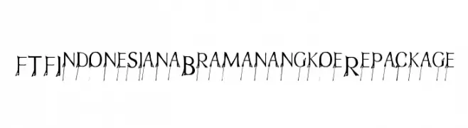
( Fonts by Fizzetica DepokAsiana TypeFoundry - fizzeticatypefoundry.tumblr.com )
A decorative font with elegant, elongated serifs and intricate details.
![FTFIndonesianaBramanangkoeRepackage font caratteri gratis]() Scaricare 266 Downloads@WebFont
Scaricare 266 Downloads@WebFont -
( Fonts by Dieter Steffmann )
A bold, inline font with a classic yet modern appeal.
![Ventura Inline Bold font caratteri gratis]() Scaricare 266 Downloads@WebFont
Scaricare 266 Downloads@WebFont -
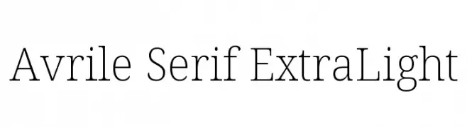
( Fonts by Cristiano Sobral - Personal-use only. For commercial use please contact owner. )
A refined serif font with thin, elegant strokes and subtle serifs.
![Avrile Serif ExtraLight font caratteri gratis]() Scaricare 266 Downloads@WebFont
Scaricare 266 Downloads@WebFont


Quali sono i font più popolari adesso?
Poppins, Roboto, Montserrat, Open Sans e Lato sono molto usati per le forme pulite e l'ampia applicabilità — dall'identità di marca alle landing page e ai poster.
Quali font si usano spesso nei loghi?
Le sans serif geometriche (es. Poppins, famiglie in stile Gotham) sono scelte comuni per un branding pulito e scalabile. Per un tocco personale restano valide script e stili manoscritti. Abbina un display deciso per i titoli a un corpo testo neutro per riconoscibilità ed equilibrio.
Ogni quanto si aggiorna la lista?
Con regolarità, in base ai download e all'attività reale. Torna spesso per scoprire in anticipo le nuove preferite.
💡 Consiglio: aggiungi ai preferiti — le tendenze cambiano in fretta e i font top di oggi possono ispirare il rebranding di domani.