Benvenuto nelle Font Più Popolari — dove popolarità e qualità si incontrano. Qui trovi i font più scaricati e usati dell'anno. Se cerchi scelte sicure per logo, web o social, inizia da qui.
Ogni font top si distingue per equilibrio, leggibilità e versatilità. Troverai sans serif moderne, script eleganti, serif vintage e display minimalisti.
-
( Zetafonts - www.zetafonts.com )
A modern, geometric sans-serif typeface with clean lines and uniform strokes.
 Scaricare 266 Downloads@WebFont
 -
( Fonts by Manfred Klein - manfred-klein.ina-mar.com )
A bold, decorative font with thick strokes and ornate detailing.
![Toscanienne-Bold font caratteri gratis]() Scaricare 266 Downloads@WebFont
Scaricare 266 Downloads@WebFont -
![BauernFraktur font caratteri gratis]() Scaricare 266 Downloads@WebFont
Scaricare 266 Downloads@WebFont -
( Fonts by www.houseoflime.com )
A diverse collection of decorative fonts with culinary themes, perfect for eye-catching designs.
![Eating Out font caratteri gratis]() Scaricare 266 Downloads@WebFont
Scaricare 266 Downloads@WebFont -
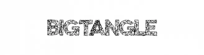
( Fonts by Xerographer Fonts )
A bold, web-patterned decorative font ideal for artistic headlines and logos.
![BigTangle font caratteri gratis]() Scaricare 266 Downloads@WebFont
Scaricare 266 Downloads@WebFont -
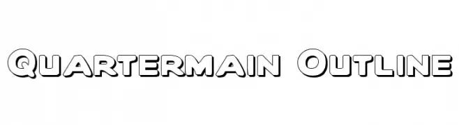
-
![Quartermain Outline font caratteri gratis]() Scaricare 266 Downloads
Scaricare 266 Downloads -
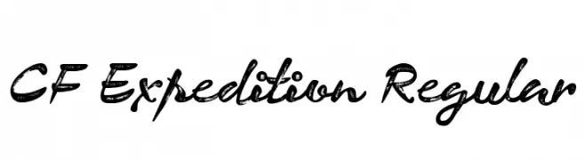
( CloutierFontes - Steve Cloutier - www.cloutierfontes.ca/ )
A bold, textured script font with a rugged, adventurous style.
![CF Expedition Regular font caratteri gratis]() Scaricare 266 Downloads@WebFont
Scaricare 266 Downloads@WebFont -
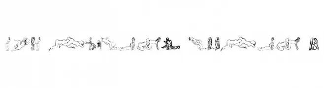
( Fonts by Pennyzine - www.thedevilinjasonramirez.com - Free for personal use )
Abstract line-art figures create each character in a decorative, illustrative style.
![that luvin' feelin 1 font caratteri gratis]() Scaricare 266 Downloads@WebFont
Scaricare 266 Downloads@WebFont -
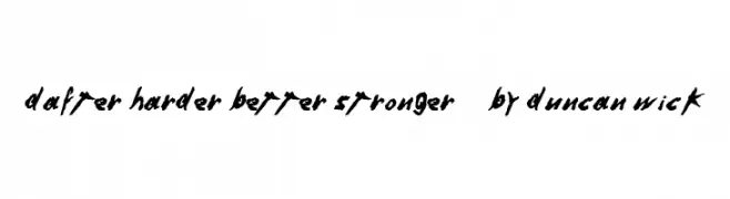
![Dafter Harder Better Stronger © by Duncan Wick font caratteri gratis]() Scaricare 266 Downloads@WebFont
Scaricare 266 Downloads@WebFont -
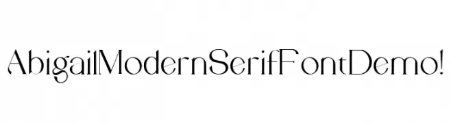
( Fonts by Nestype - Yesaya Amnestian - Personal-use only. For commercial use please contact owner. )
A modern serif font with high contrast and elegant, thin strokes.
![Abigail Modern Serif Font Demo ! font caratteri gratis]() Scaricare 266 Downloads@WebFont
Scaricare 266 Downloads@WebFont
Quali sono i font più popolari adesso?
Poppins, Roboto, Montserrat, Open Sans e Lato sono molto usati per le forme pulite e l'ampia applicabilità — dall'identità di marca alle landing page e ai poster.
Quali font si usano spesso nei loghi?
Le sans serif geometriche (es. Poppins, famiglie in stile Gotham) sono scelte comuni per un branding pulito e scalabile. Per un tocco personale restano valide script e stili manoscritti. Abbina un display deciso per i titoli a un corpo testo neutro per riconoscibilità ed equilibrio.
Ogni quanto si aggiorna la lista?
Con regolarità, in base ai download e all'attività reale. Torna spesso per scoprire in anticipo le nuove preferite.
💡 Consiglio: aggiungi ai preferiti — le tendenze cambiano in fretta e i font top di oggi possono ispirare il rebranding di domani.