Benvenuto nelle Font Più Popolari — dove popolarità e qualità si incontrano. Qui trovi i font più scaricati e usati dell'anno. Se cerchi scelte sicure per logo, web o social, inizia da qui.
Ogni font top si distingue per equilibrio, leggibilità e versatilità. Troverai sans serif moderne, script eleganti, serif vintage e display minimalisti.
-
( Fonts by Castcraft Software - opti.netii.net - check the website before use )
A modern, geometric sans-serif font with consistent stroke width and clear legibility.
 Scaricare 1055 Downloads@WebFont
 -
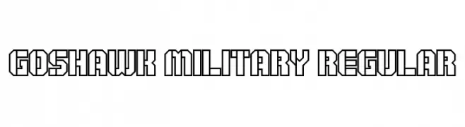
![Goshawk Military Regular font caratteri gratis]() Scaricare 1055 Downloads@WebFont
Scaricare 1055 Downloads@WebFont -
( Fonts by Manfred Klein - manfred-klein.ina-mar.com )
A font inspired by ancient architecture with sharp serifs and a historical aesthetic.
![Archeologicaps font caratteri gratis]() Scaricare 1055 Downloads@WebFont
Scaricare 1055 Downloads@WebFont -
![Awaken font caratteri gratis]() Scaricare 1055 Downloads@WebFont
Scaricare 1055 Downloads@WebFont -
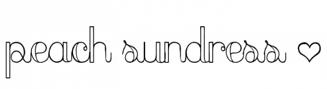
![peach sundress ~ font caratteri gratis]() Scaricare 1055 Downloads@WebFont
Scaricare 1055 Downloads@WebFont -
( Paul Lloyd Fonts )
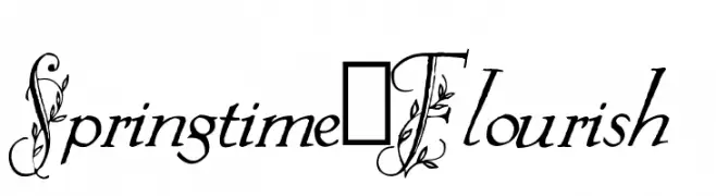
An elegant, decorative font with floral embellishments and script-like lowercase letters.
![Springtime_Flourish font caratteri gratis]() Scaricare 1055 Downloads@WebFont
Scaricare 1055 Downloads@WebFont -
( Fonts by Slub Design - Raymond Buetens - www.slubdesign.com )
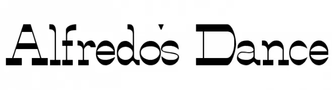
A bold, geometric font with a modern and versatile style.
![Alfredo's Dance font caratteri gratis]() Scaricare 1055 Downloads
Scaricare 1055 Downloads -
( Fonts by Jacob Fisher - www.pizzadude.dk )
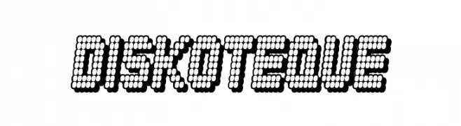
A playful, dotted font with a retro digital feel, ideal for creative and attention-grabbing designs.
![Diskoteque font caratteri gratis]() Scaricare 1055 Downloads@WebFont
Scaricare 1055 Downloads@WebFont -
( Fonts by Febryl Arully - Personal-use only. For commercial use please contact owner. )
An elegant script font with intricate swashes and flowing, interconnected letters.
![Arully font caratteri gratis]() Scaricare 1054 Downloads@WebFont
Scaricare 1054 Downloads@WebFont -
( Noto is a trademark of Google Inc. Noto fonts are open source. All Noto fonts are published under the SIL Open Font License, Version 1.1 )
A clean, modern sans-serif font with excellent readability.
![Noto Sans Sinhala Regular font caratteri gratis]() Scaricare 1054 Downloads@WebFont
Scaricare 1054 Downloads@WebFont -
![Quixotic, Haley Kershaw font caratteri gratis]() Scaricare 1054 Downloads@WebFont
Scaricare 1054 Downloads@WebFont -
![HP Slant Regular font caratteri gratis]() Scaricare 1054 Downloads@WebFont
Scaricare 1054 Downloads@WebFont -
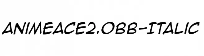
( Fonts by www.blambot.com )
A playful, italicized handwritten font with smooth, bold strokes.
![AnimeAce2.0BB-Italic font caratteri gratis]() Scaricare 1054 Downloads@WebFont
Scaricare 1054 Downloads@WebFont -
![Hemant font caratteri gratis]() Scaricare 1054 Downloads@WebFont
Scaricare 1054 Downloads@WebFont -
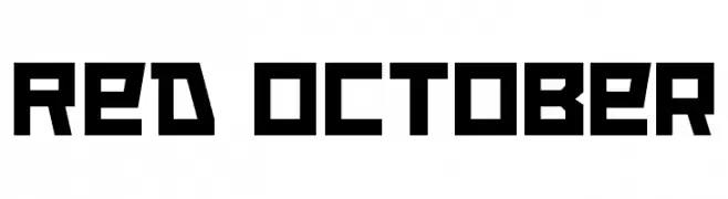
( Fonts by www.neogrey.com - Neogrey Creative )
A bold, geometric font with a strong, industrial aesthetic.
![Red October font caratteri gratis]() Scaricare 1054 Downloads@WebFont
Scaricare 1054 Downloads@WebFont -
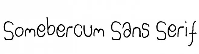
![Somebercum Sans Serif font caratteri gratis]() Scaricare 1054 Downloads@WebFont
Scaricare 1054 Downloads@WebFont -
![Sardonic-owl font caratteri gratis]() Scaricare 1054 Downloads@WebFont
Scaricare 1054 Downloads@WebFont -
( Fonts by Khurasan )
A playful, bold font with rounded characters and a friendly appearance.
![Cakeroll font caratteri gratis]() Scaricare 1053 Downloads@WebFont
Scaricare 1053 Downloads@WebFont -
( Fonts by Daniel Zadorozny - www.iconian.com - Personal-use only. For commercial use please contact owner. )
A bold, geometric font with a futuristic and technical style.
![Pilot Command Expanded font caratteri gratis]() Scaricare 1053 Downloads@WebFont
Scaricare 1053 Downloads@WebFont -
( Nils Kähler - creativevikings.com )
A modern, geometric font with clean lines and a minimalist design.
![Bauhaus Modern font caratteri gratis]() Scaricare 1053 Downloads@WebFont
Scaricare 1053 Downloads@WebFont -
( Fonts by artimasa studio )
A bold, dynamic script font with fluid, cursive letterforms.
![Sweet Sorrow font caratteri gratis]() Scaricare 1053 Downloads@WebFont
Scaricare 1053 Downloads@WebFont -
( Fonts by a Neale Davidson - www.pixelsagas.com. Personal-use only. For commercial use please contact owner. )
A bold, italicized font with a futuristic, angular design.
![Cyberverse Bold Italic font caratteri gratis]() Scaricare 1053 Downloads@WebFont
Scaricare 1053 Downloads@WebFont -
( Fonts by a The Branded Quotes - https://sellfy.com/thebrandedquotes. Personal-use only. For commercial use please contact owner. )
A bold, handwritten font with a playful and energetic style.
![Shorelines Display font caratteri gratis]() Scaricare 1053 Downloads@WebFont
Scaricare 1053 Downloads@WebFont -
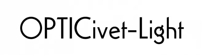
( Fonts by Castcraft Software - opti.netii.net - check the website before use )
A modern, slightly italicized font with a sleek and dynamic design.
![OPTIMirc-Light font caratteri gratis]() Scaricare 1053 Downloads@WebFont
Scaricare 1053 Downloads@WebFont -
( Copyright (c) <17/12/07>,
( An elegant serif font with a classic italic style and high contrast strokes.
![GFSDidot-Italic font caratteri gratis]() Scaricare 1053 Downloads@WebFont
Scaricare 1053 Downloads@WebFont -
![BARK font caratteri gratis]() Scaricare 1053 Downloads@WebFont
Scaricare 1053 Downloads@WebFont -
![AntPoltLtCond-Regular font caratteri gratis]() Scaricare 1053 Downloads@WebFont
Scaricare 1053 Downloads@WebFont -
( Fonts by www.fontalicious.com )
A bold, playful font with thick, rounded strokes and a bubbly appearance.
![Fat font caratteri gratis]() Scaricare 1053 Downloads@WebFont
Scaricare 1053 Downloads@WebFont -
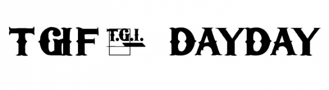
( Fonts by Dennis Ludlow - Sharkshock Productions )
A bold, decorative font with intricate details and strong serifs.
![TGIFriday font caratteri gratis]() Scaricare 1053 Downloads@WebFont
Scaricare 1053 Downloads@WebFont -
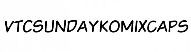
![VTCSundaykomixcaps font caratteri gratis]() Scaricare 1053 Downloads@WebFont
Scaricare 1053 Downloads@WebFont -
( Fonts by Billy Argel Fonts - www.billyargel.com - Personal-use only. For commercial use please contact owner. )
A dynamic and fluid script font with a modern twist, perfect for stylish projects.
![Nouvelle Vague Personal Use font caratteri gratis]() Scaricare 1052 Downloads@WebFont
Scaricare 1052 Downloads@WebFont -
Caratteri di HammerBro101. For commercial use please contact the owner.
![LFCurry font caratteri gratis]() Scaricare 1052 Downloads@WebFont
Scaricare 1052 Downloads@WebFont -
( Fonts by Dumadi Studios )
A bold, rounded font with a playful and energetic style.
![dumadi font caratteri gratis]() Scaricare 1052 Downloads@WebFont
Scaricare 1052 Downloads@WebFont -
( Fonts by vladimirnikolic - Personal-use only. For commercial use please contact owner. )
A modern font with high contrast and elegant, sharp lines.
![Stefan Regular font caratteri gratis]() Scaricare 1052 Downloads@WebFont
Scaricare 1052 Downloads@WebFont -
![BirminghamScriptDEMO font caratteri gratis]() Scaricare 1052 Downloads@WebFont
Scaricare 1052 Downloads@WebFont


Quali sono i font più popolari adesso?
Poppins, Roboto, Montserrat, Open Sans e Lato sono molto usati per le forme pulite e l'ampia applicabilità — dall'identità di marca alle landing page e ai poster.
Quali font si usano spesso nei loghi?
Le sans serif geometriche (es. Poppins, famiglie in stile Gotham) sono scelte comuni per un branding pulito e scalabile. Per un tocco personale restano valide script e stili manoscritti. Abbina un display deciso per i titoli a un corpo testo neutro per riconoscibilità ed equilibrio.
Ogni quanto si aggiorna la lista?
Con regolarità, in base ai download e all'attività reale. Torna spesso per scoprire in anticipo le nuove preferite.
💡 Consiglio: aggiungi ai preferiti — le tendenze cambiano in fretta e i font top di oggi possono ispirare il rebranding di domani.