Benvenuto nelle Font Più Popolari — dove popolarità e qualità si incontrano. Qui trovi i font più scaricati e usati dell'anno. Se cerchi scelte sicure per logo, web o social, inizia da qui.
Ogni font top si distingue per equilibrio, leggibilità e versatilità. Troverai sans serif moderne, script eleganti, serif vintage e display minimalisti.
-
( Fonts by Perspectype Studio - Letterena.com - Personal-use only. For commercial use please contact owner. )
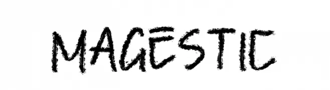
A bold, textured hand-drawn font with a rugged, artistic style.
 Scaricare 259 Downloads@WebFont
 -
( Fonts by Factor Vector - elfactorvector.blogspot.com )
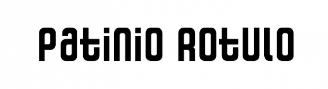
A bold, modern font with a geometric and industrial style.
![Patinio Rotulo font caratteri gratis]() Scaricare 259 Downloads@WebFont
Scaricare 259 Downloads@WebFont -
![Virile Open font caratteri gratis]() Scaricare 259 Downloads@WebFont
Scaricare 259 Downloads@WebFont -
( Fonts by ViactionType - Lukman Hidayat - Personal-use only. For commercial use please contact owner. )
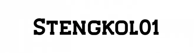
A bold, modern font with strong, thick strokes and a geometric influence.
![Stengkol01 font caratteri gratis]() Scaricare 259 Downloads@WebFont
Scaricare 259 Downloads@WebFont -
( Fonts by huawei.com - Personal-use only. For commercial use please contact owner. )
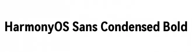
A modern, bold, and condensed sans-serif typeface with excellent readability.
![HarmonyOS Sans Condensed Bold font caratteri gratis]() Scaricare 259 Downloads@WebFont
Scaricare 259 Downloads@WebFont -
-
( Fonts by www.peter-wiegel.de. Personal-use only. For commercial use please contact owner. )
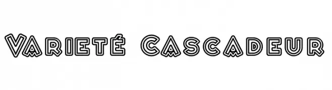
A bold, geometric font with a three-dimensional layered outline effect.
![Varieté Cascadeur font caratteri gratis]() Scaricare 259 Downloads@WebFont
Scaricare 259 Downloads@WebFont -
( Fonts by a Neale Davidson - www.pixelsagas.com. Personal-use only. For commercial use please contact owner. )
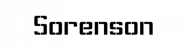
A bold, geometric font with a modern and futuristic style.
![Sorenson font caratteri gratis]() Scaricare 259 Downloads@WebFont
Scaricare 259 Downloads@WebFont -
( Fonts by Hanna Bie )
A bold, playful font with thick, rounded strokes and a bubbly appearance.
![Genoise font caratteri gratis]() Scaricare 259 Downloads@WebFont
Scaricare 259 Downloads@WebFont -
( dcoxy - Greg Medina - www.dcoxy.com/ )
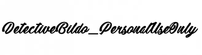
A bold, cursive font with elegant, sweeping curves and high contrast.
![Detective Bildo_PersonalUseOnly font caratteri gratis]() Scaricare 259 Downloads@WebFont
Scaricare 259 Downloads@WebFont -
( Free - www.greatmade.de/ )
A tall, narrow font with elongated characters and a modern, artistic style.
![Sancho font caratteri gratis]() Scaricare 259 Downloads@WebFont
Scaricare 259 Downloads@WebFont


Quali sono i font più popolari adesso?
Poppins, Roboto, Montserrat, Open Sans e Lato sono molto usati per le forme pulite e l'ampia applicabilità — dall'identità di marca alle landing page e ai poster.
Quali font si usano spesso nei loghi?
Le sans serif geometriche (es. Poppins, famiglie in stile Gotham) sono scelte comuni per un branding pulito e scalabile. Per un tocco personale restano valide script e stili manoscritti. Abbina un display deciso per i titoli a un corpo testo neutro per riconoscibilità ed equilibrio.
Ogni quanto si aggiorna la lista?
Con regolarità, in base ai download e all'attività reale. Torna spesso per scoprire in anticipo le nuove preferite.
💡 Consiglio: aggiungi ai preferiti — le tendenze cambiano in fretta e i font top di oggi possono ispirare il rebranding di domani.