Benvenuto nelle Font Più Popolari — dove popolarità e qualità si incontrano. Qui trovi i font più scaricati e usati dell'anno. Se cerchi scelte sicure per logo, web o social, inizia da qui.
Ogni font top si distingue per equilibrio, leggibilità e versatilità. Troverai sans serif moderne, script eleganti, serif vintage e display minimalisti.
-
 Scaricare 257 Downloads@WebFont
 -
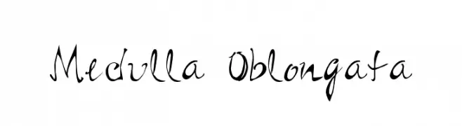
( Fonts by Bobistheowl - Personal-use only. For commercial use please contact owner. )
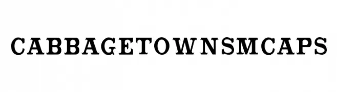
A bold serif font with a vintage yet modern appeal, perfect for impactful headlines.
![CabbagetownSmCaps font caratteri gratis]() Scaricare 257 Downloads@WebFont
Scaricare 257 Downloads@WebFont -
( Fonts by Koczman Balint - magiquefonts.gportal.hu )
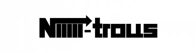
A bold, geometric font with sharp edges and a modern style.
![Niiiii-trous font caratteri gratis]() Scaricare 257 Downloads@WebFont
Scaricare 257 Downloads@WebFont -
( Fonts by www.aka-acid.com )
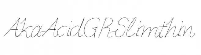
A delicate, thin script font with elegant, flowing lines.
![Aka-AcidGR-Slimthin font caratteri gratis]() Scaricare 257 Downloads@WebFont
Scaricare 257 Downloads@WebFont -
![Competitor font caratteri gratis]() Scaricare 257 Downloads@WebFont
Scaricare 257 Downloads@WebFont -
-
( Fonts by Bobistheowl - Personal-use only. For commercial use please contact owner. )
A bold, high-contrast serif font with strong, authoritative strokes.
![CabbagetownBook font caratteri gratis]() Scaricare 257 Downloads@WebFont
Scaricare 257 Downloads@WebFont -
( Fonts by Christiaan van Wyk - Personal-use only. For commercial use please contact owner. )
A bold, geometric font with strong, consistent letterforms.
![Ustulo font caratteri gratis]() Scaricare 257 Downloads@WebFont
Scaricare 257 Downloads@WebFont -
( imagex - www.imagex-fonts.com )
A bold, distressed font with a vintage, rugged texture.
![Irresponsible Direction font caratteri gratis]() Scaricare 257 Downloads@WebFont
Scaricare 257 Downloads@WebFont -
( Fonts by www.fontpanda.com. Personal-use only. For commercial use please contact owner. )
A playful, casual handwritten font with irregular strokes and a whimsical feel.
![Betsilicious font caratteri gratis]() Scaricare 257 Downloads@WebFont
Scaricare 257 Downloads@WebFont -
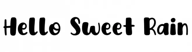
( Fonts by Khurasan )
A playful, bold font with rounded, thick strokes and a whimsical touch.
![Hello Sweet Rain font caratteri gratis]() Scaricare 257 Downloads@WebFont
Scaricare 257 Downloads@WebFont

Quali sono i font più popolari adesso?
Poppins, Roboto, Montserrat, Open Sans e Lato sono molto usati per le forme pulite e l'ampia applicabilità — dall'identità di marca alle landing page e ai poster.
Quali font si usano spesso nei loghi?
Le sans serif geometriche (es. Poppins, famiglie in stile Gotham) sono scelte comuni per un branding pulito e scalabile. Per un tocco personale restano valide script e stili manoscritti. Abbina un display deciso per i titoli a un corpo testo neutro per riconoscibilità ed equilibrio.
Ogni quanto si aggiorna la lista?
Con regolarità, in base ai download e all'attività reale. Torna spesso per scoprire in anticipo le nuove preferite.
💡 Consiglio: aggiungi ai preferiti — le tendenze cambiano in fretta e i font top di oggi possono ispirare il rebranding di domani.