Benvenuto nelle Font Più Popolari — dove popolarità e qualità si incontrano. Qui trovi i font più scaricati e usati dell'anno. Se cerchi scelte sicure per logo, web o social, inizia da qui.
Ogni font top si distingue per equilibrio, leggibilità e versatilità. Troverai sans serif moderne, script eleganti, serif vintage e display minimalisti.
-
( Fonts by Eimantas Paškonis - Personal-use only. For commercial use please contact owner. )
A modern, geometric sans-serif font with clean lines and balanced spacing.
 Scaricare 257 Downloads@WebFont
 -
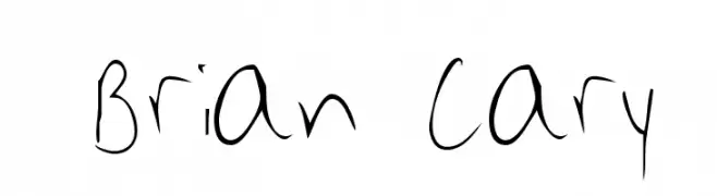
![Brian Cary font caratteri gratis]() Scaricare 257 Downloads@WebFont
Scaricare 257 Downloads@WebFont -
( Darrell Flood )
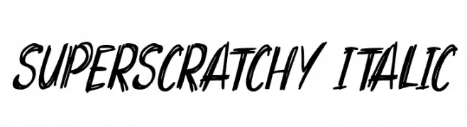
A scratchy, hand-drawn italic font with dynamic and expressive strokes.
![Superscratchy Italic font caratteri gratis]() Scaricare 257 Downloads@WebFont
Scaricare 257 Downloads@WebFont -
( imagex - www.imagex-fonts.com )
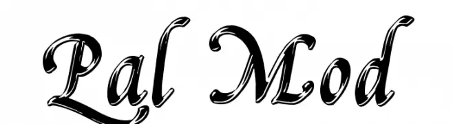
An elegant, calligraphic script font with ornate, flowing characters.
![Pal Mod font caratteri gratis]() Scaricare 257 Downloads@WebFont
Scaricare 257 Downloads@WebFont -
( Fonts by Burhan Afif - hanscostudio.com - Personal-use only. For commercial use please contact owner. )
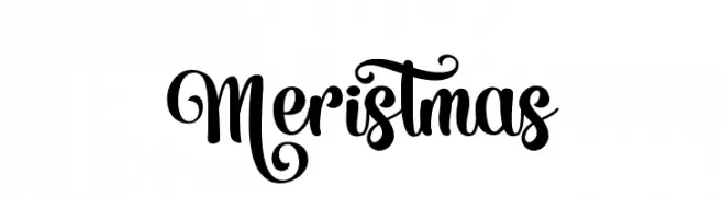
A decorative script font with ornate, swirling embellishments.
![Meristmas font caratteri gratis]() Scaricare 257 Downloads@WebFont
Scaricare 257 Downloads@WebFont -
-
![Critters1DC SemiBold font caratteri gratis]() Scaricare 257 Downloads@WebFont
Scaricare 257 Downloads@WebFont -
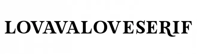
( Fonts by Situjuh Nazara - 7ntypes.com - Personal-use only. For commercial use please contact owner. )
A bold serif typeface with classic elegance and pronounced strokes.
![LovaValoveSerif font caratteri gratis]() Scaricare 257 Downloads@WebFont
Scaricare 257 Downloads@WebFont -
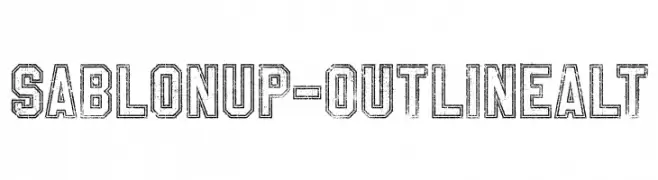
( Fonts by a Youssef Habchi - youssef-habchi.com. Personal-use only. For commercial use please contact owner. )
A bold, outlined font with a distressed, vintage texture.
![SablonUp-OutlineAlt font caratteri gratis]() Scaricare 257 Downloads@WebFont
Scaricare 257 Downloads@WebFont -
( Fonts by Loraine Wauer Ferus www.billybear4kids.com )
A whimsical font with characters inside bunny designs, perfect for festive projects.
![BB EasterEggs font caratteri gratis]() Scaricare 257 Downloads@WebFont
Scaricare 257 Downloads@WebFont -
( Fonts by Maulana Creative )
Elegant handwritten script font.
![Mattswans font caratteri gratis]() Scaricare 257 Downloads@WebFont
Scaricare 257 Downloads@WebFont


Quali sono i font più popolari adesso?
Poppins, Roboto, Montserrat, Open Sans e Lato sono molto usati per le forme pulite e l'ampia applicabilità — dall'identità di marca alle landing page e ai poster.
Quali font si usano spesso nei loghi?
Le sans serif geometriche (es. Poppins, famiglie in stile Gotham) sono scelte comuni per un branding pulito e scalabile. Per un tocco personale restano valide script e stili manoscritti. Abbina un display deciso per i titoli a un corpo testo neutro per riconoscibilità ed equilibrio.
Ogni quanto si aggiorna la lista?
Con regolarità, in base ai download e all'attività reale. Torna spesso per scoprire in anticipo le nuove preferite.
💡 Consiglio: aggiungi ai preferiti — le tendenze cambiano in fretta e i font top di oggi possono ispirare il rebranding di domani.