Benvenuto nelle Font Più Popolari — dove popolarità e qualità si incontrano. Qui trovi i font più scaricati e usati dell'anno. Se cerchi scelte sicure per logo, web o social, inizia da qui.
Ogni font top si distingue per equilibrio, leggibilità e versatilità. Troverai sans serif moderne, script eleganti, serif vintage e display minimalisti.
-
( Fonts by joorgemoron )
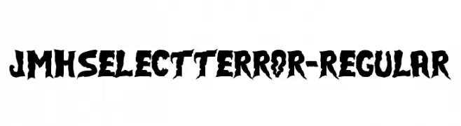
A bold, jagged font with a horror-themed, distressed appearance.
 Scaricare 254 Downloads@WebFont
 -
( Fonts by www.vicfieger.com )
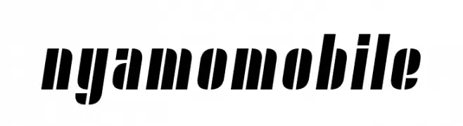
A bold, slanted font with geometric shapes and strong vertical emphasis.
![Nyamomobile font caratteri gratis]() Scaricare 254 Downloads@WebFont
Scaricare 254 Downloads@WebFont -
( Fonts by Daniel Zadorozny - www.iconian.com - Free for personal use )
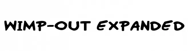
A playful, bold font with a hand-drawn, comic-style aesthetic.
![Wimp-Out Expanded font caratteri gratis]() Scaricare 254 Downloads@WebFont
Scaricare 254 Downloads@WebFont -
( Fonts by Pinisiart )
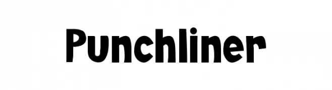
A bold, playful font with rounded edges and a lively, informal style.
![Punchliner font caratteri gratis]() Scaricare 254 Downloads@WebFont
Scaricare 254 Downloads@WebFont -
( Fonts by Saqib Ahmad )
A geometric and artistic font with circular motifs and intricate designs.
![Round Geometric font caratteri gratis]() Scaricare 254 Downloads@WebFont
Scaricare 254 Downloads@WebFont -
-
( Fonts by Font Monger - Chris Vile - Personal-use only. For commercial use please contact owner. )
A bold, high-contrast font with strong, thick strokes for impactful design.
![LCt50 font caratteri gratis]() Scaricare 254 Downloads@WebFont
Scaricare 254 Downloads@WebFont -
( Fonts by Naharstd - Nanda Hardiansyah - Personal-use only. For commercial use please contact owner. )
A graceful and elegant script font with flowing, cursive letterforms.
![Hello Cristina font caratteri gratis]() Scaricare 254 Downloads@WebFont
Scaricare 254 Downloads@WebFont -
![DNNR LightItalic font caratteri gratis]() Scaricare 254 Downloads@WebFont
Scaricare 254 Downloads@WebFont -
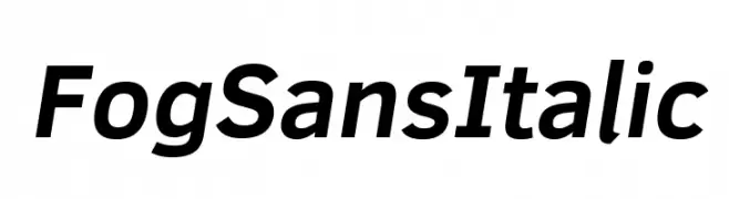
( Fonts by CannotIntoSpaceFonts - KineticPlasma Fonts - Personal-use only. For commercial use please contact owner. )
A modern, italic sans-serif font with a clean and dynamic style.
![Fog Sans Italic font caratteri gratis]() Scaricare 254 Downloads@WebFont
Scaricare 254 Downloads@WebFont -
![Trajma font caratteri gratis]() Scaricare 254 Downloads@WebFont
Scaricare 254 Downloads@WebFont


Quali sono i font più popolari adesso?
Poppins, Roboto, Montserrat, Open Sans e Lato sono molto usati per le forme pulite e l'ampia applicabilità — dall'identità di marca alle landing page e ai poster.
Quali font si usano spesso nei loghi?
Le sans serif geometriche (es. Poppins, famiglie in stile Gotham) sono scelte comuni per un branding pulito e scalabile. Per un tocco personale restano valide script e stili manoscritti. Abbina un display deciso per i titoli a un corpo testo neutro per riconoscibilità ed equilibrio.
Ogni quanto si aggiorna la lista?
Con regolarità, in base ai download e all'attività reale. Torna spesso per scoprire in anticipo le nuove preferite.
💡 Consiglio: aggiungi ai preferiti — le tendenze cambiano in fretta e i font top di oggi possono ispirare il rebranding di domani.