Benvenuto nelle Font Più Popolari — dove popolarità e qualità si incontrano. Qui trovi i font più scaricati e usati dell'anno. Se cerchi scelte sicure per logo, web o social, inizia da qui.
Ogni font top si distingue per equilibrio, leggibilità e versatilità. Troverai sans serif moderne, script eleganti, serif vintage e display minimalisti.
-
( Fonts by Cat.B - Agathe M.Joyce - Personal-use only. For commercial use please contact owner. )
A bold, expressive script font with a hand-drawn, cursive style.
 Scaricare 254 Downloads@WebFont
 -
( Fonts by Daniel Zadorozny - www.iconian.com - Free for personal use )
A bold, expanded, and italicized font with a modern, dynamic style.
![U.S.S. Dallas Expanded Italic font caratteri gratis]() Scaricare 254 Downloads@WebFont
Scaricare 254 Downloads@WebFont -
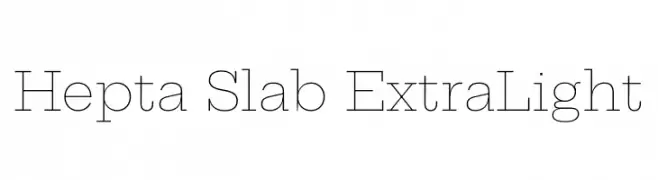
( Copyright 2018 The Hepta Slab Project Authors (https://github.com/mjlagattuta/Hepta-Slab) )
A modern slab serif font with thin, elegant strokes and geometric influence.
![Hepta Slab ExtraLight font caratteri gratis]() Scaricare 254 Downloads@WebFont
Scaricare 254 Downloads@WebFont -
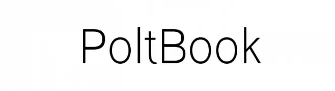
( Ariel Alvares )
A clean, modern sans-serif font with uniform stroke width and excellent readability.
![Polt Book font caratteri gratis]() Scaricare 254 Downloads@WebFont
Scaricare 254 Downloads@WebFont -
( Fonts by Roman Shamin )
A modern, light sans-serif font with a clean and balanced design.
![HattoriHanzo-Light font caratteri gratis]() Scaricare 254 Downloads@WebFont
Scaricare 254 Downloads@WebFont -
-
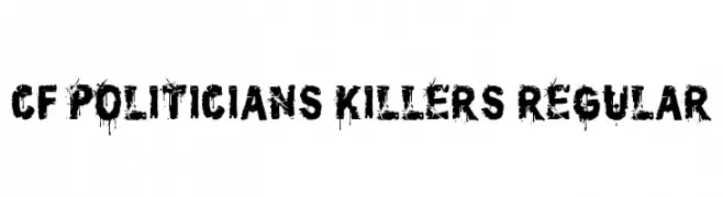
( Fonts by Steve Cloutier - www.cloutierfontes.ca )
A bold, distressed font with a grunge, graffiti-inspired style.
![CF Politicians Killers Regular font caratteri gratis]() Scaricare 254 Downloads@WebFont
Scaricare 254 Downloads@WebFont -
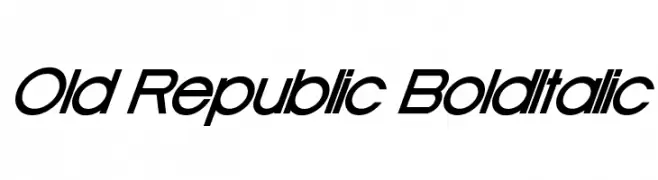
![Old Republic BoldItalic font caratteri gratis]() Scaricare 254 Downloads@WebFont
Scaricare 254 Downloads@WebFont -
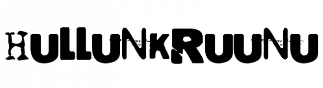
![Hullunkruunu font caratteri gratis]() Scaricare 254 Downloads@WebFont
Scaricare 254 Downloads@WebFont -
( Fonts by Alif Quentin - Personal-use only. For commercial use please contact owner. )
A bold, expressive handwritten font with fluid strokes and dynamic style.
![Latifah font caratteri gratis]() Scaricare 254 Downloads@WebFont
Scaricare 254 Downloads@WebFont -
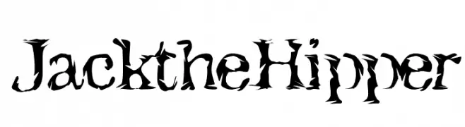
( - www.harrysdesign.com )
A dynamic, jagged font with a torn, edgy appearance.
![JacktheHipper font caratteri gratis]() Scaricare 254 Downloads@WebFont
Scaricare 254 Downloads@WebFont


Quali sono i font più popolari adesso?
Poppins, Roboto, Montserrat, Open Sans e Lato sono molto usati per le forme pulite e l'ampia applicabilità — dall'identità di marca alle landing page e ai poster.
Quali font si usano spesso nei loghi?
Le sans serif geometriche (es. Poppins, famiglie in stile Gotham) sono scelte comuni per un branding pulito e scalabile. Per un tocco personale restano valide script e stili manoscritti. Abbina un display deciso per i titoli a un corpo testo neutro per riconoscibilità ed equilibrio.
Ogni quanto si aggiorna la lista?
Con regolarità, in base ai download e all'attività reale. Torna spesso per scoprire in anticipo le nuove preferite.
💡 Consiglio: aggiungi ai preferiti — le tendenze cambiano in fretta e i font top di oggi possono ispirare il rebranding di domani.