Benvenuto nelle Font Più Popolari — dove popolarità e qualità si incontrano. Qui trovi i font più scaricati e usati dell'anno. Se cerchi scelte sicure per logo, web o social, inizia da qui.
Ogni font top si distingue per equilibrio, leggibilità e versatilità. Troverai sans serif moderne, script eleganti, serif vintage e display minimalisti.
-
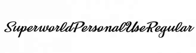
( Fonts by Typodermic Fonts - Raymond Larabie - Personal-use only. For commercial use please contact owner. )
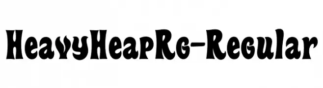
A bold, playful font with exaggerated curves and a whimsical style.
 Scaricare 253 Downloads@WebFont
 -
![Superworld Personal Use Regular font caratteri gratis]() Scaricare 253 Downloads@WebFont
Scaricare 253 Downloads@WebFont -
![___Devastation font caratteri gratis]() Scaricare 253 Downloads@WebFont
Scaricare 253 Downloads@WebFont -
( Fonts by Paul Lloyd )
A decorative font with intricate, nature-inspired patterns.
![DeepWoodsInitials font caratteri gratis]() Scaricare 253 Downloads@WebFont
Scaricare 253 Downloads@WebFont -
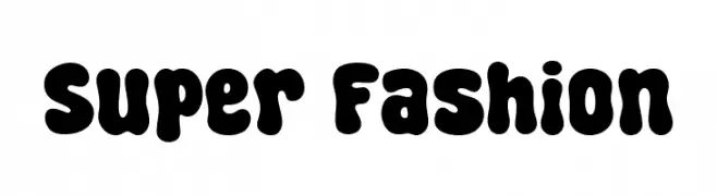
( Fonts by fsuarez913 )
A playful, bold font with thick, rounded characters perfect for creative designs.
![Super Fashion font caratteri gratis]() Scaricare 253 Downloads@WebFont
Scaricare 253 Downloads@WebFont -
-
( Fonts by Graphicfresh )
A handcrafted serif font with a modern twist, featuring elongated and narrow letterforms.
![Our Serif Hand font caratteri gratis]() Scaricare 253 Downloads@WebFont
Scaricare 253 Downloads@WebFont -
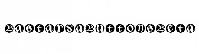
( Fonts by Manfred Klein - manfred-klein.ina-mar.com )
A bold, blackletter-inspired font with modern circular enclosures.
![BastardaButtonsBeta font caratteri gratis]() Scaricare 253 Downloads@WebFont
Scaricare 253 Downloads@WebFont -
( SDFonts. http://www.angelfire.com/scifi2/sdfonts/index.html )
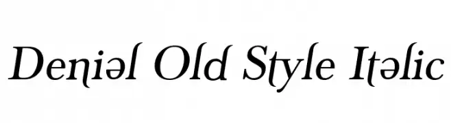
A classic serif font with an elegant italic slant and refined details.
![Denial Old Style Italic font caratteri gratis]() Scaricare 253 Downloads@WebFont
Scaricare 253 Downloads@WebFont -
( Fonts by Billy Argel - Personal-use only. For commercial use please contact owner. )
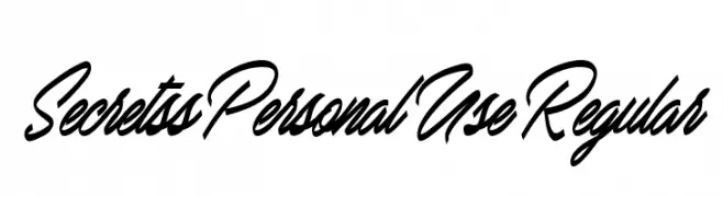
A flowing, cursive font with elegant, sweeping strokes and a handwritten appearance.
![Secretss Personal Use Regular font caratteri gratis]() Scaricare 253 Downloads@WebFont
Scaricare 253 Downloads@WebFont -
( Fonts by Pinisiart )
A bold, playful font with a hand-drawn, whimsical style.
![Hoodville font caratteri gratis]() Scaricare 253 Downloads@WebFont
Scaricare 253 Downloads@WebFont


Quali sono i font più popolari adesso?
Poppins, Roboto, Montserrat, Open Sans e Lato sono molto usati per le forme pulite e l'ampia applicabilità — dall'identità di marca alle landing page e ai poster.
Quali font si usano spesso nei loghi?
Le sans serif geometriche (es. Poppins, famiglie in stile Gotham) sono scelte comuni per un branding pulito e scalabile. Per un tocco personale restano valide script e stili manoscritti. Abbina un display deciso per i titoli a un corpo testo neutro per riconoscibilità ed equilibrio.
Ogni quanto si aggiorna la lista?
Con regolarità, in base ai download e all'attività reale. Torna spesso per scoprire in anticipo le nuove preferite.
💡 Consiglio: aggiungi ai preferiti — le tendenze cambiano in fretta e i font top di oggi possono ispirare il rebranding di domani.