Benvenuto nelle Font Più Popolari — dove popolarità e qualità si incontrano. Qui trovi i font più scaricati e usati dell'anno. Se cerchi scelte sicure per logo, web o social, inizia da qui.
Ogni font top si distingue per equilibrio, leggibilità e versatilità. Troverai sans serif moderne, script eleganti, serif vintage e display minimalisti.
-
( This font is freeware. www.thenorthernblock.co.uk )
A bold, geometric stencil font with sharp angles and clean lines.
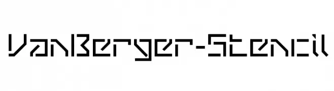 Scaricare 251 Downloads@WebFont
 -
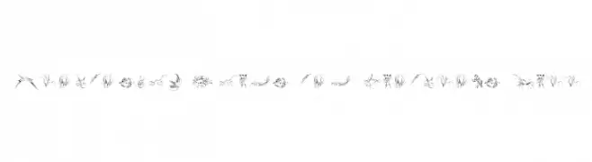
![Penmanship Birds and Ornaments Free font caratteri gratis]() Scaricare 251 Downloads@WebFont
Scaricare 251 Downloads@WebFont -
( Fonts by Syaf Rizal - Khurasan - Personal-use only. For commercial use please contact owner. )
A bold, brush-style font with an energetic and dynamic appearance.
![Oldex font caratteri gratis]() Scaricare 251 Downloads@WebFont
Scaricare 251 Downloads@WebFont -
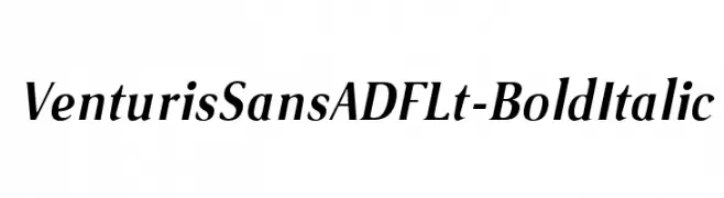
( Fonts by Arkandis Digital Foundry )
A bold italic font with modern elegance and medium contrast, ideal for dynamic designs.
![VenturisSansADFLt-BoldItalic font caratteri gratis]() Scaricare 250 Downloads@WebFont
Scaricare 250 Downloads@WebFont -
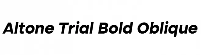
( Fonts by Eko Bimantara - Personal-use only. For commercial use please contact owner. )
A bold, oblique font with a modern and assertive style.
![Altone Trial Bold Oblique font caratteri gratis]() Scaricare 250 Downloads@WebFont
Scaricare 250 Downloads@WebFont -
-
( Fonts by Daniel Zadorozny - www.iconian.com )
A playful, bubble-like outline font with rounded edges and a whimsical style.
![Bubble Butt Outline Regular font caratteri gratis]() Scaricare 250 Downloads@WebFont
Scaricare 250 Downloads@WebFont -
( Fonts by FatmaStudio - Fatmawati - Personal-use only. For commercial use please contact owner. )
A cursive, handwritten font with elegant, flowing strokes.
![Beautifully font caratteri gratis]() Scaricare 250 Downloads@WebFont
Scaricare 250 Downloads@WebFont -
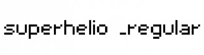
( Font by Sven Stuber - www.superlooper.de )
A pixelated, blocky font inspired by retro digital displays.
![superhelio _regular font caratteri gratis]() Scaricare 250 Downloads@WebFont
Scaricare 250 Downloads@WebFont -
( Fonts by Woodcutter Manero - http://www.woodcutter.es - Personal-use only. For commercial use please contact owner. )
A bold, gothic font with sharp, angular edges and a medieval flair.
![AC+AB font caratteri gratis]() Scaricare 250 Downloads@WebFont
Scaricare 250 Downloads@WebFont -
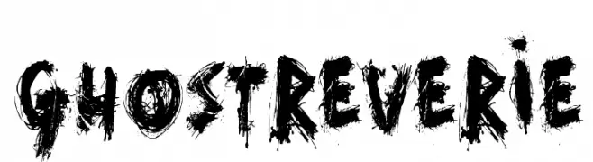
( Fonts by David Kerkhoff - www.hanodedphotography.com )
A bold, grungy font with jagged, distressed strokes for a dramatic effect.
![GhostReverie font caratteri gratis]() Scaricare 250 Downloads@WebFont
Scaricare 250 Downloads@WebFont


Quali sono i font più popolari adesso?
Poppins, Roboto, Montserrat, Open Sans e Lato sono molto usati per le forme pulite e l'ampia applicabilità — dall'identità di marca alle landing page e ai poster.
Quali font si usano spesso nei loghi?
Le sans serif geometriche (es. Poppins, famiglie in stile Gotham) sono scelte comuni per un branding pulito e scalabile. Per un tocco personale restano valide script e stili manoscritti. Abbina un display deciso per i titoli a un corpo testo neutro per riconoscibilità ed equilibrio.
Ogni quanto si aggiorna la lista?
Con regolarità, in base ai download e all'attività reale. Torna spesso per scoprire in anticipo le nuove preferite.
💡 Consiglio: aggiungi ai preferiti — le tendenze cambiano in fretta e i font top di oggi possono ispirare il rebranding di domani.