Benvenuto nelle Font Più Popolari — dove popolarità e qualità si incontrano. Qui trovi i font più scaricati e usati dell'anno. Se cerchi scelte sicure per logo, web o social, inizia da qui.
Ogni font top si distingue per equilibrio, leggibilità e versatilità. Troverai sans serif moderne, script eleganti, serif vintage e display minimalisti.
-
 Scaricare 250 Downloads@WebFont
 -
( Fonts by datto )
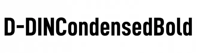
A bold, condensed font with a modern and geometric style.
![D-DIN Condensed Bold font caratteri gratis]() Scaricare 250 Downloads@WebFont
Scaricare 250 Downloads@WebFont -
( Fonts by Mr Fisk - Mike Larsson - fontorama.net )
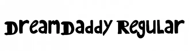
A bold, decorative font with distorted and artistic letterforms.
![Megalomania X font caratteri gratis]() Scaricare 250 Downloads@WebFont
Scaricare 250 Downloads@WebFont -
( Fonts by Etik Fatimah )
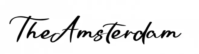
An elegant and flowing script font with smooth, connected strokes.
![The Amsterdam font caratteri gratis]() Scaricare 250 Downloads@WebFont
Scaricare 250 Downloads@WebFont -
( Fonts by Iconian Fonts )
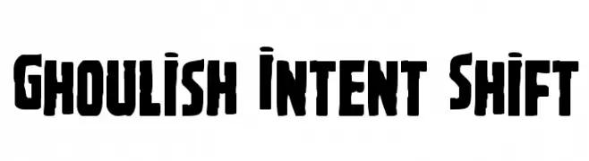
A bold, distressed font with a rugged, edgy appearance.
![Ghoulish Intent Shift font caratteri gratis]() Scaricare 250 Downloads@WebFont
Scaricare 250 Downloads@WebFont -
-
( Fonts by Garisman Studio - Risman Ginarwan - Personal-use only. For commercial use please contact owner. )
A bold, geometric font with a condensed and impactful style.
![GRNORCH font caratteri gratis]() Scaricare 250 Downloads@WebFont
Scaricare 250 Downloads@WebFont -
![Dipple KK S font caratteri gratis]() Scaricare 250 Downloads@WebFont
Scaricare 250 Downloads@WebFont -
( Fonts by Nirmala Creative - Personal-use only. For commercial use please contact owner. )
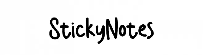
A playful, handwritten font with rounded edges and a casual style.
![Sticky Notes font caratteri gratis]() Scaricare 250 Downloads@WebFont
Scaricare 250 Downloads@WebFont -
( Fonts by Woodcutter )
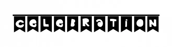
A playful, bold font with characters in flag shapes, perfect for festive designs.
![Celebration font caratteri gratis]() Scaricare 250 Downloads@WebFont
Scaricare 250 Downloads@WebFont -
( Fonts by Yumi Manabe - sba-factory.com )
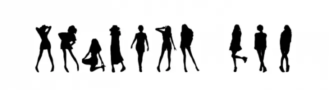
Silhouette-based decorative font using fashion model poses.
![Shibuya Now! font caratteri gratis]() Scaricare 250 Downloads@WebFont
Scaricare 250 Downloads@WebFont

Quali sono i font più popolari adesso?
Poppins, Roboto, Montserrat, Open Sans e Lato sono molto usati per le forme pulite e l'ampia applicabilità — dall'identità di marca alle landing page e ai poster.
Quali font si usano spesso nei loghi?
Le sans serif geometriche (es. Poppins, famiglie in stile Gotham) sono scelte comuni per un branding pulito e scalabile. Per un tocco personale restano valide script e stili manoscritti. Abbina un display deciso per i titoli a un corpo testo neutro per riconoscibilità ed equilibrio.
Ogni quanto si aggiorna la lista?
Con regolarità, in base ai download e all'attività reale. Torna spesso per scoprire in anticipo le nuove preferite.
💡 Consiglio: aggiungi ai preferiti — le tendenze cambiano in fretta e i font top di oggi possono ispirare il rebranding di domani.