Benvenuto nelle Font Più Popolari — dove popolarità e qualità si incontrano. Qui trovi i font più scaricati e usati dell'anno. Se cerchi scelte sicure per logo, web o social, inizia da qui.
Ogni font top si distingue per equilibrio, leggibilità e versatilità. Troverai sans serif moderne, script eleganti, serif vintage e display minimalisti.
-
( Billy Argel - billyargel.com/ )
A bold, distressed font with a rugged, vintage appearance.
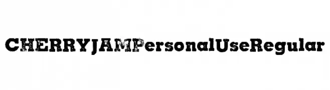 Scaricare 249 Downloads@WebFont
 -
( Fonts by Ketapel Creative - Personal-use only. For commercial use please contact owner. )
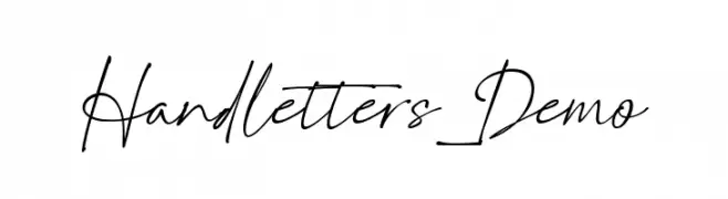
A dynamic, fluid handwritten font with elegant, flowing letterforms.
![Handletters_Demo font caratteri gratis]() Scaricare 249 Downloads@WebFont
Scaricare 249 Downloads@WebFont -
( Fonts by Mr Letters - https://www.creativefabrica.com/designer/mrletters/ - Personal-use only. For commercial use please contact owner. )
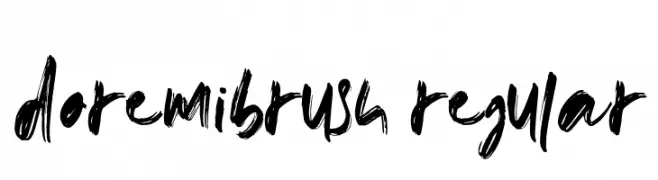
A bold, expressive brush-style font with dynamic strokes.
![doremibrush-Regular font caratteri gratis]() Scaricare 249 Downloads@WebFont
Scaricare 249 Downloads@WebFont -
( Fonts by Calligraphy Fonts )
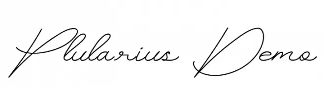
A graceful and fluid script font with a natural handwritten style.
![Plularius Demo font caratteri gratis]() Scaricare 249 Downloads@WebFont
Scaricare 249 Downloads@WebFont -
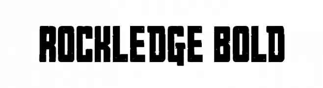
( Fonts by Daniel Zadorozny - www.iconian.com - Personal-use only. For commercial use please contact owner. )
A bold, decorative font with a rugged, vintage texture.
![Rockledge Bold font caratteri gratis]() Scaricare 249 Downloads@WebFont
Scaricare 249 Downloads@WebFont -
-
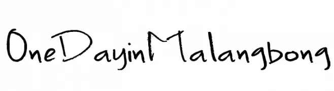
( Fonts by 'Sanz Font )
A playful, casual handwritten font with a whimsical and friendly style.
![OneDayinMalangbong font caratteri gratis]() Scaricare 249 Downloads@WebFont
Scaricare 249 Downloads@WebFont -
![BM block A15 font caratteri gratis]() Scaricare 249 Downloads@WebFont
Scaricare 249 Downloads@WebFont -
( Fonts by Iconian Fonts )
A bold, italic, and futuristic font with angular, geometric characters.
![Cruiser Fortress Title Italic font caratteri gratis]() Scaricare 249 Downloads@WebFont
Scaricare 249 Downloads@WebFont -
![DoodlesOfFun font caratteri gratis]() Scaricare 249 Downloads@WebFont
Scaricare 249 Downloads@WebFont -
( Fonts by www.typodermicfonts.com - Ray Larabie )
A bold serif font with sharp, angular serifs and a modern twist.
![CreditRiver-Regular font caratteri gratis]() Scaricare 249 Downloads@WebFont
Scaricare 249 Downloads@WebFont


Quali sono i font più popolari adesso?
Poppins, Roboto, Montserrat, Open Sans e Lato sono molto usati per le forme pulite e l'ampia applicabilità — dall'identità di marca alle landing page e ai poster.
Quali font si usano spesso nei loghi?
Le sans serif geometriche (es. Poppins, famiglie in stile Gotham) sono scelte comuni per un branding pulito e scalabile. Per un tocco personale restano valide script e stili manoscritti. Abbina un display deciso per i titoli a un corpo testo neutro per riconoscibilità ed equilibrio.
Ogni quanto si aggiorna la lista?
Con regolarità, in base ai download e all'attività reale. Torna spesso per scoprire in anticipo le nuove preferite.
💡 Consiglio: aggiungi ai preferiti — le tendenze cambiano in fretta e i font top di oggi possono ispirare il rebranding di domani.