Benvenuto nelle Font Più Popolari — dove popolarità e qualità si incontrano. Qui trovi i font più scaricati e usati dell'anno. Se cerchi scelte sicure per logo, web o social, inizia da qui.
Ogni font top si distingue per equilibrio, leggibilità e versatilità. Troverai sans serif moderne, script eleganti, serif vintage e display minimalisti.
-
( Fonts by Almarkhatype - Abdul Malik Wisnu - Personal-use only. For commercial use please contact owner. )
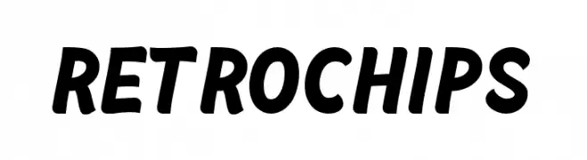
A bold, playful font with a retro vibe and slight slant.
 Scaricare 248 Downloads@WebFont
 -
( truefonts.blogspot.com )
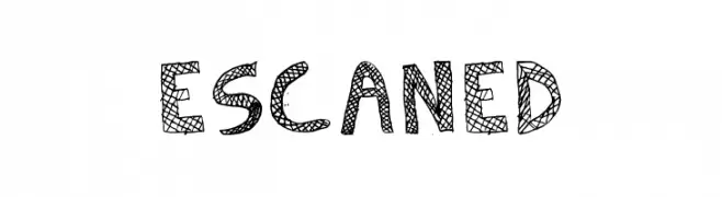
A bold, hand-drawn font with a textured, cross-hatched pattern.
![Escaned font caratteri gratis]() Scaricare 248 Downloads@WebFont
Scaricare 248 Downloads@WebFont -
( Copyright (c) 2012, Impallari Type (www.impallari.com), with Reserved Font Name Encode Sans. )
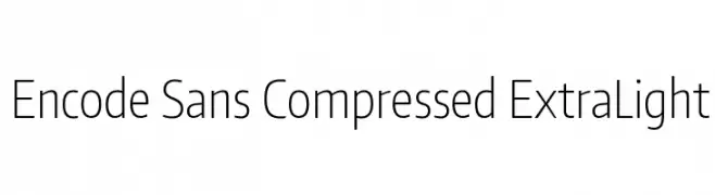
A modern, compressed sans-serif font with an extra light weight, ideal for minimalist designs.
![Encode Sans Compressed ExtraLight font caratteri gratis]() Scaricare 248 Downloads@WebFont
Scaricare 248 Downloads@WebFont -
( Fonts by 4RM Font - Arief rochman - Personal-use only. For commercial use please contact owner. )
A modern, clean sans-serif font with balanced proportions and excellent readability.
![Didi font caratteri gratis]() Scaricare 248 Downloads@WebFont
Scaricare 248 Downloads@WebFont -
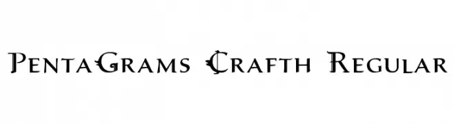
![PentaGrams Crafth Regular font caratteri gratis]() Scaricare 248 Downloads@WebFont
Scaricare 248 Downloads@WebFont -
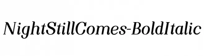
-
![NightStillComes-BoldItalic font caratteri gratis]() Scaricare 248 Downloads@WebFont
Scaricare 248 Downloads@WebFont -
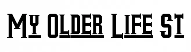
( Fonts by Southype )
A bold, vintage slab serif font with high contrast and block-like serifs.
![My Older Life St font caratteri gratis]() Scaricare 248 Downloads@WebFont
Scaricare 248 Downloads@WebFont -
( Fonts by dartcanada.tripod.com - Darren Rigby )
A modern, geometric font with clean lines and a minimalist aesthetic.
![Torquemada Starved font caratteri gratis]() Scaricare 248 Downloads@WebFont
Scaricare 248 Downloads@WebFont -
( Fonts by Graphix Line Studio - Personal-use only. For commercial use please contact owner. )
A playful, handwritten font with a dynamic and informal style.
![Brooklyn font caratteri gratis]() Scaricare 248 Downloads@WebFont
Scaricare 248 Downloads@WebFont -
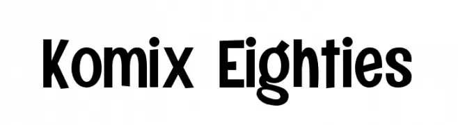
( Fonts by Figuree Studio )
A bold, playful font with a comic book style from the 1980s.
![Komix Eighties font caratteri gratis]() Scaricare 248 Downloads@WebFont
Scaricare 248 Downloads@WebFont


Quali sono i font più popolari adesso?
Poppins, Roboto, Montserrat, Open Sans e Lato sono molto usati per le forme pulite e l'ampia applicabilità — dall'identità di marca alle landing page e ai poster.
Quali font si usano spesso nei loghi?
Le sans serif geometriche (es. Poppins, famiglie in stile Gotham) sono scelte comuni per un branding pulito e scalabile. Per un tocco personale restano valide script e stili manoscritti. Abbina un display deciso per i titoli a un corpo testo neutro per riconoscibilità ed equilibrio.
Ogni quanto si aggiorna la lista?
Con regolarità, in base ai download e all'attività reale. Torna spesso per scoprire in anticipo le nuove preferite.
💡 Consiglio: aggiungi ai preferiti — le tendenze cambiano in fretta e i font top di oggi possono ispirare il rebranding di domani.