Benvenuto nelle Font Più Popolari — dove popolarità e qualità si incontrano. Qui trovi i font più scaricati e usati dell'anno. Se cerchi scelte sicure per logo, web o social, inizia da qui.
Ogni font top si distingue per equilibrio, leggibilità e versatilità. Troverai sans serif moderne, script eleganti, serif vintage e display minimalisti.
-
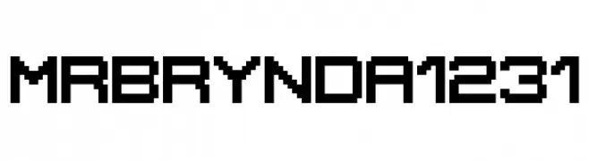
( Brynda1231 Industries )
A pixelated, blocky font with a retro digital aesthetic.
 Scaricare 245 Downloads@WebFont
 -
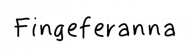
( Fonts by Ana Guerra - www.behance.net/anaguerraa - Personal-use only. For commercial use please contact owner. )
A playful, informal handwritten font with irregular strokes and a casual vibe.
![Fingeferanna font caratteri gratis]() Scaricare 245 Downloads@WebFont
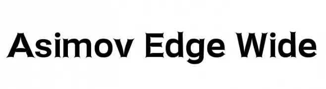
Scaricare 245 Downloads@WebFont -
![Asimov Edge Wide font caratteri gratis]() Scaricare 245 Downloads@WebFont
Scaricare 245 Downloads@WebFont -
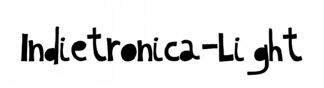
( Pisto Casero - Gilberto Moya Perona - www.pistocasero.com )
A playful, hand-drawn font with bold, irregular letterforms.
![Indietronica-Light font caratteri gratis]() Scaricare 245 Downloads@WebFont
Scaricare 245 Downloads@WebFont -
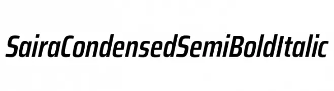
( Fonts by Omnibus Type )
A sleek, modern, semi-bold italic font with a condensed structure and medium contrast.
![Saira Condensed SemiBold Italic font caratteri gratis]() Scaricare 245 Downloads@WebFont
Scaricare 245 Downloads@WebFont -
-
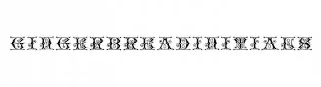
( Fonts by Dieter Steffmann )
An ornate, decorative font with intricate swirls and embellishments.
![GingerbreadInitials font caratteri gratis]() Scaricare 245 Downloads@WebFont
Scaricare 245 Downloads@WebFont -
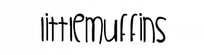
( Fonts by Des Gomez )
A playful, hand-drawn font with tall, narrow letters and a whimsical style.
![LittleMuffins font caratteri gratis]() Scaricare 245 Downloads@WebFont
Scaricare 245 Downloads@WebFont -
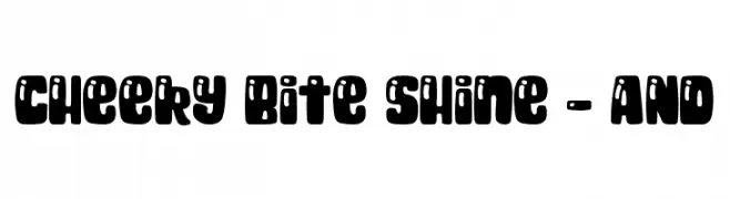
( Fonts by Amber Nest )
A playful, bold font with rounded edges and whimsical cut-out details.
![Cheeky Bite Shine - AND font caratteri gratis]() Scaricare 245 Downloads@WebFont
Scaricare 245 Downloads@WebFont -
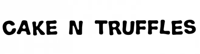
( TwoNineFive - Maximillian Limpo )
A playful, bold font with rounded, bubbly characters and a hand-drawn appearance.
![Cake n Truffles font caratteri gratis]() Scaricare 245 Downloads@WebFont
Scaricare 245 Downloads@WebFont -
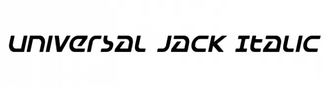
( Fonts by Daniel Zadorozny - www.iconian.com - Free for personal use )
A modern italic font with a sleek, dynamic style and smooth, rounded edges.
![Universal Jack Italic font caratteri gratis]() Scaricare 245 Downloads@WebFont
Scaricare 245 Downloads@WebFont
Quali sono i font più popolari adesso?
Poppins, Roboto, Montserrat, Open Sans e Lato sono molto usati per le forme pulite e l'ampia applicabilità — dall'identità di marca alle landing page e ai poster.
Quali font si usano spesso nei loghi?
Le sans serif geometriche (es. Poppins, famiglie in stile Gotham) sono scelte comuni per un branding pulito e scalabile. Per un tocco personale restano valide script e stili manoscritti. Abbina un display deciso per i titoli a un corpo testo neutro per riconoscibilità ed equilibrio.
Ogni quanto si aggiorna la lista?
Con regolarità, in base ai download e all'attività reale. Torna spesso per scoprire in anticipo le nuove preferite.
💡 Consiglio: aggiungi ai preferiti — le tendenze cambiano in fretta e i font top di oggi possono ispirare il rebranding di domani.