Benvenuto nelle Font Più Popolari — dove popolarità e qualità si incontrano. Qui trovi i font più scaricati e usati dell'anno. Se cerchi scelte sicure per logo, web o social, inizia da qui.
Ogni font top si distingue per equilibrio, leggibilità e versatilità. Troverai sans serif moderne, script eleganti, serif vintage e display minimalisti.
-
( Billy Argel - billyargel.com/ )
A flowing, cursive script font with elegant, sweeping forms and playful flourishes.
 Scaricare 996 Downloads@WebFont
 -
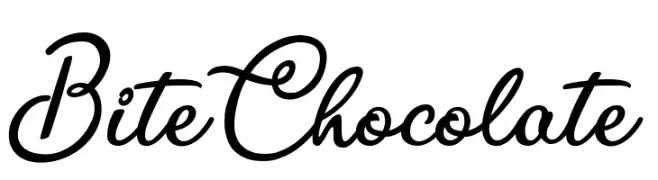
( mlkwsn - Malik Wisnu )
An elegant script font with flowing, interconnected letters and ornate flourishes.
![Classical font caratteri gratis]() Scaricare 996 Downloads@WebFont
Scaricare 996 Downloads@WebFont -
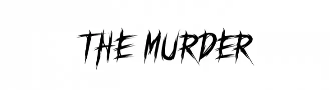
( fluffyartstudio - indra gunawan - creativemarket.com/fluffyartstudio )
A bold, jagged font with sharp edges and a dynamic, hand-drawn style.
![THE MURDER font caratteri gratis]() Scaricare 996 Downloads@WebFont
Scaricare 996 Downloads@WebFont -
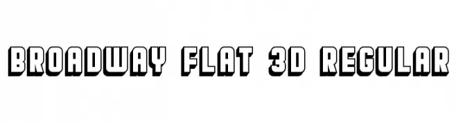
( Vladimir Nikolic - www.coroflot.com/vladimirnikolic )
A bold, 3D geometric font with a modern, impactful style.
![Broadway Flat 3D Regular font caratteri gratis]() Scaricare 996 Downloads@WebFont
Scaricare 996 Downloads@WebFont -
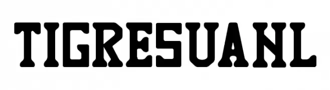
( Jaime Rangel Castro )
A bold, athletic font with a vintage slab serif style.
![TIGRES UANL font caratteri gratis]() Scaricare 996 Downloads@WebFont
Scaricare 996 Downloads@WebFont -
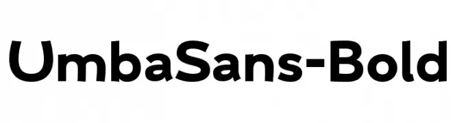
( Anita Jürgeleit - www.anitajuergeleit.de )
A bold, modern sans-serif font with clean, geometric lines.
![UmbaSans-Bold font caratteri gratis]() Scaricare 996 Downloads@WebFont
Scaricare 996 Downloads@WebFont -
![shera font caratteri gratis]() Scaricare 996 Downloads@WebFont
Scaricare 996 Downloads@WebFont -
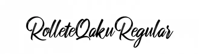
![RolleteQaku-Regular font caratteri gratis]() Scaricare 996 Downloads@WebFont
Scaricare 996 Downloads@WebFont -
( Fonts by Castcraft Software - OPTI Fonts Archive - opti.netii.net - Personal-use only. For commercial use please contact owner. )
A bold, rounded font with a playful yet strong appearance.
![RockyBlimpOpti font caratteri gratis]() Scaricare 996 Downloads@WebFont
Scaricare 996 Downloads@WebFont -
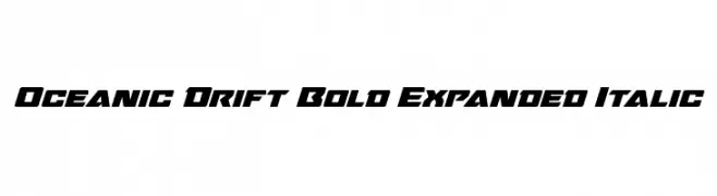
( Fonts by Daniel Zadorozny - www.iconian.com )
A bold, expanded, and italic font with a dynamic, modern style.
![Oceanic Drift Bold Expanded Italic font caratteri gratis]() Scaricare 996 Downloads@WebFont
Scaricare 996 Downloads@WebFont -
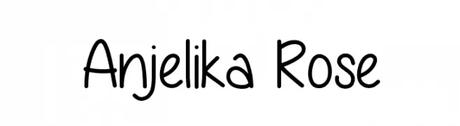
( Fonts by Vanessa Bays - bythebutterfly.com )
A playful, handwritten font with a casual and friendly style.
![Anjelika Rose font caratteri gratis]() Scaricare 996 Downloads@WebFont
Scaricare 996 Downloads@WebFont -
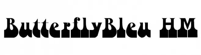
Caratteri di PsychedelicType. For commercial use please contact the owner.
![ButterflyBleu HM font caratteri gratis]() Scaricare 996 Downloads@WebFont
Scaricare 996 Downloads@WebFont -
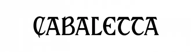
( Fonts by Harold Lohner - www.haroldsfonts.com )
A bold, dynamic font with a medieval flair and artistic curves.
![Cabaletta font caratteri gratis]() Scaricare 996 Downloads@WebFont
Scaricare 996 Downloads@WebFont -
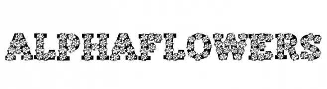
![AlphaFlowers font caratteri gratis]() Scaricare 996 Downloads@WebFont
Scaricare 996 Downloads@WebFont -
( Fonts by Miffies - mfs.jp.org - Personal-use only. For commercial use please contact owner. )
A bold, geometric font with a modern, industrial style.
![M23_HYDRANT SPECIAL font caratteri gratis]() Scaricare 996 Downloads@WebFont
Scaricare 996 Downloads@WebFont -
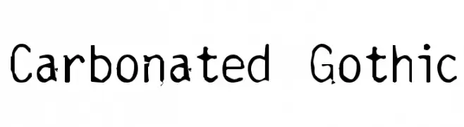
![Carbonated Gothic font caratteri gratis]() Scaricare 996 Downloads@WebFont
Scaricare 996 Downloads@WebFont -
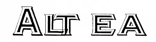
( Fonts by Paul Lloyd )
A bold, three-dimensional font with a modern yet retro flair.
![Altea font caratteri gratis]() Scaricare 996 Downloads@WebFont
Scaricare 996 Downloads@WebFont -
( Fonts by Graham Meade - GemFonts )
A bold, three-dimensional font with a striped, layered design.
![Early Tickertape font caratteri gratis]() Scaricare 996 Downloads@WebFont
Scaricare 996 Downloads@WebFont -
![Cretino font caratteri gratis]() Scaricare 996 Downloads@WebFont
Scaricare 996 Downloads@WebFont -
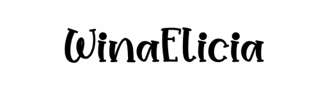
( Fonts by Nirmala Creative )
A bold, handwritten font with a playful and whimsical style.
![Wina Elicia font caratteri gratis]() Scaricare 995 Downloads@WebFont
Scaricare 995 Downloads@WebFont -
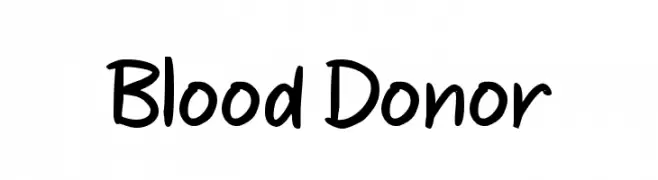
( Fonts by wep - Wahyu Eka Prasetya - Personal-use only. For commercial use please contact owner. )
A playful, handwritten font with rounded, consistent strokes.
![Blood Donor font caratteri gratis]() Scaricare 995 Downloads@WebFont
Scaricare 995 Downloads@WebFont -
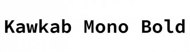
( Fonts by Abdullah Arif - Personal-use only. For commercial use please contact owner. )
A bold, monospaced font with uniform character width and consistent stroke thickness.
![Kawkab Mono Bold font caratteri gratis]() Scaricare 995 Downloads@WebFont
Scaricare 995 Downloads@WebFont -
( Copyright 2019 The Bellota Project Authors (https://github.com/kemie/Bellota-Font) )
A modern, bold font with smooth curves and balanced proportions.
![Bellota Text Bold font caratteri gratis]() Scaricare 995 Downloads@WebFont
Scaricare 995 Downloads@WebFont -
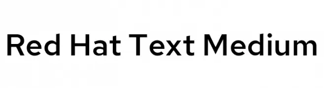
( Copyright 2019 The Red Hat Project Authors (https://github.com/RedHatOfficial/RedHatFont) )
A modern, geometric sans-serif font with balanced proportions and clear readability.
![Red Hat Text Medium font caratteri gratis]() Scaricare 995 Downloads@WebFont
Scaricare 995 Downloads@WebFont -
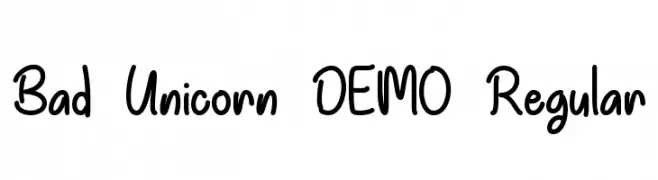
( Misti's Fonts - mistifonts.com/ )
A playful, handwritten font with a casual and friendly style.
![Bad Unicorn DEMO Regular font caratteri gratis]() Scaricare 995 Downloads@WebFont
Scaricare 995 Downloads@WebFont -
( Billy Argel - billyargel.com/ )
A flowing, cursive script with elegant, sweeping strokes and a romantic feel.
![Beautiful Lovers Personal Use font caratteri gratis]() Scaricare 995 Downloads@WebFont
Scaricare 995 Downloads@WebFont -
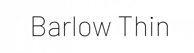
( Copyright 2017 The Barlow Project Authors (https://github.com/jpt/barlow) )
A thin, modern sans-serif font with a clean and minimalist design.
![Barlow Thin font caratteri gratis]() Scaricare 995 Downloads@WebFont
Scaricare 995 Downloads@WebFont -
![DK Liquid Embrace font caratteri gratis]() Scaricare 995 Downloads@WebFont
Scaricare 995 Downloads@WebFont -
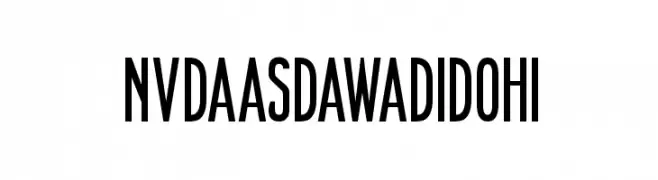
![NVDAASDAWADIDOHI font caratteri gratis]() Scaricare 995 Downloads@WebFont
Scaricare 995 Downloads@WebFont -
( Copyright (c) 2012, Brian J. Bonislawsky DBA Astigmatic (AOETI) (astigma@astigmatic.com), with Reserved Font Names "Romanesco" )
A dynamic script font with elegant calligraphic influences and dramatic flourishes.
![Romanesco font caratteri gratis]() Scaricare 995 Downloads@WebFont
Scaricare 995 Downloads@WebFont -
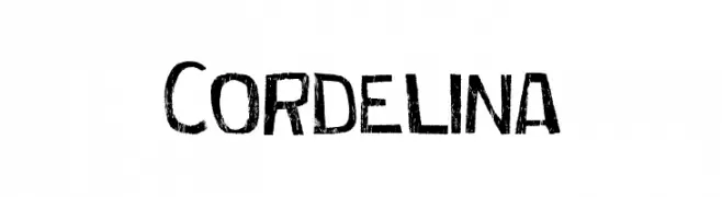
![Cordelina font caratteri gratis]() Scaricare 995 Downloads@WebFont
Scaricare 995 Downloads@WebFont -
( Fonts by Graham Meade - GemFonts )
A sleek, modern font with elongated, thin letterforms and a condensed appearance.
![Labtop Thin font caratteri gratis]() Scaricare 995 Downloads@WebFont
Scaricare 995 Downloads@WebFont -
( Fonts by Kong Font )
A bold, geometric font with sharp angles and a strong, modern presence.
![Ice Land font caratteri gratis]() Scaricare 994 Downloads@WebFont
Scaricare 994 Downloads@WebFont -
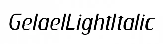
( Fonts by Mocha Frappuccino - Personal-use only. For commercial use please contact owner. )
A sleek, modern italic font with smooth, light strokes and excellent readability.
![GelaelLightItalic font caratteri gratis]() Scaricare 994 Downloads@WebFont
Scaricare 994 Downloads@WebFont -
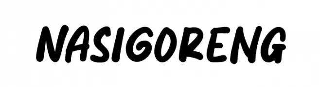
( Fonts by Mozatype )
A bold, dynamic script font with smooth, flowing strokes and medium contrast.
![Nasi Goreng font caratteri gratis]() Scaricare 994 Downloads@WebFont
Scaricare 994 Downloads@WebFont


Quali sono i font più popolari adesso?
Poppins, Roboto, Montserrat, Open Sans e Lato sono molto usati per le forme pulite e l'ampia applicabilità — dall'identità di marca alle landing page e ai poster.
Quali font si usano spesso nei loghi?
Le sans serif geometriche (es. Poppins, famiglie in stile Gotham) sono scelte comuni per un branding pulito e scalabile. Per un tocco personale restano valide script e stili manoscritti. Abbina un display deciso per i titoli a un corpo testo neutro per riconoscibilità ed equilibrio.
Ogni quanto si aggiorna la lista?
Con regolarità, in base ai download e all'attività reale. Torna spesso per scoprire in anticipo le nuove preferite.
💡 Consiglio: aggiungi ai preferiti — le tendenze cambiano in fretta e i font top di oggi possono ispirare il rebranding di domani.