Benvenuto nelle Font Più Popolari — dove popolarità e qualità si incontrano. Qui trovi i font più scaricati e usati dell'anno. Se cerchi scelte sicure per logo, web o social, inizia da qui.
Ogni font top si distingue per equilibrio, leggibilità e versatilità. Troverai sans serif moderne, script eleganti, serif vintage e display minimalisti.
-
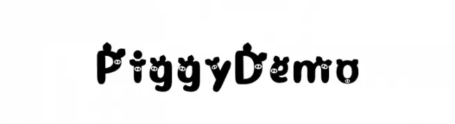
( Fonts by Toko Laris Djaja )
A playful, pig-themed decorative font with bold, rounded characters.
 Scaricare 243 Downloads@WebFont
 -
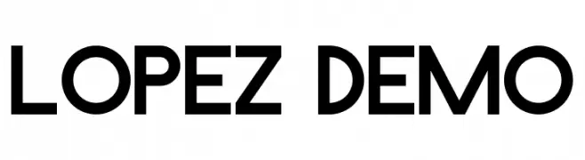
( Fonts by Noah Type - noahtype.com - Personal-use only. For commercial use please contact owner. )
A bold, geometric sans-serif font with a modern and minimalistic design.
![Lopez Demo font caratteri gratis]() Scaricare 243 Downloads@WebFont
Scaricare 243 Downloads@WebFont -
( Fonts by Pablo Impallari, Andres Torresi, & Cristiano Sobral - Personal-use only. For commercial use please contact owner. )
A modern, semi-bold sans-serif font with clean lines and excellent readability.
![Plata Sans SemiBold font caratteri gratis]() Scaricare 243 Downloads@WebFont
Scaricare 243 Downloads@WebFont -
( Fonts by Agathe M.Joyce - www.foundmyfont.com - Personal-use only. For commercial use please contact owner. )
An elegant and sophisticated script font with intricate loops and swirls.
![MidnightLegend font caratteri gratis]() Scaricare 243 Downloads@WebFont
Scaricare 243 Downloads@WebFont -
( Fonts by wep - Wahyu Eka Prasetya - Personal-use only. For commercial use please contact owner. )
A playful, hand-drawn font with bold, irregular strokes.
![Semongko font caratteri gratis]() Scaricare 243 Downloads@WebFont
Scaricare 243 Downloads@WebFont -
-
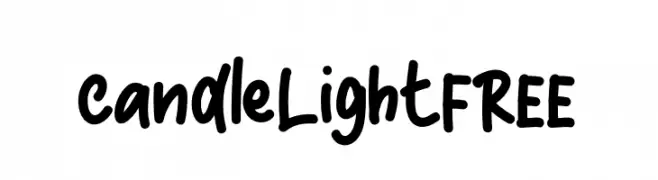
( Fonts by InspiraType )
A bold, playful handwritten font with rounded edges and a casual style.
![CandleLightFREE font caratteri gratis]() Scaricare 243 Downloads@WebFont
Scaricare 243 Downloads@WebFont -
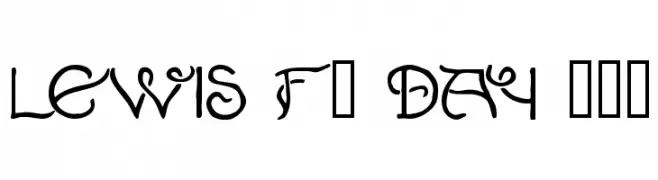
( Fonts by Klaus Johansen - www.listemageren.dK )
An intricate and decorative font with historical flair, featuring elaborate swirls and flourishes.
![Lewis F. Day 191 font caratteri gratis]() Scaricare 243 Downloads@WebFont
Scaricare 243 Downloads@WebFont -
![VI Cam Chuong Hoa font caratteri gratis]() Scaricare 243 Downloads@WebFont
Scaricare 243 Downloads@WebFont -
![WALL PAINTING font caratteri gratis]() Scaricare 243 Downloads@WebFont
Scaricare 243 Downloads@WebFont -
![DemonCubicBlockFont Black font caratteri gratis]() Scaricare 243 Downloads@WebFont
Scaricare 243 Downloads@WebFont


Quali sono i font più popolari adesso?
Poppins, Roboto, Montserrat, Open Sans e Lato sono molto usati per le forme pulite e l'ampia applicabilità — dall'identità di marca alle landing page e ai poster.
Quali font si usano spesso nei loghi?
Le sans serif geometriche (es. Poppins, famiglie in stile Gotham) sono scelte comuni per un branding pulito e scalabile. Per un tocco personale restano valide script e stili manoscritti. Abbina un display deciso per i titoli a un corpo testo neutro per riconoscibilità ed equilibrio.
Ogni quanto si aggiorna la lista?
Con regolarità, in base ai download e all'attività reale. Torna spesso per scoprire in anticipo le nuove preferite.
💡 Consiglio: aggiungi ai preferiti — le tendenze cambiano in fretta e i font top di oggi possono ispirare il rebranding di domani.