Benvenuto nelle Font Più Popolari — dove popolarità e qualità si incontrano. Qui trovi i font più scaricati e usati dell'anno. Se cerchi scelte sicure per logo, web o social, inizia da qui.
Ogni font top si distingue per equilibrio, leggibilità e versatilità. Troverai sans serif moderne, script eleganti, serif vintage e display minimalisti.
-
( Fonts by allsuperfont.com - Personal-use only. For commercial use please contact owner. )
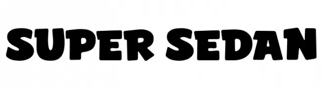
A bold, playful font with thick, rounded characters and a lively feel.
 Scaricare 242 Downloads@WebFont
 -
( Fonts by Daniel Zadorozny - www.iconian.com - Free for personal use )
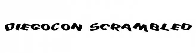
A bold, playful font with dynamic, tilted letters and thick, rounded strokes.
![DiegoCon Scrambled font caratteri gratis]() Scaricare 242 Downloads@WebFont
Scaricare 242 Downloads@WebFont -
( Fonts by www.fontmenu.com )
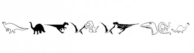
A decorative font featuring diverse dinosaur silhouettes for thematic designs.
![DinosoType font caratteri gratis]() Scaricare 242 Downloads@WebFont
Scaricare 242 Downloads@WebFont -
![KR Spring Me font caratteri gratis]() Scaricare 242 Downloads@WebFont
Scaricare 242 Downloads@WebFont -
( Fonts by www.peter-wiegel.de. Personal-use only. For commercial use please contact owner. )
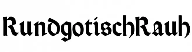
A bold Gothic font with sharp, angular lines and a medieval flair.
![RundgotischRauh font caratteri gratis]() Scaricare 242 Downloads@WebFont
Scaricare 242 Downloads@WebFont -
-
( Fonts by Mans Greback - www.mansgreback.com - Personal-use only. For commercial use please contact owner. )
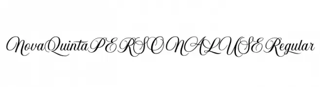
An elegant script font with flowing, ornate cursive letters.
![Nova Quinta PERSONAL USE Regular font caratteri gratis]() Scaricare 242 Downloads@WebFont
Scaricare 242 Downloads@WebFont -
( Brynda1231 Industries )
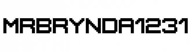
A pixelated, blocky font with a retro digital aesthetic.
![MrBrynda1231 font caratteri gratis]() Scaricare 242 Downloads@WebFont
Scaricare 242 Downloads@WebFont -
( Fonts by www.fontalicious.com )
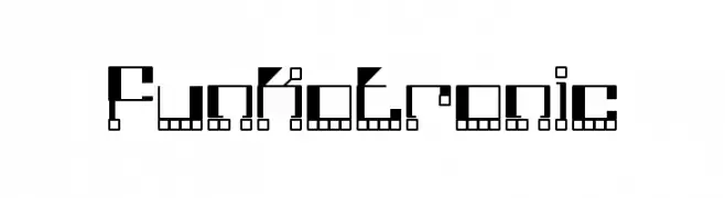
A futuristic, geometric font with a digital, pixelated aesthetic.
![Funkotronic font caratteri gratis]() Scaricare 242 Downloads@WebFont
Scaricare 242 Downloads@WebFont -
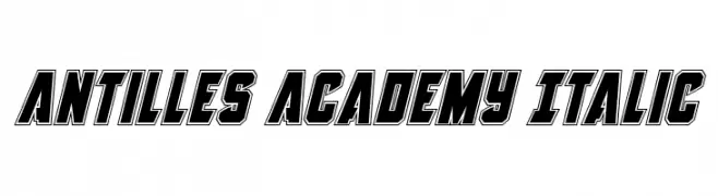
![Antilles Academy Italic font caratteri gratis]() Scaricare 242 Downloads@WebFont
Scaricare 242 Downloads@WebFont -
( Fonts by www.foamtrain.com )
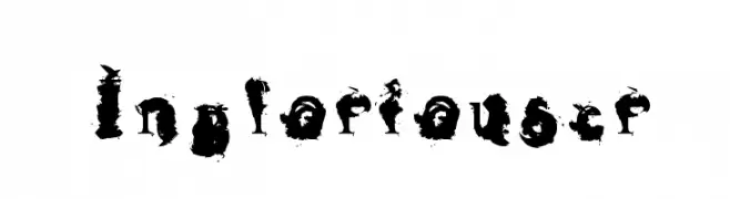
A bold, distressed font with an ink-splattered, grunge aesthetic.
![Ingloriouser font caratteri gratis]() Scaricare 242 Downloads@WebFont
Scaricare 242 Downloads@WebFont
Quali sono i font più popolari adesso?
Poppins, Roboto, Montserrat, Open Sans e Lato sono molto usati per le forme pulite e l'ampia applicabilità — dall'identità di marca alle landing page e ai poster.
Quali font si usano spesso nei loghi?
Le sans serif geometriche (es. Poppins, famiglie in stile Gotham) sono scelte comuni per un branding pulito e scalabile. Per un tocco personale restano valide script e stili manoscritti. Abbina un display deciso per i titoli a un corpo testo neutro per riconoscibilità ed equilibrio.
Ogni quanto si aggiorna la lista?
Con regolarità, in base ai download e all'attività reale. Torna spesso per scoprire in anticipo le nuove preferite.
💡 Consiglio: aggiungi ai preferiti — le tendenze cambiano in fretta e i font top di oggi possono ispirare il rebranding di domani.