Benvenuto nelle Font Più Popolari — dove popolarità e qualità si incontrano. Qui trovi i font più scaricati e usati dell'anno. Se cerchi scelte sicure per logo, web o social, inizia da qui.
Ogni font top si distingue per equilibrio, leggibilità e versatilità. Troverai sans serif moderne, script eleganti, serif vintage e display minimalisti.
-
( Fonts by a kmzero font foundry - www.zetafonts.com. Personal-use only. For commercial use please contact owner. )
A bold, geometric font with a modern, industrial aesthetic.
 Scaricare 237 Downloads@WebFont
 -
( Fonts by Manfred Klein. Free for private and charity use. Free for commercial with donation to organizations )
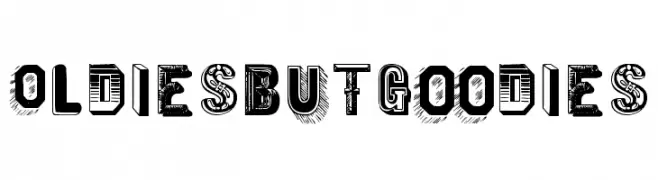
A decorative and eclectic font with unique, vintage-inspired letter designs.
![OldiesButGoodies font caratteri gratis]() Scaricare 237 Downloads@WebFont
Scaricare 237 Downloads@WebFont -
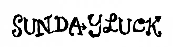
![Sundayluck font caratteri gratis]() Scaricare 237 Downloads@WebFont
Scaricare 237 Downloads@WebFont -
( Fonts by Apostrophic Lab )
A bold, italicized slab serif font with a shadowed outline for a 3D effect.
![Street Slab - Fortuna Italic font caratteri gratis]() Scaricare 237 Downloads@WebFont
Scaricare 237 Downloads@WebFont -
( IYBI - Radi Safi - ifyoubuildit.com.au/ )
A bold, geometric font with sharp angles and solid shapes.
![Happy font caratteri gratis]() Scaricare 237 Downloads@WebFont
Scaricare 237 Downloads@WebFont -
-
( Fonts by Manfred Klein. Free for private and charity use. Free for commercial with donation to organizations )
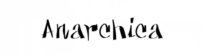
A bold, graffiti-inspired font with sharp, angular strokes and a dynamic, hand-drawn style.
![Anarchica font caratteri gratis]() Scaricare 237 Downloads@WebFont
Scaricare 237 Downloads@WebFont -
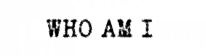
![WHO AM I font caratteri gratis]() Scaricare 237 Downloads@WebFont
Scaricare 237 Downloads@WebFont -
( Fonts by The Branded Quotes )
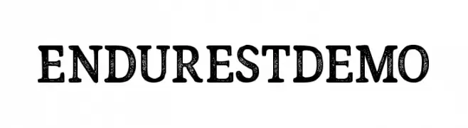
A bold, textured serif font with a vintage, distressed style.
![Endurest Demo font caratteri gratis]() Scaricare 237 Downloads@WebFont
Scaricare 237 Downloads@WebFont -
( Fonts by www.julliversum.de )
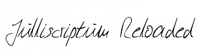
A fluid and elegant handwritten script font with a personal touch.
![Julliscriptum Reloaded font caratteri gratis]() Scaricare 237 Downloads@WebFont
Scaricare 237 Downloads@WebFont -
( Fonts by Mr Fisk - Mike Larsson - fontorama.net )
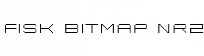
A pixelated, geometric font with a retro digital aesthetic.
![Fisk Bitmap Nr2 font caratteri gratis]() Scaricare 237 Downloads@WebFont
Scaricare 237 Downloads@WebFont


Quali sono i font più popolari adesso?
Poppins, Roboto, Montserrat, Open Sans e Lato sono molto usati per le forme pulite e l'ampia applicabilità — dall'identità di marca alle landing page e ai poster.
Quali font si usano spesso nei loghi?
Le sans serif geometriche (es. Poppins, famiglie in stile Gotham) sono scelte comuni per un branding pulito e scalabile. Per un tocco personale restano valide script e stili manoscritti. Abbina un display deciso per i titoli a un corpo testo neutro per riconoscibilità ed equilibrio.
Ogni quanto si aggiorna la lista?
Con regolarità, in base ai download e all'attività reale. Torna spesso per scoprire in anticipo le nuove preferite.
💡 Consiglio: aggiungi ai preferiti — le tendenze cambiano in fretta e i font top di oggi possono ispirare il rebranding di domani.