Benvenuto nelle Font Più Popolari — dove popolarità e qualità si incontrano. Qui trovi i font più scaricati e usati dell'anno. Se cerchi scelte sicure per logo, web o social, inizia da qui.
Ogni font top si distingue per equilibrio, leggibilità e versatilità. Troverai sans serif moderne, script eleganti, serif vintage e display minimalisti.
-
( Fonts by Skiiller Studio )
Bold, playful handwritten font.
 Scaricare 235 Downloads@WebFont
 -
( Emin Gokceoglu - be.net/emin )
A modern, rounded sans-serif font with smooth curves and a clean, approachable style.
![Kilikia font caratteri gratis]() Scaricare 235 Downloads@WebFont
Scaricare 235 Downloads@WebFont -
( Fonts by Televo - Personal-use only. For commercial use please contact owner. )
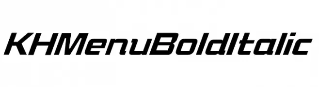
A bold, italicized font with a modern and dynamic style.
![KHMenu BoldItalic font caratteri gratis]() Scaricare 235 Downloads@WebFont
Scaricare 235 Downloads@WebFont -
( Rajendra Bitling - www.rbitling.com )
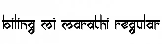
A bold, geometric font with cultural influences and a striking design.
![biling mi marathi Regular font caratteri gratis]() Scaricare 235 Downloads@WebFont
Scaricare 235 Downloads@WebFont -
( Free for a personal use. For a commercial use please visit www.kevinandamanda.com )
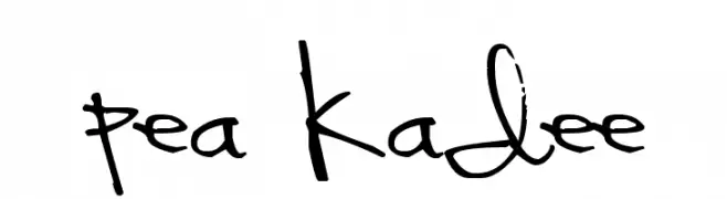
A playful, casual handwritten font with dynamic, flowing strokes.
![Pea Kadee font caratteri gratis]() Scaricare 235 Downloads@WebFont
Scaricare 235 Downloads@WebFont -
-
( Fonts by Galdino Otten Fonts )
A bold, italic, comic-style font with a playful and dynamic appearance.
![Comic Balloon New Bold Italic font caratteri gratis]() Scaricare 235 Downloads@WebFont
Scaricare 235 Downloads@WebFont -
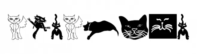
![CatCrypt font caratteri gratis]() Scaricare 235 Downloads@WebFont
Scaricare 235 Downloads@WebFont -
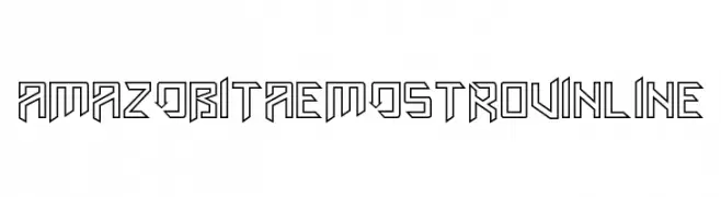
( Fonts by Amazingmax - Maxim Avdeev )
A bold, geometric font with sharp angles and a futuristic inline design.
![AmazObitaemOstrovInline font caratteri gratis]() Scaricare 235 Downloads@WebFont
Scaricare 235 Downloads@WebFont -
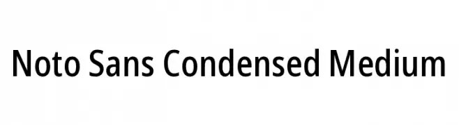
( Fonts by Google )
A modern, condensed sans-serif font with a clean and professional look.
![Noto Sans Condensed Medium font caratteri gratis]() Scaricare 235 Downloads@WebFont
Scaricare 235 Downloads@WebFont -
( Fonts by a Max Infeld - XEROGRAPHER FONTS - xerographer.blogspot.com . Personal-use only. For commercial use please contact owner. )
A playful, bold font with a shadow effect and hand-drawn style.
![HandShadow font caratteri gratis]() Scaricare 235 Downloads@WebFont
Scaricare 235 Downloads@WebFont


Quali sono i font più popolari adesso?
Poppins, Roboto, Montserrat, Open Sans e Lato sono molto usati per le forme pulite e l'ampia applicabilità — dall'identità di marca alle landing page e ai poster.
Quali font si usano spesso nei loghi?
Le sans serif geometriche (es. Poppins, famiglie in stile Gotham) sono scelte comuni per un branding pulito e scalabile. Per un tocco personale restano valide script e stili manoscritti. Abbina un display deciso per i titoli a un corpo testo neutro per riconoscibilità ed equilibrio.
Ogni quanto si aggiorna la lista?
Con regolarità, in base ai download e all'attività reale. Torna spesso per scoprire in anticipo le nuove preferite.
💡 Consiglio: aggiungi ai preferiti — le tendenze cambiano in fretta e i font top di oggi possono ispirare il rebranding di domani.