Benvenuto nelle Font Più Popolari — dove popolarità e qualità si incontrano. Qui trovi i font più scaricati e usati dell'anno. Se cerchi scelte sicure per logo, web o social, inizia da qui.
Ogni font top si distingue per equilibrio, leggibilità e versatilità. Troverai sans serif moderne, script eleganti, serif vintage e display minimalisti.
-
( Fonts by www.fontscafe.com )
A bold, retro-inspired font with a three-dimensional line effect.
 Scaricare 238 Downloads@WebFont
 -
( Fonts by Weape Design - Personal-use only. For commercial use please contact owner. )
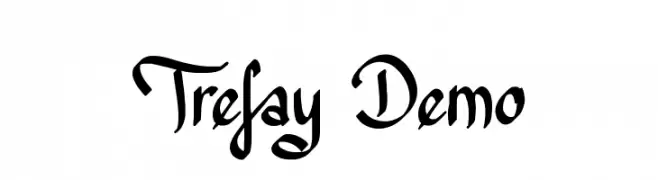
A cursive, handwritten-style font with elegant curves and moderate contrast.
![Kitabisa font caratteri gratis]() Scaricare 238 Downloads@WebFont
Scaricare 238 Downloads@WebFont -
![Trefay Demo font caratteri gratis]() Scaricare 238 Downloads@WebFont
Scaricare 238 Downloads@WebFont -
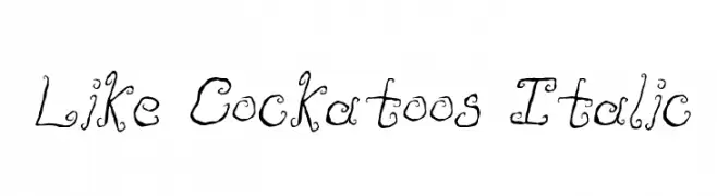
![Like Cockatoos Italic font caratteri gratis]() Scaricare 238 Downloads@WebFont
Scaricare 238 Downloads@WebFont -
( Copyright 2019 The Gelasio Project Authors (https://github.com/sorkintype/Gelasio) )
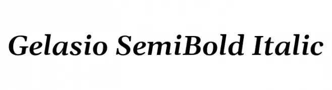
A semi-bold, italic serif font with elegant and readable characteristics.
![Gelasio SemiBold Italic font caratteri gratis]() Scaricare 238 Downloads@WebFont
Scaricare 238 Downloads@WebFont -
-
( Fonts by Abdullah Arif - Personal-use only. For commercial use please contact owner. )
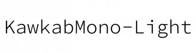
A clean, modern monospaced font ideal for coding and data presentation.
![KawkabMono-Light font caratteri gratis]() Scaricare 238 Downloads@WebFont
Scaricare 238 Downloads@WebFont -
( Fonts by ShyFonts )
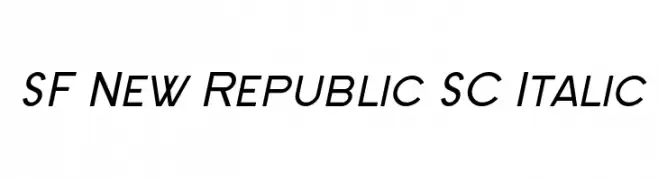
A modern, italicized font with a sleek and dynamic style.
![SF New Republic SC Italic font caratteri gratis]() Scaricare 238 Downloads@WebFont
Scaricare 238 Downloads@WebFont -
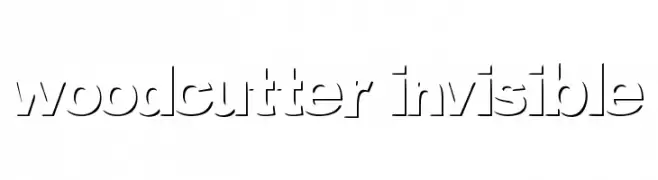
( Fonts by www.woodcutter.es - woodcutter Manero - Personal-use only. For commercial use please contact owner. )
A modern stencil font with geometric shapes and cut-out sections.
![woodcutter invisible font caratteri gratis]() Scaricare 238 Downloads@WebFont
Scaricare 238 Downloads@WebFont -
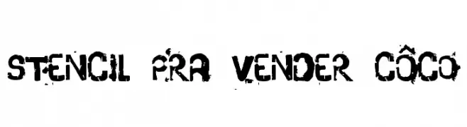
![stencil pra vender côco font caratteri gratis]() Scaricare 237 Downloads@WebFont
Scaricare 237 Downloads@WebFont -
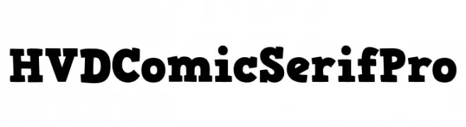
( Fonts by HVD Fonts )
A playful, bold serif font with a comic-like style.
![HVDComicSerifPro font caratteri gratis]() Scaricare 237 Downloads@WebFont
Scaricare 237 Downloads@WebFont

Quali sono i font più popolari adesso?
Poppins, Roboto, Montserrat, Open Sans e Lato sono molto usati per le forme pulite e l'ampia applicabilità — dall'identità di marca alle landing page e ai poster.
Quali font si usano spesso nei loghi?
Le sans serif geometriche (es. Poppins, famiglie in stile Gotham) sono scelte comuni per un branding pulito e scalabile. Per un tocco personale restano valide script e stili manoscritti. Abbina un display deciso per i titoli a un corpo testo neutro per riconoscibilità ed equilibrio.
Ogni quanto si aggiorna la lista?
Con regolarità, in base ai download e all'attività reale. Torna spesso per scoprire in anticipo le nuove preferite.
💡 Consiglio: aggiungi ai preferiti — le tendenze cambiano in fretta e i font top di oggi possono ispirare il rebranding di domani.