Benvenuto nelle Font Più Popolari — dove popolarità e qualità si incontrano. Qui trovi i font più scaricati e usati dell'anno. Se cerchi scelte sicure per logo, web o social, inizia da qui.
Ogni font top si distingue per equilibrio, leggibilità e versatilità. Troverai sans serif moderne, script eleganti, serif vintage e display minimalisti.
-
( Fonts by Levi Halmos )
A bold, angular serif font with a medieval flair.
 Scaricare 230 Downloads@WebFont
 -
( Haris Prawoto - graphicriver.net/user/selawe/portfolio )
A stylish cursive font with flowing, interconnected letterforms.
![Harris font caratteri gratis]() Scaricare 230 Downloads@WebFont
Scaricare 230 Downloads@WebFont -
( Fonts by Peter Wiegel - www.peter-wiegel.de )
An elegant, outlined font with tall, narrow characters and a modern aesthetic.
![XAyaxOutline font caratteri gratis]() Scaricare 230 Downloads@WebFont
Scaricare 230 Downloads@WebFont -
( Fonts by MadeType - Personal-use only. For commercial use please contact owner. )
A bold, rounded outline font with a playful and modern style.
![MADETommySoftOutline-Black font caratteri gratis]() Scaricare 230 Downloads@WebFont
Scaricare 230 Downloads@WebFont -
![KR Steve's Solo font caratteri gratis]() Scaricare 230 Downloads@WebFont
Scaricare 230 Downloads@WebFont -
-
( Fonts by Woodcutter Manero - http://www.woodcutter.es - Personal-use only. For commercial use please contact owner. )
A distressed, vintage-style font with a stencil-like appearance and sharp serifs.
![Borrachera Fina font caratteri gratis]() Scaricare 230 Downloads@WebFont
Scaricare 230 Downloads@WebFont -
( Fonts by Erik Studio - Personal-use only. For commercial use please contact owner. )
A cursive, handwritten font with elegant, flowing strokes.
![Tamara font caratteri gratis]() Scaricare 230 Downloads@WebFont
Scaricare 230 Downloads@WebFont -
( Fonts by Daniel Zadorozny - www.iconian.com - Free for personal use )
A bold, italicized font with a futuristic and dynamic style.
![Red Rocket Academy Italic font caratteri gratis]() Scaricare 230 Downloads@WebFont
Scaricare 230 Downloads@WebFont -
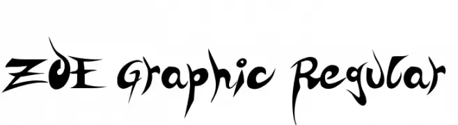
( Fonts by zoe fonts - www.comiczeichnerin.de - free for non-commercial and commercial purposes. )
A bold, edgy font with sharp, angular lines and dramatic curves.
![ZOE Graphic Regular font caratteri gratis]() Scaricare 230 Downloads@WebFont
Scaricare 230 Downloads@WebFont -
( Fonts by ONG Type )
Playful handwritten font with rounded edges.
![Different Sunset font caratteri gratis]() Scaricare 230 Downloads@WebFont
Scaricare 230 Downloads@WebFont


Quali sono i font più popolari adesso?
Poppins, Roboto, Montserrat, Open Sans e Lato sono molto usati per le forme pulite e l'ampia applicabilità — dall'identità di marca alle landing page e ai poster.
Quali font si usano spesso nei loghi?
Le sans serif geometriche (es. Poppins, famiglie in stile Gotham) sono scelte comuni per un branding pulito e scalabile. Per un tocco personale restano valide script e stili manoscritti. Abbina un display deciso per i titoli a un corpo testo neutro per riconoscibilità ed equilibrio.
Ogni quanto si aggiorna la lista?
Con regolarità, in base ai download e all'attività reale. Torna spesso per scoprire in anticipo le nuove preferite.
💡 Consiglio: aggiungi ai preferiti — le tendenze cambiano in fretta e i font top di oggi possono ispirare il rebranding di domani.