Benvenuto nelle Font Più Popolari — dove popolarità e qualità si incontrano. Qui trovi i font più scaricati e usati dell'anno. Se cerchi scelte sicure per logo, web o social, inizia da qui.
Ogni font top si distingue per equilibrio, leggibilità e versatilità. Troverai sans serif moderne, script eleganti, serif vintage e display minimalisti.
-
( Fonts by a Max Infeld - XEROGRAPHER FONTS - xerographer.blogspot.com . Personal-use only. For commercial use please contact owner. )
A bold, modern sans-serif font with clean lines and geometric shapes.
 Scaricare 229 Downloads@WebFont
 -
( Fonts by Al Ghul )
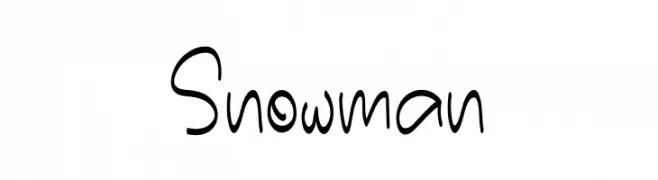
A playful handwritten font with smooth, rounded strokes and a whimsical style.
![Snowman font caratteri gratis]() Scaricare 229 Downloads@WebFont
Scaricare 229 Downloads@WebFont -
( Fonts by Graham Meade - GemFonts )
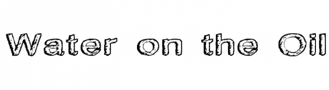
A textured, distressed font with a bold, rugged appearance.
![Water on the Oil font caratteri gratis]() Scaricare 229 Downloads@WebFont
Scaricare 229 Downloads@WebFont -
( Fonts by Khurasan )
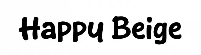
A playful, rounded font with bold strokes and smooth curves.
![Happy Beige font caratteri gratis]() Scaricare 229 Downloads@WebFont
Scaricare 229 Downloads@WebFont -
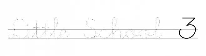
![Little School 3 font caratteri gratis]() Scaricare 229 Downloads@WebFont
Scaricare 229 Downloads@WebFont -
-
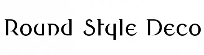
![Round Style Deco font caratteri gratis]() Scaricare 229 Downloads@WebFont
Scaricare 229 Downloads@WebFont -
( Fonts by Iconian Fonts )
A bold, jagged font with a spooky, horror-themed design.
![Creepy Crawlers Rotated font caratteri gratis]() Scaricare 229 Downloads@WebFont
Scaricare 229 Downloads@WebFont -
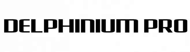
![Delphinium Pro font caratteri gratis]() Scaricare 229 Downloads@WebFont
Scaricare 229 Downloads@WebFont -
( Fonts by Daniel Zadorozny - www.iconian.com - Free for personal use )
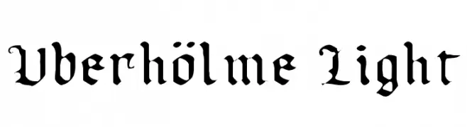
A gothic blackletter font with ornate, sharp-edged characters.
![Uberhölme Light font caratteri gratis]() Scaricare 229 Downloads@WebFont
Scaricare 229 Downloads@WebFont -
( Fonts by Noah Type - noahtype.com - Personal-use only. For commercial use please contact owner. )
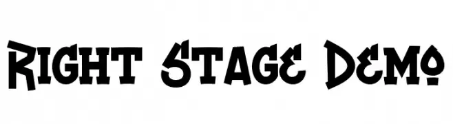
A bold, modern font with sharp angles and a strong presence.
![Right Stage Demo font caratteri gratis]() Scaricare 229 Downloads@WebFont
Scaricare 229 Downloads@WebFont

Quali sono i font più popolari adesso?
Poppins, Roboto, Montserrat, Open Sans e Lato sono molto usati per le forme pulite e l'ampia applicabilità — dall'identità di marca alle landing page e ai poster.
Quali font si usano spesso nei loghi?
Le sans serif geometriche (es. Poppins, famiglie in stile Gotham) sono scelte comuni per un branding pulito e scalabile. Per un tocco personale restano valide script e stili manoscritti. Abbina un display deciso per i titoli a un corpo testo neutro per riconoscibilità ed equilibrio.
Ogni quanto si aggiorna la lista?
Con regolarità, in base ai download e all'attività reale. Torna spesso per scoprire in anticipo le nuove preferite.
💡 Consiglio: aggiungi ai preferiti — le tendenze cambiano in fretta e i font top di oggi possono ispirare il rebranding di domani.