Benvenuto nelle Font Più Popolari — dove popolarità e qualità si incontrano. Qui trovi i font più scaricati e usati dell'anno. Se cerchi scelte sicure per logo, web o social, inizia da qui.
Ogni font top si distingue per equilibrio, leggibilità e versatilità. Troverai sans serif moderne, script eleganti, serif vintage e display minimalisti.
-
( Fonts by vilogsign )
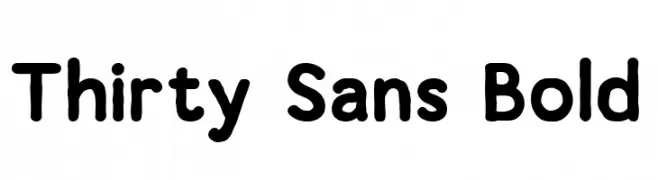
A bold, rounded sans-serif font with a friendly and approachable style.
 Scaricare 228 Downloads@WebFont
 -
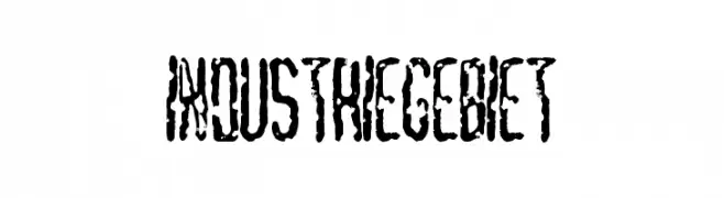
![Industriegebiet font caratteri gratis]() Scaricare 228 Downloads
Scaricare 228 Downloads -
( Fonts by arttotell )
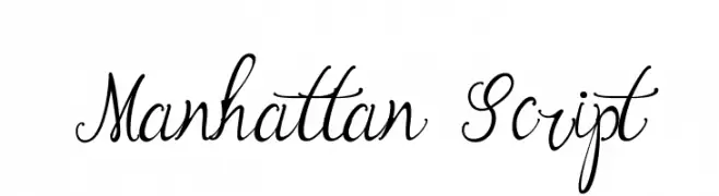
An elegant and flowing script font with intricate loops and swashes.
![Manhattan Script font caratteri gratis]() Scaricare 228 Downloads@WebFont
Scaricare 228 Downloads@WebFont -
( Free for personal use - www.pressgang-studios.com )
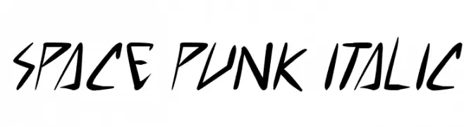
A dynamic, angular italic font with a futuristic and edgy style.
![space punk Italic font caratteri gratis]() Scaricare 228 Downloads@WebFont
Scaricare 228 Downloads@WebFont -
( 7NTypes - Situjuh Nazara - 7ntypes.com )
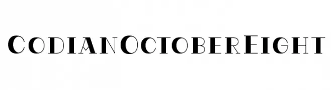
A modern serif font with high contrast and elegant strokes.
![CodianOctoberEight font caratteri gratis]() Scaricare 228 Downloads@WebFont
Scaricare 228 Downloads@WebFont -
-
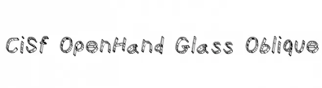
![CiSf OpenHand Glass Oblique font caratteri gratis]() Scaricare 228 Downloads@WebFont
Scaricare 228 Downloads@WebFont -
( Fonts by www.aenigmafonts.com )
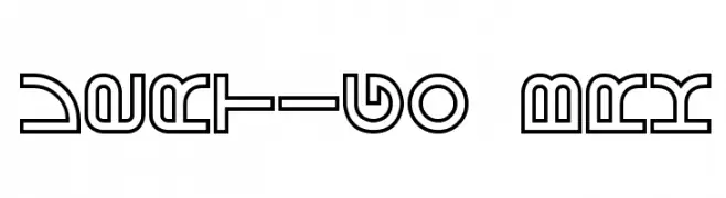
A futuristic, geometric font with bold outlines and intricate patterns.
![Vertigo BRK font caratteri gratis]() Scaricare 228 Downloads@WebFont
Scaricare 228 Downloads@WebFont -
( Fonts by Apostrophic Lab )
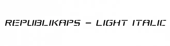
A sleek, modern, light italic font with geometric shapes and low contrast.
![Republikaps - Light Italic font caratteri gratis]() Scaricare 228 Downloads@WebFont
Scaricare 228 Downloads@WebFont -
( Fonts by www.junkohanhero.com - Personal-use only. For commercial use please contact owner. )
A hand-drawn, playful font with varying stroke widths and a dynamic appearance.
![Sister Morphine font caratteri gratis]() Scaricare 228 Downloads@WebFont
Scaricare 228 Downloads@WebFont -
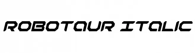
( Fonts by Daniel Zadorozny - www.iconian.com - Free for personal use )
A bold, italicized font with a futuristic and angular design.
![Robotaur Italic font caratteri gratis]() Scaricare 228 Downloads@WebFont
Scaricare 228 Downloads@WebFont

Quali sono i font più popolari adesso?
Poppins, Roboto, Montserrat, Open Sans e Lato sono molto usati per le forme pulite e l'ampia applicabilità — dall'identità di marca alle landing page e ai poster.
Quali font si usano spesso nei loghi?
Le sans serif geometriche (es. Poppins, famiglie in stile Gotham) sono scelte comuni per un branding pulito e scalabile. Per un tocco personale restano valide script e stili manoscritti. Abbina un display deciso per i titoli a un corpo testo neutro per riconoscibilità ed equilibrio.
Ogni quanto si aggiorna la lista?
Con regolarità, in base ai download e all'attività reale. Torna spesso per scoprire in anticipo le nuove preferite.
💡 Consiglio: aggiungi ai preferiti — le tendenze cambiano in fretta e i font top di oggi possono ispirare il rebranding di domani.