Benvenuto nelle Font Più Popolari — dove popolarità e qualità si incontrano. Qui trovi i font più scaricati e usati dell'anno. Se cerchi scelte sicure per logo, web o social, inizia da qui.
Ogni font top si distingue per equilibrio, leggibilità e versatilità. Troverai sans serif moderne, script eleganti, serif vintage e display minimalisti.
-
 Scaricare 227 Downloads@WebFont
 -
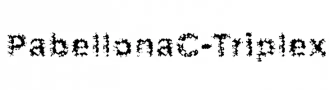
![PabellonaC-Triplex font caratteri gratis]() Scaricare 227 Downloads@WebFont
Scaricare 227 Downloads@WebFont -
Caratteri di ArashiGames. For commercial use please contact the owner.
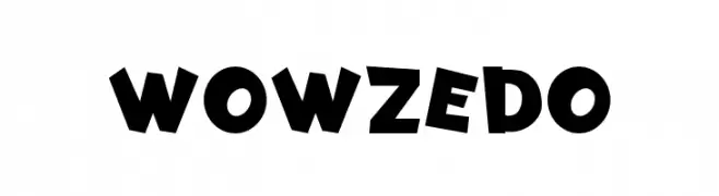
( A personally designed font that uses chunky lettering to create a fun and cool style that calls back to the wild and irreverent 90s style. )
A playful, bold font with irregular, dynamic letterforms.
![Wowzedo font caratteri gratis]() Scaricare 227 Downloads@WebFont
Scaricare 227 Downloads@WebFont -
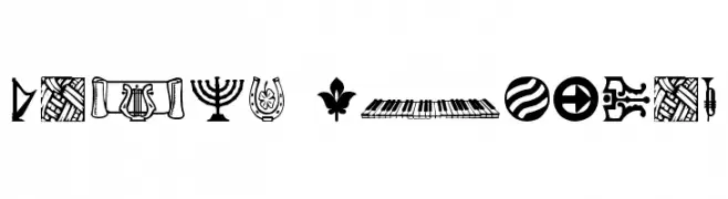
( Fonts by David Rakowski )
A diverse collection of bold, decorative pictograms and dingbats.
![DaOth Regular font caratteri gratis]() Scaricare 227 Downloads@WebFont
Scaricare 227 Downloads@WebFont -
( Fonts by Darrell Flood - Personal-use only. For commercial use please contact owner. )
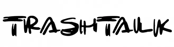
A bold, graffiti-inspired font with dynamic, brush-like strokes.
![Trashtalk font caratteri gratis]() Scaricare 227 Downloads@WebFont
Scaricare 227 Downloads@WebFont -
-
( Fonts by Khurasan )
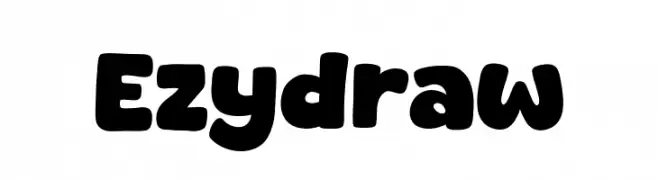
A bold, rounded font with a playful and approachable style.
![Ezydraw font caratteri gratis]() Scaricare 227 Downloads@WebFont
Scaricare 227 Downloads@WebFont -
( Fonts by Southype )
A retro digital display-inspired font with bold, blocky characters in rectangular frames.
![Data Cards St font caratteri gratis]() Scaricare 227 Downloads@WebFont
Scaricare 227 Downloads@WebFont -
( Fonts by Jonathan S. Harris - www.tattoowoo.com. Personal-use only. For commercial use please contact owner. )
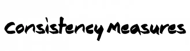
A bold, hand-painted style font with a dynamic and expressive appearance.
![Consistency Measures font caratteri gratis]() Scaricare 227 Downloads@WebFont
Scaricare 227 Downloads@WebFont -
( Fonts by Daniel Zadorozny - www.iconian.com - Free for personal use )
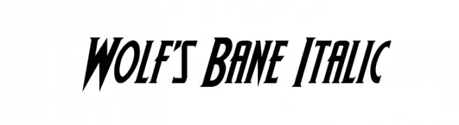
A bold, italic font with sharp angles and a dynamic style.
![Wolf's Bane Italic font caratteri gratis]() Scaricare 227 Downloads@WebFont
Scaricare 227 Downloads@WebFont -
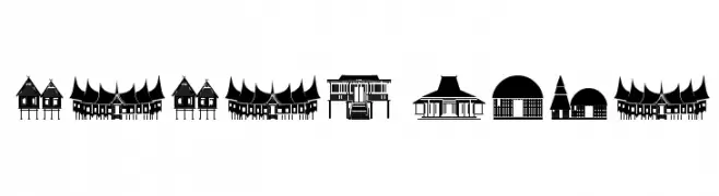
( dascatopia.daportfolio.com )
Architectural silhouette display font with building-themed glyphs.
![Papan Kita font caratteri gratis]() Scaricare 227 Downloads@WebFont
Scaricare 227 Downloads@WebFont

Quali sono i font più popolari adesso?
Poppins, Roboto, Montserrat, Open Sans e Lato sono molto usati per le forme pulite e l'ampia applicabilità — dall'identità di marca alle landing page e ai poster.
Quali font si usano spesso nei loghi?
Le sans serif geometriche (es. Poppins, famiglie in stile Gotham) sono scelte comuni per un branding pulito e scalabile. Per un tocco personale restano valide script e stili manoscritti. Abbina un display deciso per i titoli a un corpo testo neutro per riconoscibilità ed equilibrio.
Ogni quanto si aggiorna la lista?
Con regolarità, in base ai download e all'attività reale. Torna spesso per scoprire in anticipo le nuove preferite.
💡 Consiglio: aggiungi ai preferiti — le tendenze cambiano in fretta e i font top di oggi possono ispirare il rebranding di domani.