Benvenuto nelle Font Più Popolari — dove popolarità e qualità si incontrano. Qui trovi i font più scaricati e usati dell'anno. Se cerchi scelte sicure per logo, web o social, inizia da qui.
Ogni font top si distingue per equilibrio, leggibilità e versatilità. Troverai sans serif moderne, script eleganti, serif vintage e display minimalisti.
-
( Incinerator )
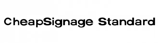
A bold, modern sans-serif font with a geometric structure.
 Scaricare 219 Downloads@WebFont
 -
( Fonts by Joseph Dawson - Personal-use only. For commercial use please contact owner. )
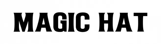
A bold, modern font with strong, impactful characters.
![Magic Hat font caratteri gratis]() Scaricare 219 Downloads@WebFont
Scaricare 219 Downloads@WebFont -
( Fonts by Iconian Fonts )
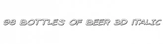
A bold, 3D italic font with outlined characters and a playful, dynamic style.
![98 Bottles of Beer 3D Italic font caratteri gratis]() Scaricare 219 Downloads@WebFont
Scaricare 219 Downloads@WebFont -
( Fonts by DumadiStyle - Toni Dzulham - Personal-use only. For commercial use please contact owner. )
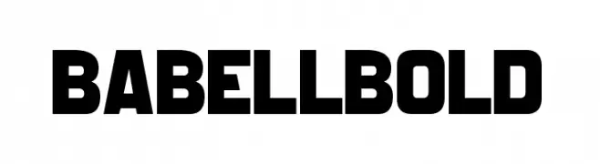
A bold, modern font with thick, uniform strokes and high contrast, ideal for headlines.
![Babell Bold font caratteri gratis]() Scaricare 219 Downloads@WebFont
Scaricare 219 Downloads@WebFont -
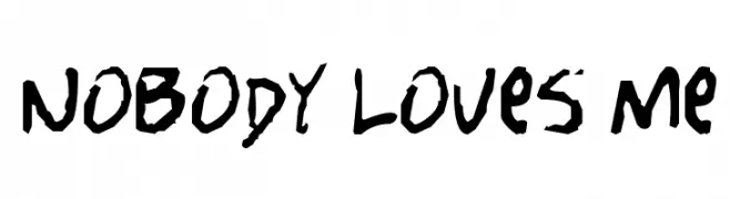
( Fonts by Spork Thug Typography - Josh Wilhelm - www.lifewithouttaffy.com/taffy/blog )
A bold, expressive handwritten font with a rough, textured style.
![Nobody Loves Me font caratteri gratis]() Scaricare 219 Downloads@WebFont
Scaricare 219 Downloads@WebFont -
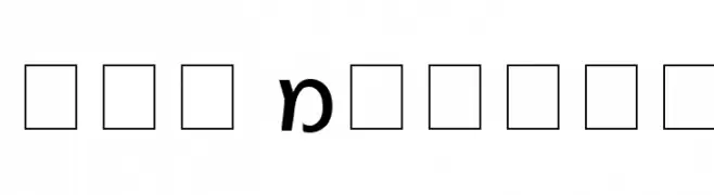
-
![Gad Normal font caratteri gratis]() Scaricare 219 Downloads
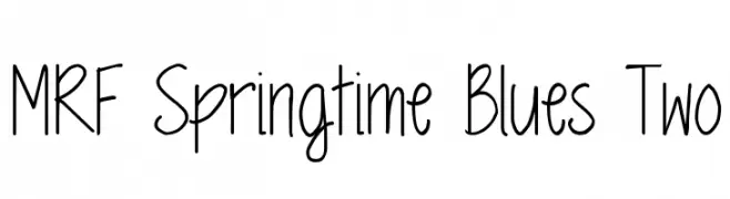
Scaricare 219 Downloads -
![MRF Springtime Blues Two font caratteri gratis]() Scaricare 219 Downloads@WebFont
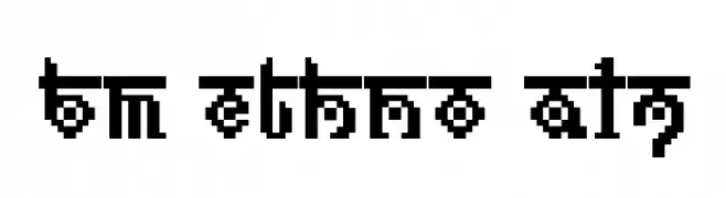
Scaricare 219 Downloads@WebFont -
![BM ethno A17 font caratteri gratis]() Scaricare 219 Downloads@WebFont
Scaricare 219 Downloads@WebFont -
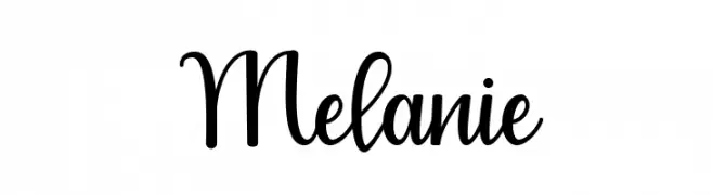
( Fonts by Cavalera Creative - Anjas Cov Cava Lera - Personal-use only. For commercial use please contact owner. )
A playful, elegant script font with a handwritten feel and whimsical curls.
![Melanie font caratteri gratis]() Scaricare 219 Downloads@WebFont
Scaricare 219 Downloads@WebFont -
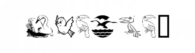
( Fonts by Graham Meade - GemFonts )
A dingbat font with diverse bird illustrations in various styles.
![BirdArt font caratteri gratis]() Scaricare 219 Downloads@WebFont
Scaricare 219 Downloads@WebFont
Quali sono i font più popolari adesso?
Poppins, Roboto, Montserrat, Open Sans e Lato sono molto usati per le forme pulite e l'ampia applicabilità — dall'identità di marca alle landing page e ai poster.
Quali font si usano spesso nei loghi?
Le sans serif geometriche (es. Poppins, famiglie in stile Gotham) sono scelte comuni per un branding pulito e scalabile. Per un tocco personale restano valide script e stili manoscritti. Abbina un display deciso per i titoli a un corpo testo neutro per riconoscibilità ed equilibrio.
Ogni quanto si aggiorna la lista?
Con regolarità, in base ai download e all'attività reale. Torna spesso per scoprire in anticipo le nuove preferite.
💡 Consiglio: aggiungi ai preferiti — le tendenze cambiano in fretta e i font top di oggi possono ispirare il rebranding di domani.