Benvenuto nelle Font Più Popolari — dove popolarità e qualità si incontrano. Qui trovi i font più scaricati e usati dell'anno. Se cerchi scelte sicure per logo, web o social, inizia da qui.
Ogni font top si distingue per equilibrio, leggibilità e versatilità. Troverai sans serif moderne, script eleganti, serif vintage e display minimalisti.
-
Caratteri di letterhanna. For commercial use please contact the owner.
( Free for personal use only. With only $13 You can purchase the basic desktop license: https://letterhanna.com/ )
A playful and whimsical font with smooth, rounded letterforms.
 Scaricare 217 Downloads@WebFont
 -
( Fonts by www.fontscafe.com )
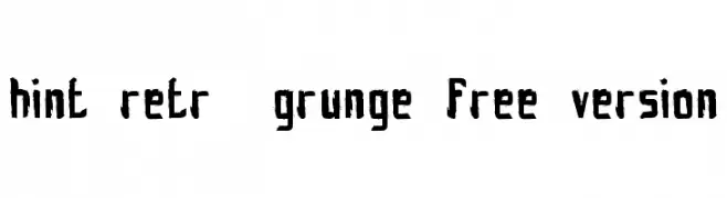
A rugged, distressed font with a bold, hand-drawn appearance.
![hint-retrò-grunge_free-version font caratteri gratis]() Scaricare 217 Downloads@WebFont
Scaricare 217 Downloads@WebFont -
( Fonts by www.hindson.com.au )
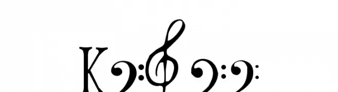
A decorative collection of musical clefs and symbols.
![Clefs font caratteri gratis]() Scaricare 217 Downloads@WebFont
Scaricare 217 Downloads@WebFont -
( Fonts by Tom Kolter - www.ghostsofbigfoot.com )
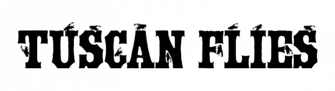
A bold, decorative font with unique fly motifs on each character.
![Tuscan Flies font caratteri gratis]() Scaricare 217 Downloads@WebFont
Scaricare 217 Downloads@WebFont -
![Kubic's Rube font caratteri gratis]() Scaricare 217 Downloads@WebFont
Scaricare 217 Downloads@WebFont -
-
( Fonts by Uddi Uddi )
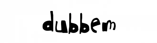
A playful, irregular font with a hand-drawn, artistic style.
![dubbem font caratteri gratis]() Scaricare 217 Downloads@WebFont
Scaricare 217 Downloads@WebFont -
( Craft Supply Co. - creativemarket.com/craftsupplyco )
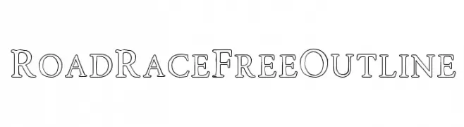
A bold, outlined serif font with a modern and elegant style.
![RoadRaceFree-Outline font caratteri gratis]() Scaricare 217 Downloads@WebFont
Scaricare 217 Downloads@WebFont -
( Fonts by Scratchones )
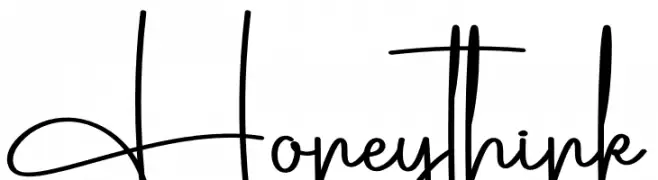
Playful handwritten font with a whimsical style.
![Honeythink font caratteri gratis]() Scaricare 217 Downloads@WebFont
Scaricare 217 Downloads@WebFont -
( Fonts by Daniel Zadorozny - www.iconian.com - Free for personal use )
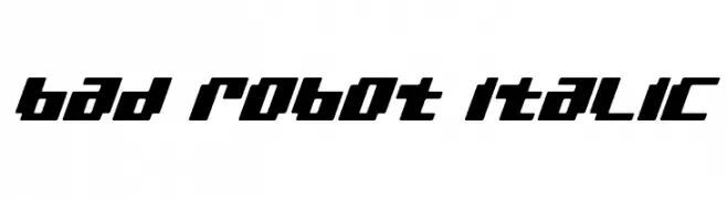
A bold, angular, and futuristic italic font with a mechanical aesthetic.
![bad robot italic font caratteri gratis]() Scaricare 217 Downloads@WebFont
Scaricare 217 Downloads@WebFont -
( Fonts by Woodcutter )
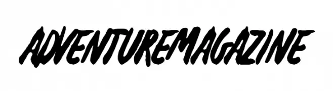
A bold, brush-style font with dynamic, hand-drawn strokes.
![Adventure Magazine font caratteri gratis]() Scaricare 217 Downloads@WebFont
Scaricare 217 Downloads@WebFont

Quali sono i font più popolari adesso?
Poppins, Roboto, Montserrat, Open Sans e Lato sono molto usati per le forme pulite e l'ampia applicabilità — dall'identità di marca alle landing page e ai poster.
Quali font si usano spesso nei loghi?
Le sans serif geometriche (es. Poppins, famiglie in stile Gotham) sono scelte comuni per un branding pulito e scalabile. Per un tocco personale restano valide script e stili manoscritti. Abbina un display deciso per i titoli a un corpo testo neutro per riconoscibilità ed equilibrio.
Ogni quanto si aggiorna la lista?
Con regolarità, in base ai download e all'attività reale. Torna spesso per scoprire in anticipo le nuove preferite.
💡 Consiglio: aggiungi ai preferiti — le tendenze cambiano in fretta e i font top di oggi possono ispirare il rebranding di domani.