Benvenuto nelle Font Più Popolari — dove popolarità e qualità si incontrano. Qui trovi i font più scaricati e usati dell'anno. Se cerchi scelte sicure per logo, web o social, inizia da qui.
Ogni font top si distingue per equilibrio, leggibilità e versatilità. Troverai sans serif moderne, script eleganti, serif vintage e display minimalisti.
-
 Scaricare 914 Downloads@WebFont
 -
( Fonts by Kong Font - https://fontkong.com/ - Personal-use only. For commercial use please contact owner. )
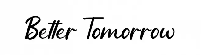
A lively, cursive script font with fluid connections and elegant curves.
![Better Tomorrow font caratteri gratis]() Scaricare 913 Downloads@WebFont
Scaricare 913 Downloads@WebFont -
( Fonts by Christian Robertson, Adam Twardoch, & Cristiano Sobral - Personal-use only. For commercial use please contact owner. )
A bold, modern sans-serif font with clean lines and balanced spacing.
![Bert Sans Bold font caratteri gratis]() Scaricare 913 Downloads@WebFont
Scaricare 913 Downloads@WebFont -
( Copyright 2007 The Ibarra Real Nova Project Authors (https://github.com/googlefonts/ibarrareal) )
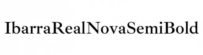
A classic serif font with a semi-bold weight, offering elegance and readability.
![Ibarra Real Nova SemiBold font caratteri gratis]() Scaricare 913 Downloads@WebFont
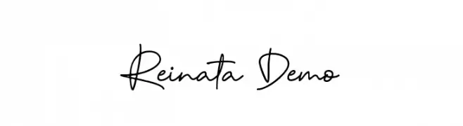
Scaricare 913 Downloads@WebFont -
![Reinata Demo font caratteri gratis]() Scaricare 913 Downloads@WebFont
Scaricare 913 Downloads@WebFont -
( Thor Christopher Arisland - www.tcarisland.com )
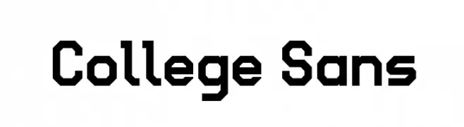
A bold, geometric font with a modern and industrial aesthetic.
![College Sans font caratteri gratis]() Scaricare 913 Downloads@WebFont
Scaricare 913 Downloads@WebFont -
Caratteri di spideraysfonts. For commercial use please contact the owner.
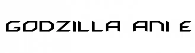
( GODZILLA ANIME )
A bold, angular font with a futuristic and mechanical design.
![GODZILLA ANIME font caratteri gratis]() Scaricare 913 Downloads@WebFont
Scaricare 913 Downloads@WebFont -
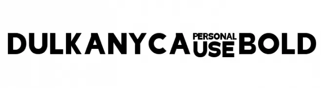
![Dulkanyca Bold font caratteri gratis]() Scaricare 913 Downloads@WebFont
Scaricare 913 Downloads@WebFont -
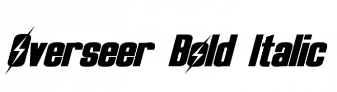
( Fonts by a Neale Davidson - www.pixelsagas.com. Personal-use only. For commercial use please contact owner. )
A bold, italicized font with a dynamic and edgy style, featuring a unique lightning bolt motif.
![Overseer Bold Italic font caratteri gratis]() Scaricare 913 Downloads@WebFont
Scaricare 913 Downloads@WebFont -
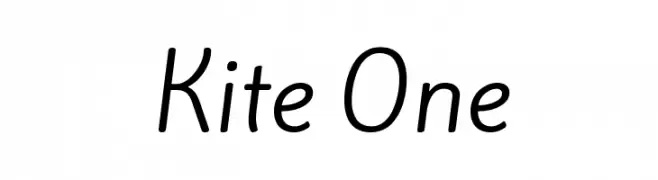
( Copyright (c) 2012, Eduardo Tunni (http://www.tipo.net.ar), with Reserved Font Name 'Kite' )
A modern, rounded sans-serif font with a clean and balanced design.
![Kite One font caratteri gratis]() Scaricare 913 Downloads@WebFont
Scaricare 913 Downloads@WebFont -
( Fonts by www.artill.de - Lukas Bischoff )
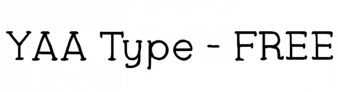
A playful and whimsical font with rounded, slightly irregular letterforms.
![YAA Type - FREE font caratteri gratis]() Scaricare 913 Downloads@WebFont
Scaricare 913 Downloads@WebFont -
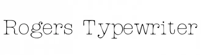
![Rogers Typewriter font caratteri gratis]() Scaricare 913 Downloads@WebFont
Scaricare 913 Downloads@WebFont -
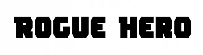
( Fonts by Daniel Zadorozny - www.iconian.com )
A bold, geometric font with strong, angular shapes and a modern-retro vibe.
![Rogue Hero font caratteri gratis]() Scaricare 913 Downloads@WebFont
Scaricare 913 Downloads@WebFont -
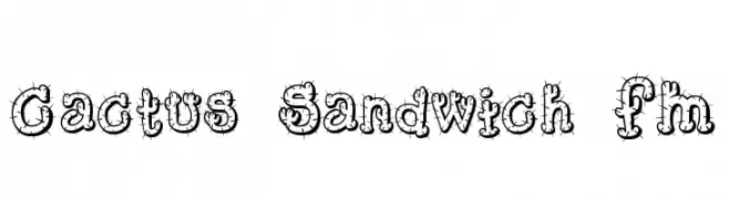
![Cactus Sandwich FM font caratteri gratis]() Scaricare 913 Downloads@WebFont
Scaricare 913 Downloads@WebFont -
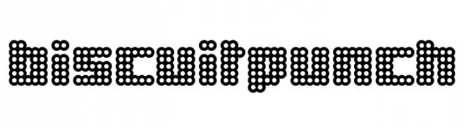
![BiscuitPunch font caratteri gratis]() Scaricare 913 Downloads@WebFont
Scaricare 913 Downloads@WebFont -
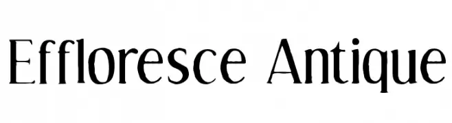
![Effloresce Antique font caratteri gratis]() Scaricare 913 Downloads@WebFont
Scaricare 913 Downloads@WebFont -
( Paul Grosse - grosse.is-a-geek.com/paul/ttf01.htm )
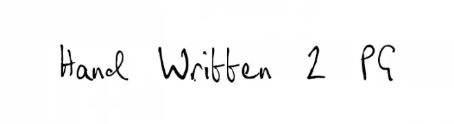
A casual, handwritten font with a natural, flowing style.
![Hand Written 2 PG font caratteri gratis]() Scaricare 912 Downloads@WebFont
Scaricare 912 Downloads@WebFont -
( Fonts by windestrian - https://crmrkt.com/OJQvwk - Personal-use only. For commercial use please contact owner. )
A playful, bold script font with a casual, handwritten style.
![Sweaty font caratteri gratis]() Scaricare 912 Downloads@WebFont
Scaricare 912 Downloads@WebFont -
( Copyright (c) 2016 The Muli Project Authors (contact@sansoxygen.com) )
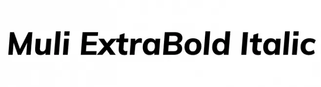
A modern, extra bold sans-serif typeface with italic styling.
![Muli ExtraBold Italic font caratteri gratis]() Scaricare 912 Downloads@WebFont
Scaricare 912 Downloads@WebFont -
( Copyright (c) 2015, Cadson Demak (info@cadsondemak.com) )
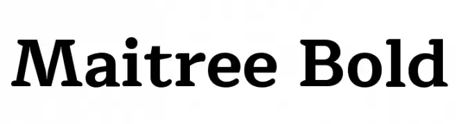
A bold serif font with strong, clear letterforms and a modern classic appeal.
![Maitree Bold font caratteri gratis]() Scaricare 912 Downloads@WebFont
Scaricare 912 Downloads@WebFont -
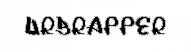
![UrbRapper font caratteri gratis]() Scaricare 912 Downloads@WebFont
Scaricare 912 Downloads@WebFont -
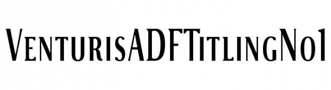
( Fonts by Arkandis Digital Foundry )
A classic serif font with elegant, refined letterforms and sharp serifs.
![VenturisADFTitlingNo1 font caratteri gratis]() Scaricare 912 Downloads@WebFont
Scaricare 912 Downloads@WebFont -
( Fonts by www.blambot.com )
A bold, playful font with a comic-like style and dynamic slant.
![CrashLanding BB font caratteri gratis]() Scaricare 912 Downloads@WebFont
Scaricare 912 Downloads@WebFont -
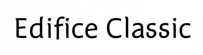
( Fonts by www.thebend.be - Dimitri Castrique )
A modern, rounded sans-serif font with a clean and approachable style.
![Edifice Classic font caratteri gratis]() Scaricare 912 Downloads@WebFont
Scaricare 912 Downloads@WebFont -
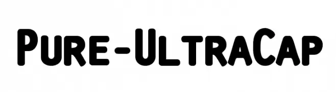
![Pure-UltraCap font caratteri gratis]() Scaricare 912 Downloads@WebFont
Scaricare 912 Downloads@WebFont -
( Fonts by Nick Curtis - www.nicksfonts.com )
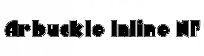
A bold, geometric font with inline detailing for a striking visual impact.
![Arbuckle Inline NF font caratteri gratis]() Scaricare 912 Downloads@WebFont
Scaricare 912 Downloads@WebFont -
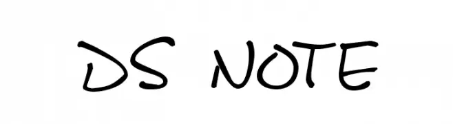
![DS Note font caratteri gratis]() Scaricare 912 Downloads@WebFont
Scaricare 912 Downloads@WebFont -
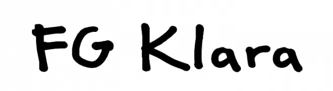
![FG Klara font caratteri gratis]() Scaricare 912 Downloads@WebFont
Scaricare 912 Downloads@WebFont -
![Thalia Normal font caratteri gratis]() Scaricare 912 Downloads
Scaricare 912 Downloads -
( Fonts by Paul Miller )
An elegant italic font with smooth curves and dynamic strokes, reminiscent of calligraphic handwriting.
![Balgruf Italic font caratteri gratis]() Scaricare 911 Downloads@WebFont
Scaricare 911 Downloads@WebFont -
( Fonts by Vladimir Nikolic - https://www.creativefabrica.com/product/educated-deers/ref/144265/ - Personal-use only. For commercial use please contact owner. )
A digital, futuristic font with angular, geometric shapes.
![Technology Regular font caratteri gratis]() Scaricare 911 Downloads@WebFont
Scaricare 911 Downloads@WebFont -
( Fonts by Barland )
A decorative script font with elegant swashes and high contrast strokes.
![KaiyilaScriptDEMO font caratteri gratis]() Scaricare 911 Downloads@WebFont
Scaricare 911 Downloads@WebFont -
( Free for personal use - www.iagency1980.com )
A bold, geometric typeface with strong, uniform strokes and minimal contrast.
![JECR Font Bold font caratteri gratis]() Scaricare 911 Downloads@WebFont
Scaricare 911 Downloads@WebFont -
( Copyright 2010 The Cuprum Project Authors (lemonad@jovanny.ru), with Reserved Font Name "Cuprum". )
A modern, bold, and italicized font with medium contrast and a sleek appearance.
![Cuprum Bold Italic font caratteri gratis]() Scaricare 911 Downloads@WebFont
Scaricare 911 Downloads@WebFont -
( Font by Jayvee D. Enaguas - grandchaos9000.deviantart.com )
A bold, pixelated font with a retro, digital style.
![Kemco Pixel Bold font caratteri gratis]() Scaricare 911 Downloads@WebFont
Scaricare 911 Downloads@WebFont


Quali sono i font più popolari adesso?
Poppins, Roboto, Montserrat, Open Sans e Lato sono molto usati per le forme pulite e l'ampia applicabilità — dall'identità di marca alle landing page e ai poster.
Quali font si usano spesso nei loghi?
Le sans serif geometriche (es. Poppins, famiglie in stile Gotham) sono scelte comuni per un branding pulito e scalabile. Per un tocco personale restano valide script e stili manoscritti. Abbina un display deciso per i titoli a un corpo testo neutro per riconoscibilità ed equilibrio.
Ogni quanto si aggiorna la lista?
Con regolarità, in base ai download e all'attività reale. Torna spesso per scoprire in anticipo le nuove preferite.
💡 Consiglio: aggiungi ai preferiti — le tendenze cambiano in fretta e i font top di oggi possono ispirare il rebranding di domani.