Benvenuto nelle Font Più Popolari — dove popolarità e qualità si incontrano. Qui trovi i font più scaricati e usati dell'anno. Se cerchi scelte sicure per logo, web o social, inizia da qui.
Ogni font top si distingue per equilibrio, leggibilità e versatilità. Troverai sans serif moderne, script eleganti, serif vintage e display minimalisti.
-
( Fonts by Manfred Klein. Free for private and charity use. Free for commercial with donation to organizations )
A playful, informal handwritten font with irregular strokes.
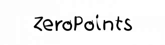 Scaricare 217 Downloads@WebFont
 -
Caratteri di spideraysfonts. For commercial use please contact the owner.
( Font by spideraysfonts. For commercial use please contact the owner. )
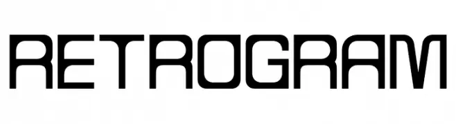
A retro-futuristic font with geometric shapes and a clean, minimalistic design.
![RETROGRAM font caratteri gratis]() Scaricare 217 Downloads@WebFont
Scaricare 217 Downloads@WebFont -
( Fonts by Vidkä© Foundry )
A decorative font with intricate wood grain patterns, ideal for artistic and nature-themed projects.
![Vidka Woodcraft font caratteri gratis]() Scaricare 217 Downloads@WebFont
Scaricare 217 Downloads@WebFont -
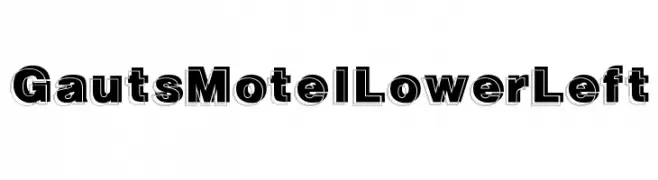
( Fonts by Daniel Gauthier )
Bold, three-dimensional font with a modern and playful style.
![GautsMotelLowerLeft font caratteri gratis]() Scaricare 217 Downloads@WebFont
Scaricare 217 Downloads@WebFont -
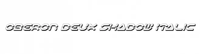
![Oberon Deux Shadow Italic font caratteri gratis]() Scaricare 217 Downloads@WebFont
Scaricare 217 Downloads@WebFont -
-
![Oberon Deux Shadow font caratteri gratis]() Scaricare 217 Downloads@WebFont
Scaricare 217 Downloads@WebFont -
( Fonts by JSH creates )
A bold, brush-style font with dynamic, expressive strokes.
![Smokey Kingston font caratteri gratis]() Scaricare 217 Downloads@WebFont
Scaricare 217 Downloads@WebFont -
( J D )
A pixelated, retro-style font with a digital, grid-like appearance.
![Code Regular font caratteri gratis]() Scaricare 217 Downloads@WebFont
Scaricare 217 Downloads@WebFont -
( Fonts by Bilqis Studio )
A bold, playful font with a cartoonish style and strong presence.
![The Warrior font caratteri gratis]() Scaricare 217 Downloads@WebFont
Scaricare 217 Downloads@WebFont -
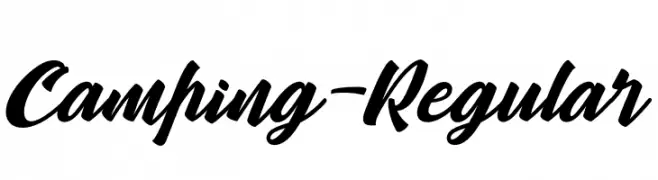
( Fonts by Zulfikar Ali - Personal-use only. For commercial use please contact owner. )
A bold, dynamic script font with a handwritten feel.
![Camping-Regular font caratteri gratis]() Scaricare 217 Downloads@WebFont
Scaricare 217 Downloads@WebFont

Quali sono i font più popolari adesso?
Poppins, Roboto, Montserrat, Open Sans e Lato sono molto usati per le forme pulite e l'ampia applicabilità — dall'identità di marca alle landing page e ai poster.
Quali font si usano spesso nei loghi?
Le sans serif geometriche (es. Poppins, famiglie in stile Gotham) sono scelte comuni per un branding pulito e scalabile. Per un tocco personale restano valide script e stili manoscritti. Abbina un display deciso per i titoli a un corpo testo neutro per riconoscibilità ed equilibrio.
Ogni quanto si aggiorna la lista?
Con regolarità, in base ai download e all'attività reale. Torna spesso per scoprire in anticipo le nuove preferite.
💡 Consiglio: aggiungi ai preferiti — le tendenze cambiano in fretta e i font top di oggi possono ispirare il rebranding di domani.