Benvenuto nelle Font Più Popolari — dove popolarità e qualità si incontrano. Qui trovi i font più scaricati e usati dell'anno. Se cerchi scelte sicure per logo, web o social, inizia da qui.
Ogni font top si distingue per equilibrio, leggibilità e versatilità. Troverai sans serif moderne, script eleganti, serif vintage e display minimalisti.
-
 Scaricare 8085 Downloads@WebFont
 -
( Fonts by Debut Studio - Ari Fadli - creativemarket.com/debutstudio - Personal-use only. For commercial use please contact owner. )
A bold, condensed font with high contrast and elongated characters.
![BLASTIMOSANS font caratteri gratis]() Scaricare 8081 Downloads@WebFont
Scaricare 8081 Downloads@WebFont -
( Copyright (c) 2010, Matt McInerney (matt@pixelspread.com) )
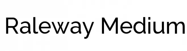
A modern, geometric sans-serif font with clean lines and balanced proportions.
![Raleway Medium font caratteri gratis]() Scaricare 8079 Downloads@WebFont
Scaricare 8079 Downloads@WebFont -
( Copyright (c) 2011 by LatinoType Limitada (luciano@latinotype.com) )
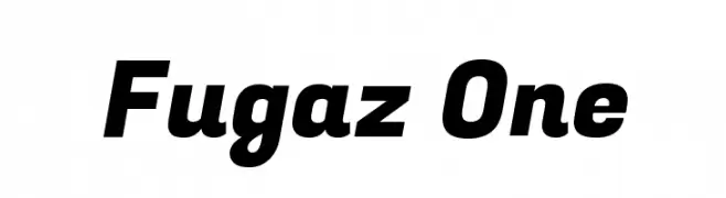
A bold, dynamic font with a modern and energetic style.
![Fugaz One font caratteri gratis]() Scaricare 8076 Downloads@WebFont
Scaricare 8076 Downloads@WebFont -
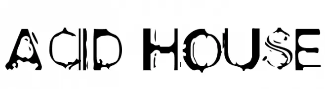
![Acid House font caratteri gratis]() Scaricare 8076 Downloads@WebFont
Scaricare 8076 Downloads@WebFont -
( Fonts by Christophe Feray - www.wcfonts.com )
An artistic font with ink splatter-like characters, offering a bold and dynamic appearance.
![WC Rhesus A Bta font caratteri gratis]() Scaricare 8070 Downloads@WebFont
Scaricare 8070 Downloads@WebFont -
Caratteri di AlejoBergmann. For commercial use please contact the owner.
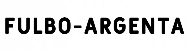
( Fulbo Font )
A bold, rounded font with a modern and approachable style.
![Fulbo-Argenta font caratteri gratis]() Scaricare 8068 Downloads@WebFont
Scaricare 8068 Downloads@WebFont -
( Fonts by a kmzero font foundry - www.zetafonts.com. Personal-use only. For commercial use please contact owner. )
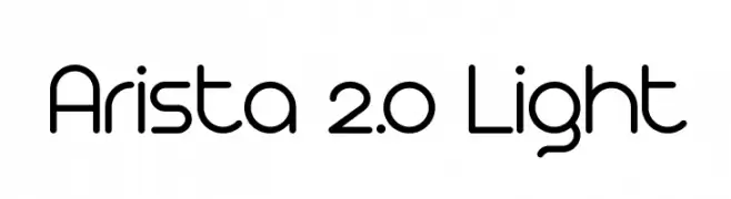
A modern, rounded sans-serif font with a minimalist design.
![Arista 2.0 Light font caratteri gratis]() Scaricare 8068 Downloads@WebFont
Scaricare 8068 Downloads@WebFont -
( Fonts by Nick Curtis - www.nicksfonts.com )
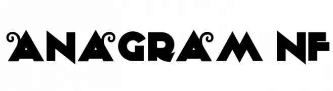
A bold, geometric font with angular and circular elements, perfect for striking designs.
![Anagram NF font caratteri gratis]() Scaricare 8065 Downloads@WebFont
Scaricare 8065 Downloads@WebFont -
( Fonts by Francis John - Francis Studio - Personal-use only. For commercial use please contact owner. )
A flowing, cursive script font with elegant loops and swashes.
![Buttercup Sample font caratteri gratis]() Scaricare 8063 Downloads@WebFont
Scaricare 8063 Downloads@WebFont -
( Fonts by BLKBK - https://blkbk.ink - Personal-use only. For commercial use please contact owner. Commerciali Caratteri )
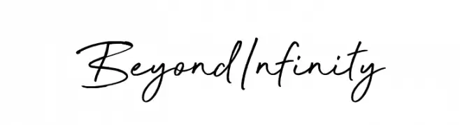
A fluid, elegant handwritten font with smooth, flowing lines.
![Beyond Infinity font caratteri gratis]() Scaricare 8061 Downloads
Scaricare 8061 Downloads -
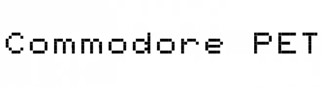
![Commodore PET font caratteri gratis]() Scaricare 8057 Downloads@WebFont
Scaricare 8057 Downloads@WebFont -
( Fonts by Vanessa Bays - bythebutterfly.com )
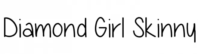
A playful, casual handwritten font with rounded, irregular letterforms.
![Diamond Girl Skinny font caratteri gratis]() Scaricare 8055 Downloads@WebFont
Scaricare 8055 Downloads@WebFont -
( Fonts by Dieter Steffmann )
An elegant script font with flowing lines and classic appeal.
![Forelle font caratteri gratis]() Scaricare 8055 Downloads@WebFont
Scaricare 8055 Downloads@WebFont -
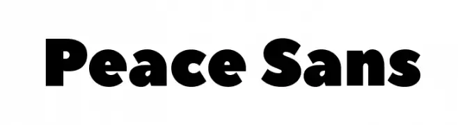
![Peace Sans font caratteri gratis]() Scaricare 8052 Downloads@WebFont
Scaricare 8052 Downloads@WebFont -
( Fonts by www.carrois.com )
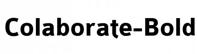
A bold, modern sans-serif font with clean lines and a slightly condensed style.
![Colaborate-Bold font caratteri gratis]() Scaricare 8049 Downloads@WebFont
Scaricare 8049 Downloads@WebFont -
( Fonts by Castcraft Software - opti.netii.net - check the website before use )
A bold, classic serif font with strong strokes and a modern touch.
![OPTIAntique-Bold font caratteri gratis]() Scaricare 8037 Downloads@WebFont
Scaricare 8037 Downloads@WebFont -
( Fonts by www.typodermicfonts.com - Ray Larabie )
A futuristic, geometric font with rounded edges and a sleek design.
![Neuropol X Free font caratteri gratis]() Scaricare 8034 Downloads@WebFont
Scaricare 8034 Downloads@WebFont -
![absender font caratteri gratis]() Scaricare 8033 Downloads@WebFont
Scaricare 8033 Downloads@WebFont -
( Copyright (c) 2011 by Sorkin Type Co (www.sorkintype.com) )
A tall, slender, and playful font with a modern and informal style.
![Pompiere font caratteri gratis]() Scaricare 8030 Downloads@WebFont
Scaricare 8030 Downloads@WebFont -
( Fonts by Philippe BLONDEL www.philing.net )
An abstract, intellectual font with diagonal line accents.
![LACAN font caratteri gratis]() Scaricare 8030 Downloads@WebFont
Scaricare 8030 Downloads@WebFont -
![TeXGyreHeros-Bold font caratteri gratis]() Scaricare 8027 Downloads@WebFont
Scaricare 8027 Downloads@WebFont -
![ER Univers KOI-8 Bold font caratteri gratis]() Scaricare 8027 Downloads@WebFont
Scaricare 8027 Downloads@WebFont -
( Fonts by Iconian Fonts - Daniel Zadorozny )
A futuristic and geometric font with bold, angular characters.
![Alexis font caratteri gratis]() Scaricare 8017 Downloads@WebFont
Scaricare 8017 Downloads@WebFont -
![IRON MAN OF WAR 002 NCV font caratteri gratis]() Scaricare 8014 Downloads@WebFont
Scaricare 8014 Downloads@WebFont -
( Fonts by Sharkshock Productions----www.sharkshock.com. Personal-use only. For commercial use please contact owner. )
A bold, modern font with clean, geometric shapes and strong impact.
![Mouser font caratteri gratis]() Scaricare 8011 Downloads@WebFont
Scaricare 8011 Downloads@WebFont -
( Copyright 2014-2017 Indian Type Foundry (info@indiantypefoundry.com) )
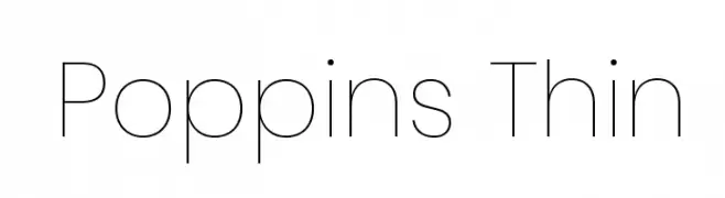
A modern, thin sans-serif font with geometric shapes and balanced spacing.
![Poppins Thin font caratteri gratis]() Scaricare 8009 Downloads@WebFont
Scaricare 8009 Downloads@WebFont -
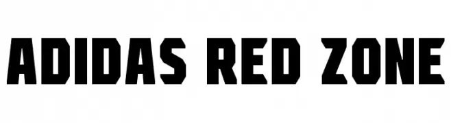
![Adidas Red Zone font caratteri gratis]() Scaricare 8006 Downloads@WebFont
Scaricare 8006 Downloads@WebFont -
( Fonts by Nick Curtis - www.nicksfonts.com )
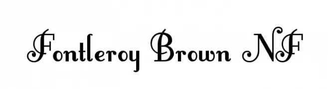
An elegant, decorative font with ornate uppercase letters and subtle lowercase curves.
![Fontleroy Brown NF font caratteri gratis]() Scaricare 8005 Downloads@WebFont
Scaricare 8005 Downloads@WebFont -
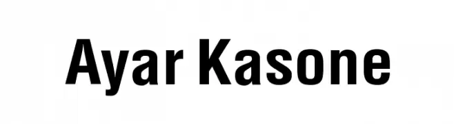
![Ayar Kasone font caratteri gratis]() Scaricare 7998 Downloads@WebFont
Scaricare 7998 Downloads@WebFont -
( Fonts by Dieter Steffmann )
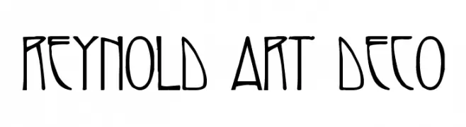
An elegant, geometric font with Art Deco influences, featuring elongated, narrow letterforms.
![Reynold Art Deco font caratteri gratis]() Scaricare 7998 Downloads@WebFont
Scaricare 7998 Downloads@WebFont -
( Fonts by Castcraft Software - opti.netii.net - check the website before use )
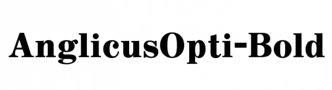
A bold, high-contrast serif font with strong, pronounced serifs.
![AnglicusOpti-Bold font caratteri gratis]() Scaricare 7996 Downloads@WebFont
Scaricare 7996 Downloads@WebFont -
( Fonts by Jurgen Geiger - www.geigerartwork.de )
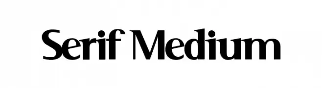
A classic serif typeface with medium weight, offering elegance and readability.
![Serif Medium font caratteri gratis]() Scaricare 7996 Downloads@WebFont
Scaricare 7996 Downloads@WebFont -
![Sports EA Sports font caratteri gratis]() Scaricare 7995 Downloads@WebFont
Scaricare 7995 Downloads@WebFont -
![FuturistStencil font caratteri gratis]() Scaricare 7989 Downloads
Scaricare 7989 Downloads


Quali sono i font più popolari adesso?
Poppins, Roboto, Montserrat, Open Sans e Lato sono molto usati per le forme pulite e l'ampia applicabilità — dall'identità di marca alle landing page e ai poster.
Quali font si usano spesso nei loghi?
Le sans serif geometriche (es. Poppins, famiglie in stile Gotham) sono scelte comuni per un branding pulito e scalabile. Per un tocco personale restano valide script e stili manoscritti. Abbina un display deciso per i titoli a un corpo testo neutro per riconoscibilità ed equilibrio.
Ogni quanto si aggiorna la lista?
Con regolarità, in base ai download e all'attività reale. Torna spesso per scoprire in anticipo le nuove preferite.
💡 Consiglio: aggiungi ai preferiti — le tendenze cambiano in fretta e i font top di oggi possono ispirare il rebranding di domani.