Benvenuto nelle Font Più Popolari — dove popolarità e qualità si incontrano. Qui trovi i font più scaricati e usati dell'anno. Se cerchi scelte sicure per logo, web o social, inizia da qui.
Ogni font top si distingue per equilibrio, leggibilità e versatilità. Troverai sans serif moderne, script eleganti, serif vintage e display minimalisti.
-
( Fonts by www.misprintedtype.com )
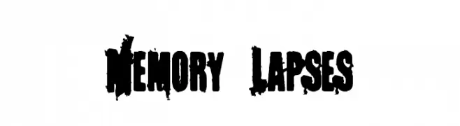
A bold, distressed font with a grungy, textured appearance.
 Scaricare 908 Downloads@WebFont
 -
( Fonts by Otto Maurer Design )
A whimsical, shadowed font with curly serifs and playful design.
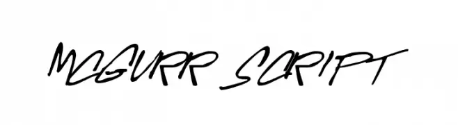
![Corps-Script-Shadow font caratteri gratis]() Scaricare 908 Downloads@WebFont
Scaricare 908 Downloads@WebFont -
![McGurr Script font caratteri gratis]() Scaricare 908 Downloads@WebFont
Scaricare 908 Downloads@WebFont -
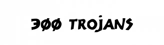
( Fonts by Daniel Zadorozny - www.iconian.com - Free for personal use )
A bold, angular font with a dynamic and powerful style.
![300 Trojans font caratteri gratis]() Scaricare 908 Downloads@WebFont
Scaricare 908 Downloads@WebFont -
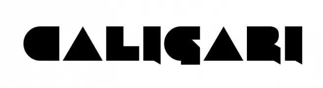
![Caligari font caratteri gratis]() Scaricare 908 Downloads@WebFont
Scaricare 908 Downloads@WebFont -
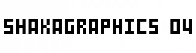
![SHAKAGRAPHICS 04 font caratteri gratis]() Scaricare 908 Downloads@WebFont
Scaricare 908 Downloads@WebFont -
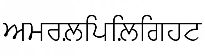
![AmrLipiLight font caratteri gratis]() Scaricare 908 Downloads@WebFont
Scaricare 908 Downloads@WebFont -
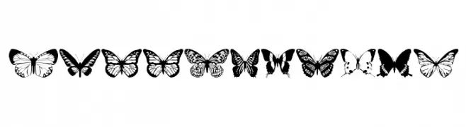
![butterflips font caratteri gratis]() Scaricare 908 Downloads@WebFont
Scaricare 908 Downloads@WebFont -
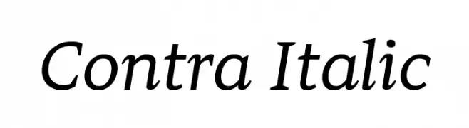
( Fonts by Apostrophic Lab )
A modern italic font with elegant, flowing letterforms and medium contrast.
![Contra Italic font caratteri gratis]() Scaricare 908 Downloads@WebFont
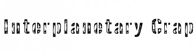
Scaricare 908 Downloads@WebFont -
![Interplanetary Crap font caratteri gratis]() Scaricare 908 Downloads@WebFont
Scaricare 908 Downloads@WebFont -
![Swifty font caratteri gratis]() Scaricare 908 Downloads
Scaricare 908 Downloads -
![C9 font caratteri gratis]() Scaricare 908 Downloads@WebFont
Scaricare 908 Downloads@WebFont -
![Pixel_Screen_Font-Light font caratteri gratis]() Scaricare 908 Downloads
Scaricare 908 Downloads -
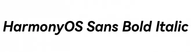
( Fonts by huawei.com - Personal-use only. For commercial use please contact owner. )
A modern, bold, and italic sans-serif font with a clean and dynamic style.
![HarmonyOS Sans Bold Italic font caratteri gratis]() Scaricare 907 Downloads@WebFont
Scaricare 907 Downloads@WebFont -
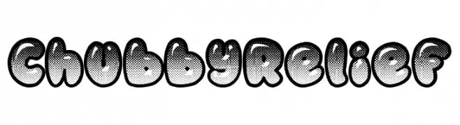
( Fonts by imagex )
A playful, bold font with a chubby relief style and dotted texture.
![Chubby Relief font caratteri gratis]() Scaricare 907 Downloads@WebFont
Scaricare 907 Downloads@WebFont -
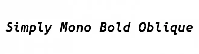
( Fonts by Wojciech Kalinowski )
A bold, oblique monospaced font with a modern and dynamic style.
![Simply Mono Bold Oblique font caratteri gratis]() Scaricare 907 Downloads@WebFont
Scaricare 907 Downloads@WebFont -
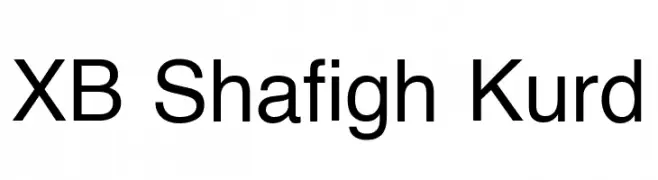
( Fonts by Behnam - Personal-use only. For commercial use please contact owner. )
A clean, modern sans-serif font with uniform stroke width and balanced spacing.
![XB Shafigh Kurd font caratteri gratis]() Scaricare 907 Downloads@WebFont
Scaricare 907 Downloads@WebFont -
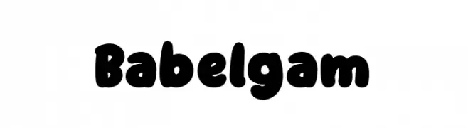
( Fonts by Staircase Studio )
A playful, bold typeface with rounded, bubble-like characters.
![Babelgam font caratteri gratis]() Scaricare 907 Downloads@WebFont
Scaricare 907 Downloads@WebFont -
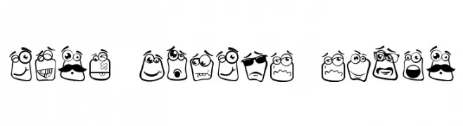
( Fonts by Haslinda Adnan - Personal-use only. For commercial use please contact owner. )
Cartoonish, expressive font with each character as a unique emoji face.
![Alin Square Emoji font caratteri gratis]() Scaricare 907 Downloads@WebFont
Scaricare 907 Downloads@WebFont -
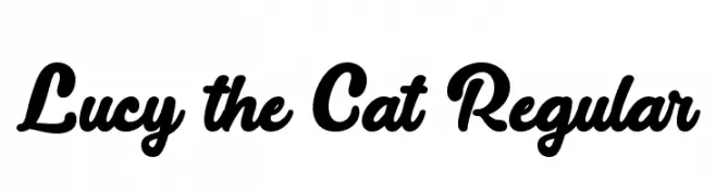
( Misti's Fonts - mistifonts.com/ )
A bold, playful script font with flowing, cursive letterforms.
![Lucy the Cat Regular font caratteri gratis]() Scaricare 907 Downloads@WebFont
Scaricare 907 Downloads@WebFont -
( Fargoboy - type.fargoboy.com )
A tall, narrow, hand-drawn font with a whimsical and artistic style.
![Pablo Skinny font caratteri gratis]() Scaricare 907 Downloads@WebFont
Scaricare 907 Downloads@WebFont -
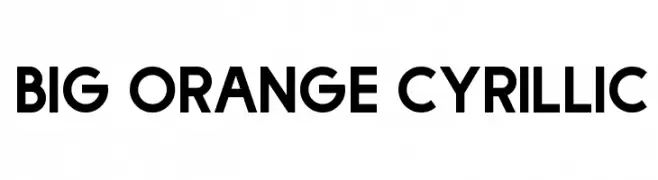
( Fonts by Dan P. Lyons - Personal-use only. For commercial use please contact owner. )
A bold, geometric sans-serif font with a modern and clean design.
![Big Orange Cyrillic font caratteri gratis]() Scaricare 907 Downloads@WebFont
Scaricare 907 Downloads@WebFont -
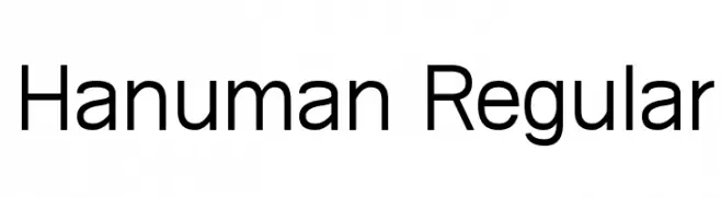
( Copyright (c) 2010, Danh Hong (khmertype.blogspot.com) )
A modern sans-serif font with clean lines and balanced proportions.
![Hanuman Regular font caratteri gratis]() Scaricare 907 Downloads@WebFont
Scaricare 907 Downloads@WebFont -
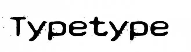
( Fonts by www.junkohanhero.com - Personal-use only. For commercial use please contact owner. )
A rugged, distressed font with a hand-drawn, vintage style.
![Typetype font caratteri gratis]() Scaricare 907 Downloads@WebFont
Scaricare 907 Downloads@WebFont -
( Copyright (c) 2013-2015 Post No Bills Project Authors (https://github.com/mooniak/post-no-bills-font). )
A modern, geometric stencil font with a semi-bold weight and industrial feel.
![Post No Bills Jaffna SemiBold font caratteri gratis]() Scaricare 907 Downloads@WebFont
Scaricare 907 Downloads@WebFont -
( Fonts by a Zaffar Ansari - Zansari . Personal-use only. For commercial use please contact owner. )
A bold, brush-stroke style font with dynamic, textured characters.
![Black Sand font caratteri gratis]() Scaricare 907 Downloads@WebFont
Scaricare 907 Downloads@WebFont -
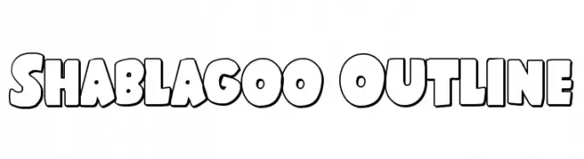
( Fonts by Iconian Fonts )
A bold, playful outline font with a cartoonish style.
![Shablagoo Outline font caratteri gratis]() Scaricare 907 Downloads@WebFont
Scaricare 907 Downloads@WebFont -
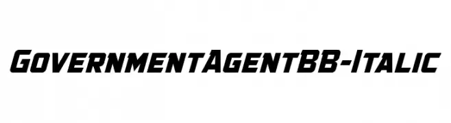
( Fonts by www.blambot.com )
A bold, italic, and geometric font with a modern and authoritative style.
![GovernmentAgentBB-Italic font caratteri gratis]() Scaricare 907 Downloads@WebFont
Scaricare 907 Downloads@WebFont -
( Fonts by Castcraft Software - opti.netii.net - check the website before use )
A light, modern serif font with elegant and refined characteristics.
![OPTIGleam-Light font caratteri gratis]() Scaricare 907 Downloads@WebFont
Scaricare 907 Downloads@WebFont -
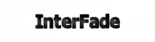
( Fonts by a Max Infeld - XEROGRAPHER FONTS - xerographer.blogspot.com . Personal-use only. For commercial use please contact owner. )
Bold, textured font with a unique dotted pattern.
![InterFade font caratteri gratis]() Scaricare 907 Downloads@WebFont
Scaricare 907 Downloads@WebFont -
![DrukpaBold font caratteri gratis]() Scaricare 907 Downloads@WebFont
Scaricare 907 Downloads@WebFont -
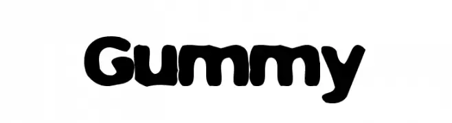
( THESE ARE SHAREWARE FONTS ! NOT FREEWARE ! PLEASE VISIT www.fuelfonts.com )
A playful, bold font with rounded, bubble-like characters.
![Gummy font caratteri gratis]() Scaricare 907 Downloads@WebFont
Scaricare 907 Downloads@WebFont -
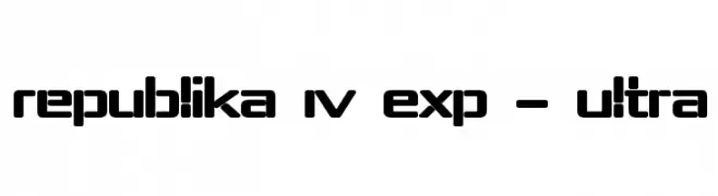
( Fonts by Apostrophic Lab )
A bold, geometric font with a futuristic and modern design.
![Republika IV Exp - Ultra font caratteri gratis]() Scaricare 907 Downloads@WebFont
Scaricare 907 Downloads@WebFont -
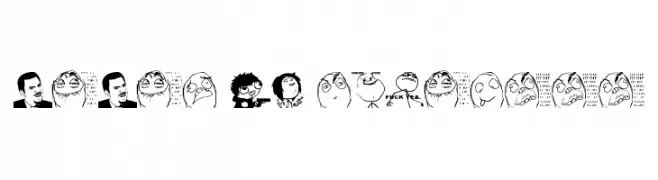
( - jopea302.co.cc )
A display font made up of hand-drawn meme faces and reaction images.
![Memes by jopea302 font caratteri gratis]() Scaricare 907 Downloads@WebFont
Scaricare 907 Downloads@WebFont -
( Fonts by bob istheowl http://luc.devroye.org/bobistheowl.html )
Whimsical, cartoon-inspired font with playful, rounded letterforms.
![Grim Natwick Betty font caratteri gratis]() Scaricare 907 Downloads@WebFont
Scaricare 907 Downloads@WebFont


Quali sono i font più popolari adesso?
Poppins, Roboto, Montserrat, Open Sans e Lato sono molto usati per le forme pulite e l'ampia applicabilità — dall'identità di marca alle landing page e ai poster.
Quali font si usano spesso nei loghi?
Le sans serif geometriche (es. Poppins, famiglie in stile Gotham) sono scelte comuni per un branding pulito e scalabile. Per un tocco personale restano valide script e stili manoscritti. Abbina un display deciso per i titoli a un corpo testo neutro per riconoscibilità ed equilibrio.
Ogni quanto si aggiorna la lista?
Con regolarità, in base ai download e all'attività reale. Torna spesso per scoprire in anticipo le nuove preferite.
💡 Consiglio: aggiungi ai preferiti — le tendenze cambiano in fretta e i font top di oggi possono ispirare il rebranding di domani.