Benvenuto nelle Font Più Popolari — dove popolarità e qualità si incontrano. Qui trovi i font più scaricati e usati dell'anno. Se cerchi scelte sicure per logo, web o social, inizia da qui.
Ogni font top si distingue per equilibrio, leggibilità e versatilità. Troverai sans serif moderne, script eleganti, serif vintage e display minimalisti.
-
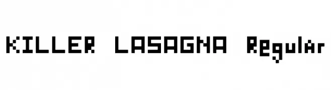
( Fonts by Daniel Zadorozny - www.iconian.com - Free for personal use )
A modern, italicized font with bold, geometric characters and rounded edges.
 Scaricare 214 Downloads@WebFont
 -
![KILLER LASAGNA Regular font caratteri gratis]() Scaricare 214 Downloads@WebFont
Scaricare 214 Downloads@WebFont -
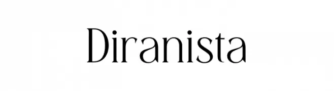
( Fonts by BrandSemut - A Sidiq - Personal-use only. For commercial use please contact owner. )
A refined serif font with high contrast and elegant strokes.
![Diranista font caratteri gratis]() Scaricare 214 Downloads@WebFont
Scaricare 214 Downloads@WebFont -
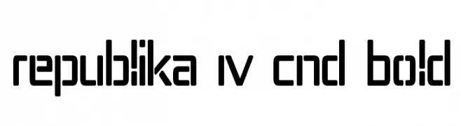
( Fonts by Apostrophic Lab )
A bold, geometric, and modern font with rounded edges and a condensed width.
![Republika IV Cnd Bold font caratteri gratis]() Scaricare 214 Downloads@WebFont
Scaricare 214 Downloads@WebFont -
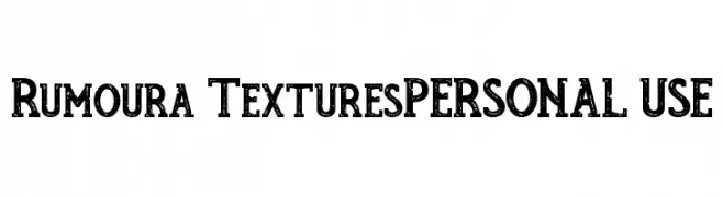
( INKsTYPIA - Andi Winarno - inkstypia-std.blogspot.com )
A bold, textured font with a rugged, distressed appearance.
![Rumoura TexturesPERSONAL USE font caratteri gratis]() Scaricare 214 Downloads@WebFont
Scaricare 214 Downloads@WebFont -
-
( Mr. Typeman - creativemarket.com/mr.typeman )
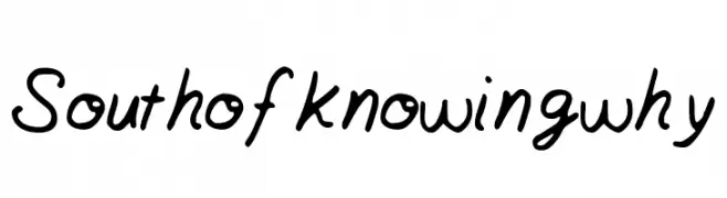
A dynamic, expressive handwritten font with fluid cursive strokes.
![Syberic font caratteri gratis]() Scaricare 214 Downloads@WebFont
Scaricare 214 Downloads@WebFont -
![Southofknowingwhy font caratteri gratis]() Scaricare 214 Downloads@WebFont
Scaricare 214 Downloads@WebFont -
( Fonts by Letterhend Studio )
A bold, playful handwritten font with thick strokes and rounded edges.
![Milterna1Demo font caratteri gratis]() Scaricare 214 Downloads@WebFont
Scaricare 214 Downloads@WebFont -
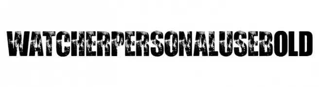
( Fonts by Billy Argel Fonts - www.billyargel.com - Personal-use only. For commercial use please contact owner. )
A bold, distressed decorative font with a rugged, grunge style.
![WATCHER PERSONAL USE Bold font caratteri gratis]() Scaricare 214 Downloads@WebFont
Scaricare 214 Downloads@WebFont -
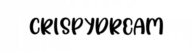
( Fonts by Erlina Graphic )
A bold, playful handwritten font with smooth, rounded edges and a lively appearance.
![Crispy dream font caratteri gratis]() Scaricare 214 Downloads@WebFont
Scaricare 214 Downloads@WebFont


Quali sono i font più popolari adesso?
Poppins, Roboto, Montserrat, Open Sans e Lato sono molto usati per le forme pulite e l'ampia applicabilità — dall'identità di marca alle landing page e ai poster.
Quali font si usano spesso nei loghi?
Le sans serif geometriche (es. Poppins, famiglie in stile Gotham) sono scelte comuni per un branding pulito e scalabile. Per un tocco personale restano valide script e stili manoscritti. Abbina un display deciso per i titoli a un corpo testo neutro per riconoscibilità ed equilibrio.
Ogni quanto si aggiorna la lista?
Con regolarità, in base ai download e all'attività reale. Torna spesso per scoprire in anticipo le nuove preferite.
💡 Consiglio: aggiungi ai preferiti — le tendenze cambiano in fretta e i font top di oggi possono ispirare il rebranding di domani.