Benvenuto nelle Font Più Popolari — dove popolarità e qualità si incontrano. Qui trovi i font più scaricati e usati dell'anno. Se cerchi scelte sicure per logo, web o social, inizia da qui.
Ogni font top si distingue per equilibrio, leggibilità e versatilità. Troverai sans serif moderne, script eleganti, serif vintage e display minimalisti.
-
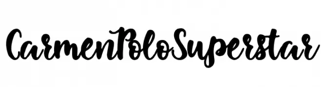
( Fonts by Woodcutter Manero - http://www.woodcutter.es - Personal-use only. For commercial use please contact owner. )
A bold, expressive handwritten font with dynamic curves and thick strokes.
 Scaricare 211 Downloads@WebFont
 -
![Yakap font caratteri gratis]() Scaricare 211 Downloads@WebFont
Scaricare 211 Downloads@WebFont -
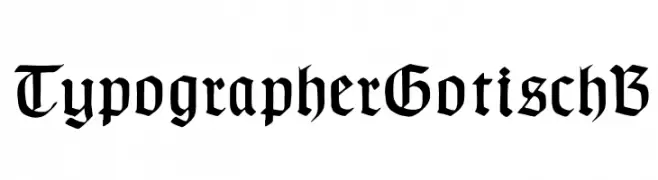
( Fonts by Dieter Steffmann )
A traditional Blackletter font with intricate detailing and historical elegance.
![TypographerGotischB font caratteri gratis]() Scaricare 211 Downloads@WebFont
Scaricare 211 Downloads@WebFont -
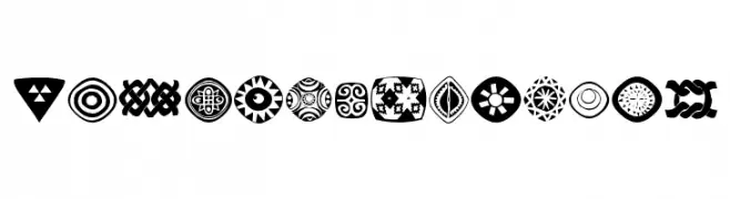
( Fonts by Manfred Klein. Free for private and charity use. Free for commercial with donation to organizations )
Bold, geometric African-inspired symbol set with high contrast.
![AfricanSymbols font caratteri gratis]() Scaricare 211 Downloads@WebFont
Scaricare 211 Downloads@WebFont -
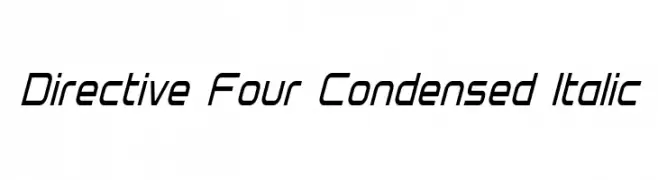
![Directive Four Condensed Italic font caratteri gratis]() Scaricare 211 Downloads@WebFont
Scaricare 211 Downloads@WebFont -
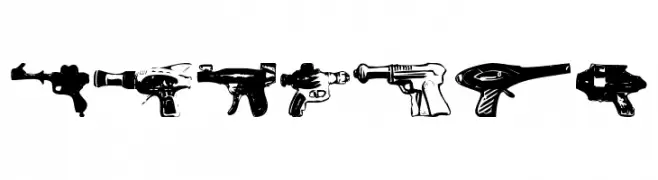
-
![rayguns font caratteri gratis]() Scaricare 211 Downloads@WebFont
Scaricare 211 Downloads@WebFont -
( Iconian Fonts - Daniel Zadorozny - www.iconian.com )
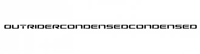
A futuristic, condensed font with bold, angular letterforms and tight spacing.
![Outrider Condensed Condensed font caratteri gratis]() Scaricare 211 Downloads@WebFont
Scaricare 211 Downloads@WebFont -
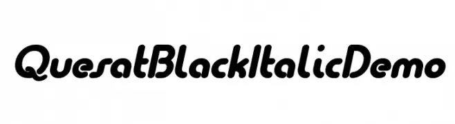
( Fonts by www.studiotypo.com - Personal-use only. For commercial use please contact owner. )
A bold, italicized font with smooth, rounded characters and a modern, dynamic feel.
![Quesat Black Italic Demo font caratteri gratis]() Scaricare 211 Downloads@WebFont
Scaricare 211 Downloads@WebFont -
( Fonts by Galdino Otten Fonts )
A playful, bold font with a comic-like, hand-drawn style.
![Comic Balloon New Bold font caratteri gratis]() Scaricare 211 Downloads@WebFont
Scaricare 211 Downloads@WebFont -
( Fonts by Skiiller Studio )
Bold, playful handwritten font.
![Caslya font caratteri gratis]() Scaricare 211 Downloads@WebFont
Scaricare 211 Downloads@WebFont


Quali sono i font più popolari adesso?
Poppins, Roboto, Montserrat, Open Sans e Lato sono molto usati per le forme pulite e l'ampia applicabilità — dall'identità di marca alle landing page e ai poster.
Quali font si usano spesso nei loghi?
Le sans serif geometriche (es. Poppins, famiglie in stile Gotham) sono scelte comuni per un branding pulito e scalabile. Per un tocco personale restano valide script e stili manoscritti. Abbina un display deciso per i titoli a un corpo testo neutro per riconoscibilità ed equilibrio.
Ogni quanto si aggiorna la lista?
Con regolarità, in base ai download e all'attività reale. Torna spesso per scoprire in anticipo le nuove preferite.
💡 Consiglio: aggiungi ai preferiti — le tendenze cambiano in fretta e i font top di oggi possono ispirare il rebranding di domani.