Benvenuto nelle Font Più Popolari — dove popolarità e qualità si incontrano. Qui trovi i font più scaricati e usati dell'anno. Se cerchi scelte sicure per logo, web o social, inizia da qui.
Ogni font top si distingue per equilibrio, leggibilità e versatilità. Troverai sans serif moderne, script eleganti, serif vintage e display minimalisti.
-
( Fonts by NJ Studio - Personal-use only. For commercial use please contact owner. )
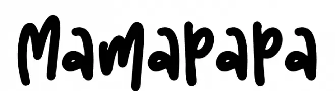
A bold, playful handwritten font with a lively and energetic style.
 Scaricare 211 Downloads@WebFont
 -
( Fonts by www.peter-wiegel.de - Personal-use only. For commercial use please contact owner. )
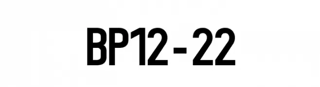
A bold, modern sans-serif font with clean lines and uniform spacing.
![BP12-22 font caratteri gratis]() Scaricare 211 Downloads@WebFont
Scaricare 211 Downloads@WebFont -
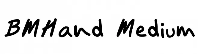
![BMHand Medium font caratteri gratis]() Scaricare 211 Downloads@WebFont
Scaricare 211 Downloads@WebFont -
( Fonts by Nathatype )
A bold, hand-drawn font with rugged, organic strokes.
![Biloner font caratteri gratis]() Scaricare 211 Downloads@WebFont
Scaricare 211 Downloads@WebFont -
( fonts.pistocasero.com )
A bold, distressed font with a grungy, textured appearance.
![Corrupted Democrazy Bold font caratteri gratis]() Scaricare 211 Downloads@WebFont
Scaricare 211 Downloads@WebFont -
-
( truefonts.blogspot.com )
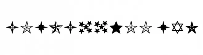
A decorative star-themed dingbat font with diverse star icons.
![Estrellass TFB font caratteri gratis]() Scaricare 211 Downloads@WebFont
Scaricare 211 Downloads@WebFont -
( Fonts by Manfred Klein. Free for private and charity use. Free for commercial with donation to organizations )
A hand-drawn, edgy font with jagged, angular lines and a dynamic appearance.
![Tremolo font caratteri gratis]() Scaricare 211 Downloads@WebFont
Scaricare 211 Downloads@WebFont -
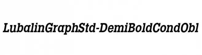
Caratteri di HammerBro101. For commercial use please contact the owner.
![LubalinGraphStd-DemiBoldCondObl font caratteri gratis]() Scaricare 211 Downloads@WebFont
Scaricare 211 Downloads@WebFont -
( Free for personal use - www.chrisvile.com/ )
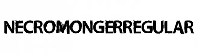
A bold, distressed font with a grunge texture and rugged edges.
![Necro Monger Regular font caratteri gratis]() Scaricare 211 Downloads@WebFont
Scaricare 211 Downloads@WebFont -
( Fonts by Style-7 - www.styleseven.com - Personal-use only. For commercial use please contact owner. )
A pixelated, neon-inspired font with a retro digital aesthetic.
![Neon Pixel-7 font caratteri gratis]() Scaricare 210 Downloads@WebFont
Scaricare 210 Downloads@WebFont


Quali sono i font più popolari adesso?
Poppins, Roboto, Montserrat, Open Sans e Lato sono molto usati per le forme pulite e l'ampia applicabilità — dall'identità di marca alle landing page e ai poster.
Quali font si usano spesso nei loghi?
Le sans serif geometriche (es. Poppins, famiglie in stile Gotham) sono scelte comuni per un branding pulito e scalabile. Per un tocco personale restano valide script e stili manoscritti. Abbina un display deciso per i titoli a un corpo testo neutro per riconoscibilità ed equilibrio.
Ogni quanto si aggiorna la lista?
Con regolarità, in base ai download e all'attività reale. Torna spesso per scoprire in anticipo le nuove preferite.
💡 Consiglio: aggiungi ai preferiti — le tendenze cambiano in fretta e i font top di oggi possono ispirare il rebranding di domani.