Benvenuto nelle Font Più Popolari — dove popolarità e qualità si incontrano. Qui trovi i font più scaricati e usati dell'anno. Se cerchi scelte sicure per logo, web o social, inizia da qui.
Ogni font top si distingue per equilibrio, leggibilità e versatilità. Troverai sans serif moderne, script eleganti, serif vintage e display minimalisti.
-
( Fonts by Castcraft Software - opti.netii.net - check the website before use )
A classic serif font with elegant strokes and balanced proportions.
 Scaricare 882 Downloads@WebFont
 -
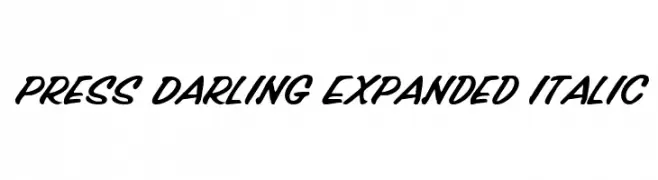
( Fonts by Daniel Zadorozny - www.iconian.com - Free for personal use )
A bold, expanded script font with an italic slant and smooth, flowing strokes.
![Press Darling Expanded Italic font caratteri gratis]() Scaricare 882 Downloads@WebFont
Scaricare 882 Downloads@WebFont -
( Fonts by Grzegorz l - www.glukfonts.pl )
A modern, narrow sans-serif font with clean lines and a sleek appearance.
![Reswysokr font caratteri gratis]() Scaricare 882 Downloads@WebFont
Scaricare 882 Downloads@WebFont -
![HakusyuTenkoin_kk font caratteri gratis]() Scaricare 882 Downloads@WebFont
Scaricare 882 Downloads@WebFont -
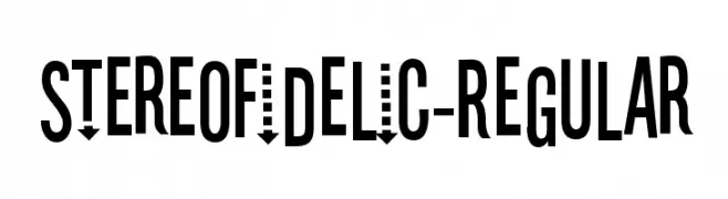
( Fonts by www.typodermicfonts.com - Ray Larabie )
A bold, condensed, and modern geometric font with high legibility.
![Stereofidelic-Regular font caratteri gratis]() Scaricare 882 Downloads@WebFont
Scaricare 882 Downloads@WebFont -
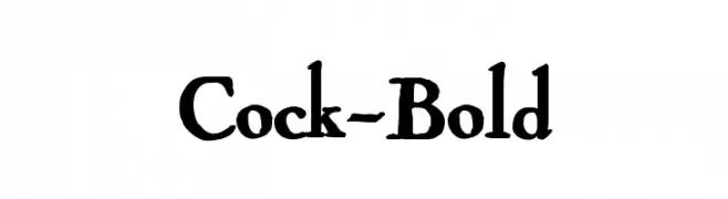
( Fonts by Manfred Klein. Free for private and charity use. Free for commercial with donation to organizations )
A bold, classic serif font with thick strokes and elegant curves.
![Cock-Bold font caratteri gratis]() Scaricare 882 Downloads@WebFont
Scaricare 882 Downloads@WebFont -
( Free for a personal use. For a commercial use please visit www.kevinandamanda.com )
A playful, hand-drawn font with bold, rounded characters and a whimsical style.
![rhino dino font caratteri gratis]() Scaricare 882 Downloads@WebFont
Scaricare 882 Downloads@WebFont -
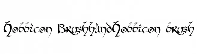
![Hobbiton BrushhandHobbiton brush font caratteri gratis]() Scaricare 882 Downloads@WebFont
Scaricare 882 Downloads@WebFont -
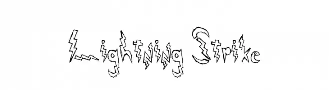
![Lightning Strike font caratteri gratis]() Scaricare 882 Downloads@WebFont
Scaricare 882 Downloads@WebFont -
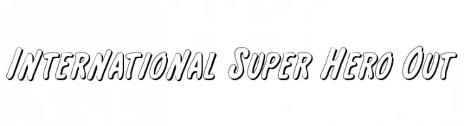
( Fonts by Daniel Zadorozny - www.iconian.com - Free for personal use )
A bold, outlined font with a playful, comic book style.
![International Super Hero Out font caratteri gratis]() Scaricare 882 Downloads@WebFont
Scaricare 882 Downloads@WebFont -
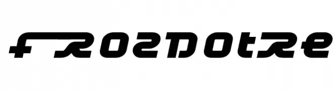
![Frozdotre font caratteri gratis]() Scaricare 882 Downloads@WebFont
Scaricare 882 Downloads@WebFont -
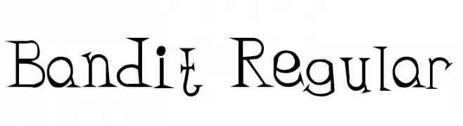
( Fonts by Buddha Graphix - buddha.graphix.dk/fonts.html )
A playful and whimsical font with irregular letterforms and exaggerated serifs.
![Bandit Regular font caratteri gratis]() Scaricare 882 Downloads@WebFont
Scaricare 882 Downloads@WebFont -
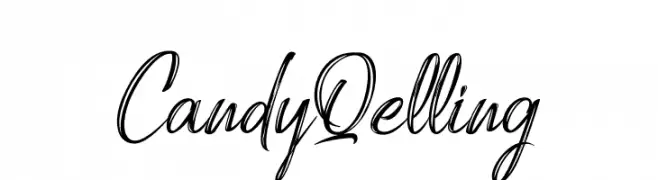
( Fonts by StringLabs - stringlabscreative.com - Personal-use only. For commercial use please contact owner. )
A lively, cursive script font with a handwritten feel.
![Candy Qelling font caratteri gratis]() Scaricare 881 Downloads@WebFont
Scaricare 881 Downloads@WebFont -
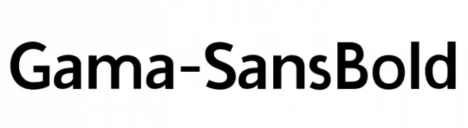
( Fonts by Universitas Gadjah Mada Yogyakarta - Personal-use only. For commercial use please contact owner. )
A bold, modern sans-serif font with clean lines and balanced proportions.
![Gama-Sans Bold font caratteri gratis]() Scaricare 881 Downloads@WebFont
Scaricare 881 Downloads@WebFont -
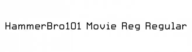
Caratteri di HammerBro101. For commercial use please contact the owner.
![HammerBro101 Movie Reg Regular font caratteri gratis]() Scaricare 881 Downloads@WebFont
Scaricare 881 Downloads@WebFont -
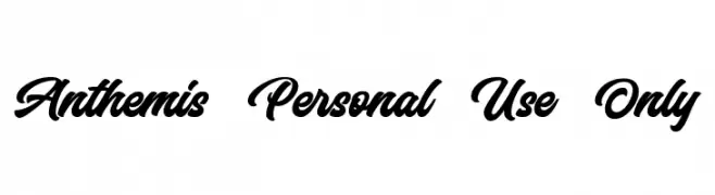
( Bangkit Tri Setiadi - creativemarket.com/bangkit.tri.setiadi )
A bold, flowing script font with elegant, cursive letterforms.
![Anthemis Personal Use Only font caratteri gratis]() Scaricare 881 Downloads@WebFont
Scaricare 881 Downloads@WebFont -
( Fonts by Octotype - www.foundmyfont.com - Personal-use only. For commercial use please contact owner. )
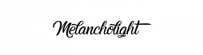
An elegant script font with flowing, decorative strokes.
![Melancholight font caratteri gratis]() Scaricare 881 Downloads@WebFont
Scaricare 881 Downloads@WebFont -
( Fonts by Manuel Ramos - www.infinitismo.com - Personal-use only. For commercial use please contact owner. )
A modern, decorative font with a striped, textured design.
![aura font caratteri gratis]() Scaricare 881 Downloads@WebFont
Scaricare 881 Downloads@WebFont -
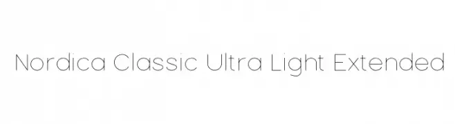
![Nordica Classic Ultra Light Extended font caratteri gratis]() Scaricare 881 Downloads@WebFont
Scaricare 881 Downloads@WebFont -
( Fonts by www.gliphmaker.com. Personal-use only. For commercial use please contact owner. )
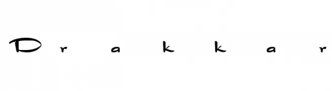
An artistic and whimsical font with flowing, hand-drawn letterforms.
![Drakkar font caratteri gratis]() Scaricare 881 Downloads@WebFont
Scaricare 881 Downloads@WebFont -
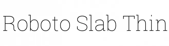
![Roboto Slab Thin font caratteri gratis]() Scaricare 881 Downloads@WebFont
Scaricare 881 Downloads@WebFont -
( Fonts by Roland Huse - rolandhuse.com )
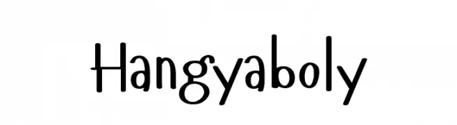
A playful, handwritten font with a casual and friendly style.
![Hangyaboly font caratteri gratis]() Scaricare 881 Downloads@WebFont
Scaricare 881 Downloads@WebFont -
( Fonts by Castcraft Software - opti.netii.net - check the website before use )
A classic calligraphic font with elegant, flowing strokes and refined serifs.
![AuthorCalligraphyOpti-Regular font caratteri gratis]() Scaricare 881 Downloads@WebFont
Scaricare 881 Downloads@WebFont -
![KARATE font caratteri gratis]() Scaricare 881 Downloads@WebFont
Scaricare 881 Downloads@WebFont -
( Fonts by Dieter Steffmann )
A bold, ornate Blackletter font with intricate, angular letterforms.
![Missal font caratteri gratis]() Scaricare 881 Downloads@WebFont
Scaricare 881 Downloads@WebFont -
( Fonts by HungLan Design - www.hunglandesign.com )
A dynamic handwritten font with fluid, slightly slanted letterforms and medium contrast.
![HL Netco 1BK font caratteri gratis]() Scaricare 881 Downloads@WebFont
Scaricare 881 Downloads@WebFont -
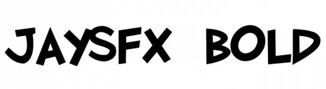
( Fonts by Jason Arthur - JibbaJabba Fonts - www.myspace.com/jasonarthurloaded )
A bold, playful font with a dynamic and energetic style.
![JaySFX Bold font caratteri gratis]() Scaricare 881 Downloads@WebFont
Scaricare 881 Downloads@WebFont -
![Shebrew Medium font caratteri gratis]() Scaricare 881 Downloads@WebFont
Scaricare 881 Downloads@WebFont -
( Fonts by Dieter Steffmann )
A festive, decorative font with Easter-themed elements and bold styling.
![Happy Easter font caratteri gratis]() Scaricare 881 Downloads@WebFont
Scaricare 881 Downloads@WebFont -
![AI kelso I font caratteri gratis]() Scaricare 881 Downloads@WebFont
Scaricare 881 Downloads@WebFont -
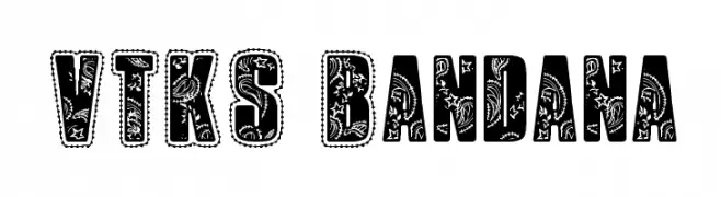
( Fonts by Douglas Vitkauskas - www.vtksdesign.com. Personal-use only. For commercial use please contact owner. )
A bold, decorative font with intricate bandana-inspired patterns.
![VTKS Bandana font caratteri gratis]() Scaricare 881 Downloads@WebFont
Scaricare 881 Downloads@WebFont -
![BD Alm font caratteri gratis]() Scaricare 881 Downloads@WebFont
Scaricare 881 Downloads@WebFont -
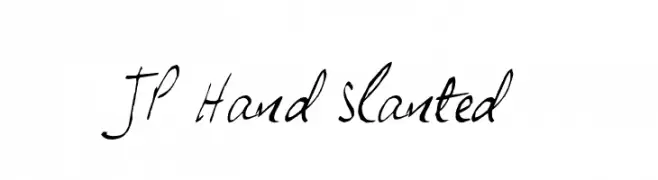
( Fonts by Jonathan Paterson )
A dynamic, slanted handwritten font with fluid strokes and a personal touch.
![JP Hand Slanted font caratteri gratis]() Scaricare 881 Downloads@WebFont
Scaricare 881 Downloads@WebFont -
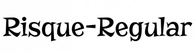
( Fonts by Astigmatic )
A playful and whimsical font with exaggerated curves and sharp edges.
![Risque-Regular font caratteri gratis]() Scaricare 880 Downloads@WebFont
Scaricare 880 Downloads@WebFont -
( Fonts by Syaf Rizal - www.creativefabrica.com/ref/53/ - Personal-use only. For commercial use please contact owner. )
A playful handwritten font with a casual, friendly style.
![Juliagar font caratteri gratis]() Scaricare 880 Downloads@WebFont
Scaricare 880 Downloads@WebFont


Quali sono i font più popolari adesso?
Poppins, Roboto, Montserrat, Open Sans e Lato sono molto usati per le forme pulite e l'ampia applicabilità — dall'identità di marca alle landing page e ai poster.
Quali font si usano spesso nei loghi?
Le sans serif geometriche (es. Poppins, famiglie in stile Gotham) sono scelte comuni per un branding pulito e scalabile. Per un tocco personale restano valide script e stili manoscritti. Abbina un display deciso per i titoli a un corpo testo neutro per riconoscibilità ed equilibrio.
Ogni quanto si aggiorna la lista?
Con regolarità, in base ai download e all'attività reale. Torna spesso per scoprire in anticipo le nuove preferite.
💡 Consiglio: aggiungi ai preferiti — le tendenze cambiano in fretta e i font top di oggi possono ispirare il rebranding di domani.