Benvenuto nelle Font Più Popolari — dove popolarità e qualità si incontrano. Qui trovi i font più scaricati e usati dell'anno. Se cerchi scelte sicure per logo, web o social, inizia da qui.
Ogni font top si distingue per equilibrio, leggibilità e versatilità. Troverai sans serif moderne, script eleganti, serif vintage e display minimalisti.
-
( Fonts by fabiandesmet.com )
A bold serif font with high contrast and elegant design.
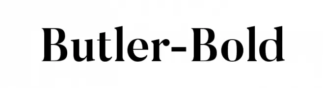 Scaricare 7883 Downloads@WebFont
 -
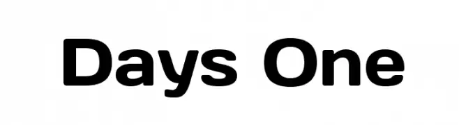
( Copyright (c) 2011, Jovanny Lemonad (http://www.jovanny.ru) )
A bold, modern sans-serif font with rounded edges and consistent stroke thickness.
![Days One font caratteri gratis]() Scaricare 7879 Downloads@WebFont
Scaricare 7879 Downloads@WebFont -
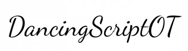
( Fonts by www.impallari.com )
A lively, cursive script font with smooth, flowing connections.
![DancingScriptOT font caratteri gratis]() Scaricare 7879 Downloads@WebFont
Scaricare 7879 Downloads@WebFont -
![24 LED font caratteri gratis]() Scaricare 7878 Downloads@WebFont
Scaricare 7878 Downloads@WebFont -
Caratteri di spideraysfonts. For commercial use please contact the owner.
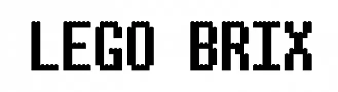
![LEGO BRIX font caratteri gratis]() Scaricare 7877 Downloads@WebFont
Scaricare 7877 Downloads@WebFont -
![Pakenham font caratteri gratis]() Scaricare 7876 Downloads@WebFont
Scaricare 7876 Downloads@WebFont -
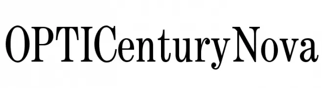
( Fonts by Castcraft Software - opti.netii.net - check the website before use )
A classic serif font with elegant strokes and a timeless feel.
![OPTICenturyNova font caratteri gratis]() Scaricare 7874 Downloads@WebFont
Scaricare 7874 Downloads@WebFont -
( Fonts by a The Branded Quotes - https://sellfy.com/thebrandedquotes. Personal-use only. For commercial use please contact owner. )
A bold, brush-style font with textured, dynamic strokes.
![Chasing Embers font caratteri gratis]() Scaricare 7872 Downloads@WebFont
Scaricare 7872 Downloads@WebFont -
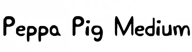
![Peppa Pig Medium font caratteri gratis]() Scaricare 7871 Downloads@WebFont
Scaricare 7871 Downloads@WebFont -
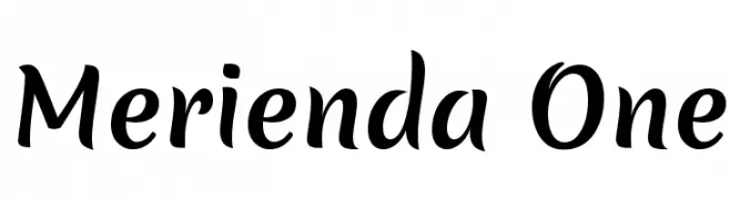
( Copyright (c) 2011, Eduardo Tunni (http://www.tipo.net.ar) )
A playful, handwritten-style font with smooth, rounded strokes.
![Merienda One font caratteri gratis]() Scaricare 7869 Downloads@WebFont
Scaricare 7869 Downloads@WebFont -
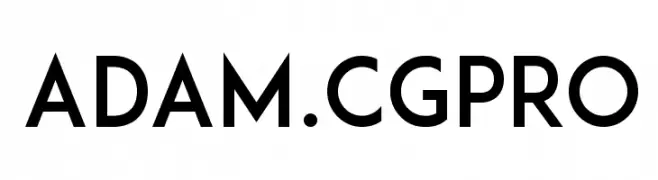
( Fonts by Shrenik Ganatra - Personal-use only. For commercial use please contact owner. )
A clean, geometric typeface with a modern aesthetic and consistent stroke width.
![ADAM.CGPRO font caratteri gratis]() Scaricare 7867 Downloads@WebFont
Scaricare 7867 Downloads@WebFont -
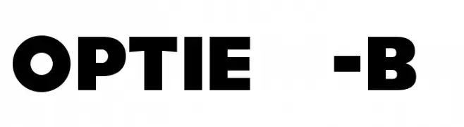
( Fonts by Castcraft Software - opti.netii.net - check the website before use )
A bold, geometric font with strong, impactful letterforms.
![OPTIEagle-Bold font caratteri gratis]() Scaricare 7865 Downloads@WebFont
Scaricare 7865 Downloads@WebFont -
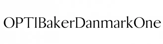
( Fonts by Castcraft Software - opti.netii.net - check the website before use )
A classic serif font with elegant strokes and a timeless design.
![OPTIBakerDanmarkOne font caratteri gratis]() Scaricare 7864 Downloads@WebFont
Scaricare 7864 Downloads@WebFont -
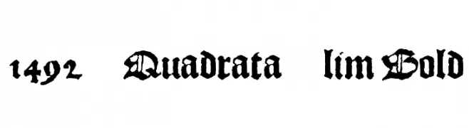
![1492_Quadrata_lim Bold font caratteri gratis]() Scaricare 7854 Downloads@WebFont
Scaricare 7854 Downloads@WebFont -
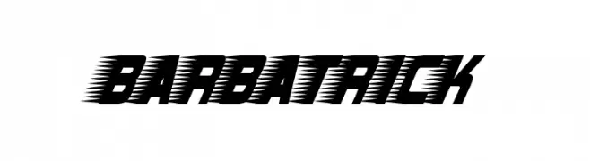
![Barbatrick font caratteri gratis]() Scaricare 7852 Downloads@WebFont
Scaricare 7852 Downloads@WebFont -
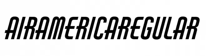
( Fonts by SAJA TYPEWORKS )
A bold, dynamic font with a slight slant and consistent stroke widths, ideal for impactful designs.
![Air America Regular font caratteri gratis]() Scaricare 7851 Downloads@WebFont
Scaricare 7851 Downloads@WebFont -
Caratteri di krraaa. For commercial use please contact the owner.
( Fonts by Lukas Krakora - Free for personal use )
A vintage typewriter-style font with bold, textured characters.
![Bohemian typewriter font caratteri gratis]() Scaricare 7851 Downloads@WebFont
Scaricare 7851 Downloads@WebFont -
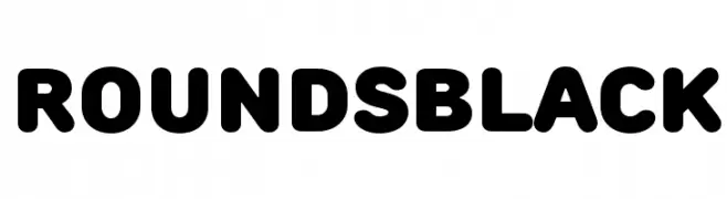
( Fonts by Jovanny Lemonad - typetype.ru - Personal-use only. For commercial use please contact owner. )
A bold, rounded font with smooth curves and a modern, friendly style.
![RoundsBlack font caratteri gratis]() Scaricare 7849 Downloads@WebFont
Scaricare 7849 Downloads@WebFont -
( Fonts by Zetafonts - Personal-use only. For commercial use please contact owner. )
A clean, modern sans-serif font with a semi-light weight and uniform stroke width.
![Cocogoose Pro SemiLight font caratteri gratis]() Scaricare 7848 Downloads@WebFont
Scaricare 7848 Downloads@WebFont -
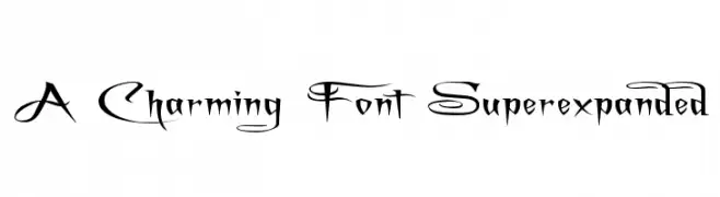
( Fonts by Graham Meade - GemFonts )
An ornate and decorative font with elaborate flourishes and artistic letterforms.
![A Charming Font Superexpanded font caratteri gratis]() Scaricare 7847 Downloads@WebFont
Scaricare 7847 Downloads@WebFont -
( Fonts by Alfredo Marco Pradil - Personal-use only. For commercial use please contact owner. )
A modern, geometric sans-serif font with clean lines and balanced proportions.
![Open Sauce One Regular font caratteri gratis]() Scaricare 7846 Downloads@WebFont
Scaricare 7846 Downloads@WebFont -
![Babylon Industrial font caratteri gratis]() Scaricare 7836 Downloads@WebFont
Scaricare 7836 Downloads@WebFont -
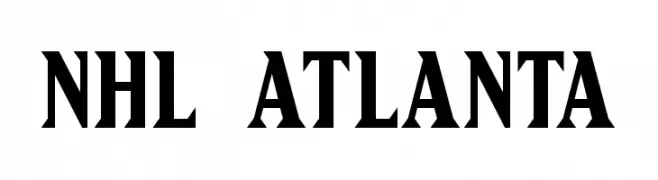
![NHL Atlanta font caratteri gratis]() Scaricare 7833 Downloads@WebFont
Scaricare 7833 Downloads@WebFont -
![Sports FOX Sports UScore font caratteri gratis]() Scaricare 7832 Downloads@WebFont
Scaricare 7832 Downloads@WebFont -
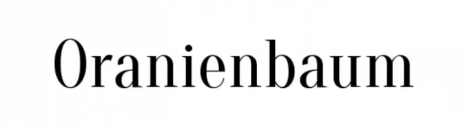
( Copyright (c) 2012, Oleg Pospelov (oleg@pospelov.com), Jovanny Lemonad (lemonad@jovanny.ru), with Reserved Font Name 'Oranienbaum' )
A classic serif font with high contrast and elegant strokes.
![Oranienbaum font caratteri gratis]() Scaricare 7831 Downloads@WebFont
Scaricare 7831 Downloads@WebFont -
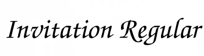
![Invitation Regular font caratteri gratis]() Scaricare 7830 Downloads@WebFont
Scaricare 7830 Downloads@WebFont -
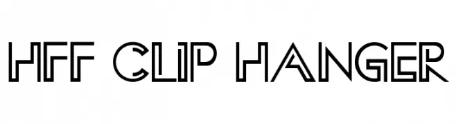
( Fonts by Have Fun with Fonts )
A modern, geometric font with sharp angles and a futuristic style.
![HFF Clip Hanger font caratteri gratis]() Scaricare 7828 Downloads@WebFont
Scaricare 7828 Downloads@WebFont -
( Fonts by Andrew McCluskey - nalgames.com. Personal-use only. For commercial use please contact owner. )
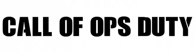
A bold, impactful typeface with a strong, geometric style.
![Call Of Ops Duty font caratteri gratis]() Scaricare 7825 Downloads@WebFont
Scaricare 7825 Downloads@WebFont -
( Fonts by a www.fontfabric.com. Personal-use only. For commercial use please contact owner. )
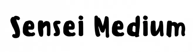
A bold, playful, hand-drawn font with rounded, irregular characters.
![Sensei Medium font caratteri gratis]() Scaricare 7824 Downloads@WebFont
Scaricare 7824 Downloads@WebFont -
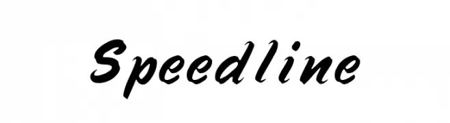
( Fonts by Rick Mueller )
A bold, dynamic script font with flowing, energetic letterforms.
![Speedline font caratteri gratis]() Scaricare 7815 Downloads@WebFont
Scaricare 7815 Downloads@WebFont -
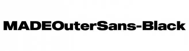
( Fonts by MadeType - Personal-use only. For commercial use please contact owner. )
A bold, modern sans-serif font with a strong and geometric design.
![MADEOuterSans-Black font caratteri gratis]() Scaricare 7811 Downloads@WebFont
Scaricare 7811 Downloads@WebFont -
![321Perfect font caratteri gratis]() Scaricare 7806 Downloads@WebFont
Scaricare 7806 Downloads@WebFont -
![Swansea Bold font caratteri gratis]() Scaricare 7806 Downloads@WebFont
Scaricare 7806 Downloads@WebFont -
![JACKPORT REGULAR NCV font caratteri gratis]() Scaricare 7804 Downloads@WebFont
Scaricare 7804 Downloads@WebFont -
( Fonts by Des Gomez )
A playful, hand-drawn font with a whimsical and bold style.
![Bliss font caratteri gratis]() Scaricare 7803 Downloads@WebFont
Scaricare 7803 Downloads@WebFont


Quali sono i font più popolari adesso?
Poppins, Roboto, Montserrat, Open Sans e Lato sono molto usati per le forme pulite e l'ampia applicabilità — dall'identità di marca alle landing page e ai poster.
Quali font si usano spesso nei loghi?
Le sans serif geometriche (es. Poppins, famiglie in stile Gotham) sono scelte comuni per un branding pulito e scalabile. Per un tocco personale restano valide script e stili manoscritti. Abbina un display deciso per i titoli a un corpo testo neutro per riconoscibilità ed equilibrio.
Ogni quanto si aggiorna la lista?
Con regolarità, in base ai download e all'attività reale. Torna spesso per scoprire in anticipo le nuove preferite.
💡 Consiglio: aggiungi ai preferiti — le tendenze cambiano in fretta e i font top di oggi possono ispirare il rebranding di domani.