Benvenuto nelle Font Più Popolari — dove popolarità e qualità si incontrano. Qui trovi i font più scaricati e usati dell'anno. Se cerchi scelte sicure per logo, web o social, inizia da qui.
Ogni font top si distingue per equilibrio, leggibilità e versatilità. Troverai sans serif moderne, script eleganti, serif vintage e display minimalisti.
-
( Fonts by Typhoon Type - Suthi Srisopha - www.typhoontype.net - Personal-use only. For commercial use please contact owner. )
A dynamic script font with elegant, calligraphic strokes and intricate flourishes.
 Scaricare 209 Downloads@WebFont
 -
( Fonts by Anwar )
A whimsical, playful font with a hand-drawn, animated style.
![Disney font caratteri gratis]() Scaricare 209 Downloads@WebFont
Scaricare 209 Downloads@WebFont -
( Fonts by Darrell Flood )
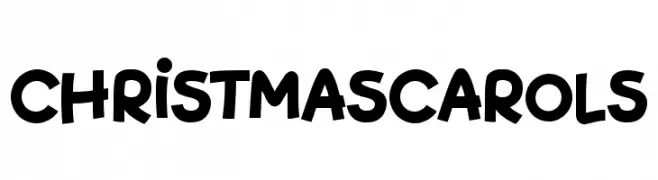
A playful, bold, and rounded font with a hand-drawn, whimsical style.
![Christmas Carols font caratteri gratis]() Scaricare 209 Downloads@WebFont
Scaricare 209 Downloads@WebFont -
( Fonts by Dan P. Lyons - Personal-use only. For commercial use please contact owner. )
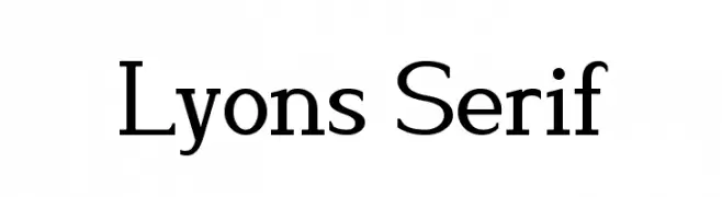
A classic serif typeface with elegant and balanced letterforms.
![Lyons Serif font caratteri gratis]() Scaricare 209 Downloads@WebFont
Scaricare 209 Downloads@WebFont -
( Fonts by madeDeduk )
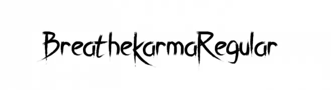
An edgy, hand-drawn font with sharp, elongated strokes and a distressed texture.
![Breathe Karma Regular font caratteri gratis]() Scaricare 209 Downloads@WebFont
Scaricare 209 Downloads@WebFont -
-
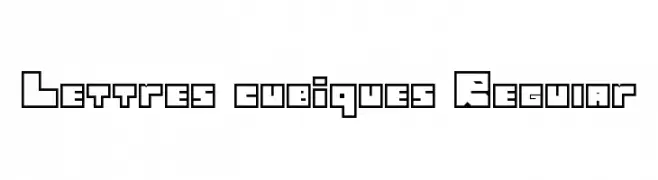
![Lettres cubiques Regular font caratteri gratis]() Scaricare 209 Downloads@WebFont
Scaricare 209 Downloads@WebFont -
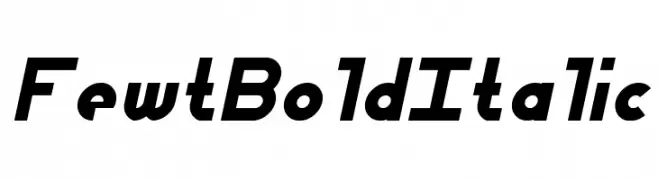
![Fewt Bold Italic font caratteri gratis]() Scaricare 209 Downloads@WebFont
Scaricare 209 Downloads@WebFont -
( Luc Mahler )
A modern, geometric font with a unique cut-out, stencil-like design.
![Mirage font caratteri gratis]() Scaricare 209 Downloads@WebFont
Scaricare 209 Downloads@WebFont -
( Fonts by Emma Kumer )
A whimsical, playful handwritten font with thin, tall letters.
![Kaleidescope font caratteri gratis]() Scaricare 208 Downloads@WebFont
Scaricare 208 Downloads@WebFont -
( Fonts by Style-7 - www.styleseven.com - Personal-use only. For commercial use please contact owner. )
A pixelated, neon-inspired font with a retro digital aesthetic.
![Neon Pixel-7 font caratteri gratis]() Scaricare 208 Downloads@WebFont
Scaricare 208 Downloads@WebFont


Quali sono i font più popolari adesso?
Poppins, Roboto, Montserrat, Open Sans e Lato sono molto usati per le forme pulite e l'ampia applicabilità — dall'identità di marca alle landing page e ai poster.
Quali font si usano spesso nei loghi?
Le sans serif geometriche (es. Poppins, famiglie in stile Gotham) sono scelte comuni per un branding pulito e scalabile. Per un tocco personale restano valide script e stili manoscritti. Abbina un display deciso per i titoli a un corpo testo neutro per riconoscibilità ed equilibrio.
Ogni quanto si aggiorna la lista?
Con regolarità, in base ai download e all'attività reale. Torna spesso per scoprire in anticipo le nuove preferite.
💡 Consiglio: aggiungi ai preferiti — le tendenze cambiano in fretta e i font top di oggi possono ispirare il rebranding di domani.