Benvenuto nelle Font Più Popolari — dove popolarità e qualità si incontrano. Qui trovi i font più scaricati e usati dell'anno. Se cerchi scelte sicure per logo, web o social, inizia da qui.
Ogni font top si distingue per equilibrio, leggibilità e versatilità. Troverai sans serif moderne, script eleganti, serif vintage e display minimalisti.
-
( Fonts by blue studio09 - Personal-use only. For commercial use please contact owner. )
An elegant script font with flowing, cursive letterforms and graceful curves.
 Scaricare 204 Downloads@WebFont
 -
( Fonts by Kong Font - https://fontkong.com/ - Personal-use only. For commercial use please contact owner. )
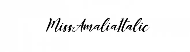
An elegant, flowing script font with an italic slant and ornate flourishes.
![Miss Amalia Italic font caratteri gratis]() Scaricare 204 Downloads@WebFont
Scaricare 204 Downloads@WebFont -
( Fonts by a Des Gomez. Personal-use only. For commercial use please contact owner. )
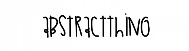
A playful, hand-drawn font with tall, narrow letters and a whimsical style.
![AbstractThing font caratteri gratis]() Scaricare 204 Downloads@WebFont
Scaricare 204 Downloads@WebFont -
( Fonts by www.woodcutter.es - woodcutter Manero - Personal-use only. For commercial use please contact owner. )
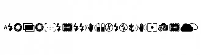
A camera symbol icon font for digital photography interfaces.
![Digital Camera Symbols font caratteri gratis]() Scaricare 204 Downloads@WebFont
Scaricare 204 Downloads@WebFont -
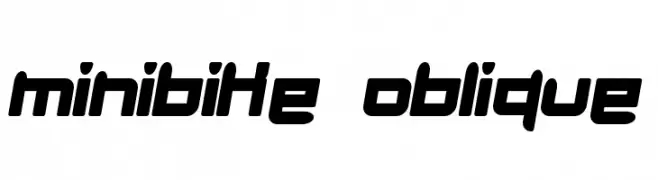
![minibike oblique font caratteri gratis]() Scaricare 204 Downloads@WebFont
Scaricare 204 Downloads@WebFont -
-
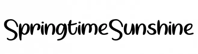
![Springtime Sunshine font caratteri gratis]() Scaricare 204 Downloads@WebFont
Scaricare 204 Downloads@WebFont -
( www.tattoowoo.com )
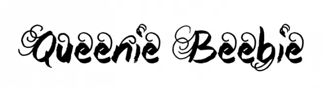
An ornate, decorative font with elaborate swirls and a calligraphic style.
![Queenie Beebie font caratteri gratis]() Scaricare 204 Downloads@WebFont
Scaricare 204 Downloads@WebFont -
( Fonts by Jonathan Smith )
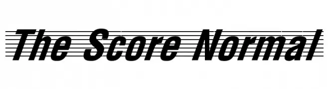
A bold, italicized font with high contrast and dynamic slant.
![The Score Normal font caratteri gratis]() Scaricare 204 Downloads
Scaricare 204 Downloads -
( Fonts by Alex Tomlinson - Skyhaven Fonts - shfonts.com )
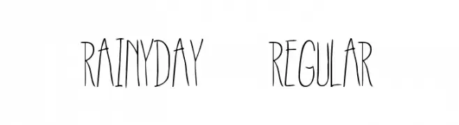
A whimsical, handwritten font with tall, narrow letters and a playful style.
![RainyDay-Regular font caratteri gratis]() Scaricare 204 Downloads@WebFont
Scaricare 204 Downloads@WebFont -
( Fonts by 7NTypes )
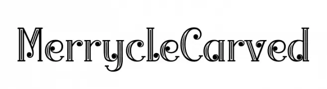
A decorative font with a carved, layered appearance and intricate detailing.
![Merrycle Carved font caratteri gratis]() Scaricare 204 Downloads@WebFont
Scaricare 204 Downloads@WebFont
Quali sono i font più popolari adesso?
Poppins, Roboto, Montserrat, Open Sans e Lato sono molto usati per le forme pulite e l'ampia applicabilità — dall'identità di marca alle landing page e ai poster.
Quali font si usano spesso nei loghi?
Le sans serif geometriche (es. Poppins, famiglie in stile Gotham) sono scelte comuni per un branding pulito e scalabile. Per un tocco personale restano valide script e stili manoscritti. Abbina un display deciso per i titoli a un corpo testo neutro per riconoscibilità ed equilibrio.
Ogni quanto si aggiorna la lista?
Con regolarità, in base ai download e all'attività reale. Torna spesso per scoprire in anticipo le nuove preferite.
💡 Consiglio: aggiungi ai preferiti — le tendenze cambiano in fretta e i font top di oggi possono ispirare il rebranding di domani.