Benvenuto nelle Font Più Popolari — dove popolarità e qualità si incontrano. Qui trovi i font più scaricati e usati dell'anno. Se cerchi scelte sicure per logo, web o social, inizia da qui.
Ogni font top si distingue per equilibrio, leggibilità e versatilità. Troverai sans serif moderne, script eleganti, serif vintage e display minimalisti.
-
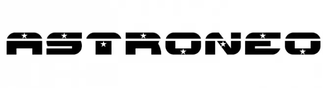
( Fonts by www.typodermicfonts.com - Ray Larabie )
A jagged, angular font with sharp strokes and dynamic energy.
 Scaricare 203 Downloads@WebFont
 -
![ASTRONEO font caratteri gratis]() Scaricare 203 Downloads@WebFont
Scaricare 203 Downloads@WebFont -
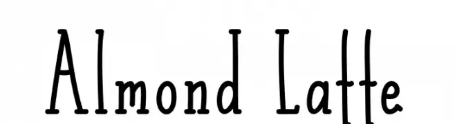
( Fonts by Alde Saputro - aldedesign - https://www.creativefabrica.com/product/the-crafty-holiday-font-bundle/ref/125925/ - Personal-use only. For commercial use please contact owner. )
A playful, hand-drawn font with tall, narrow characters and a whimsical style.
![Almond Latte font caratteri gratis]() Scaricare 203 Downloads@WebFont
Scaricare 203 Downloads@WebFont -
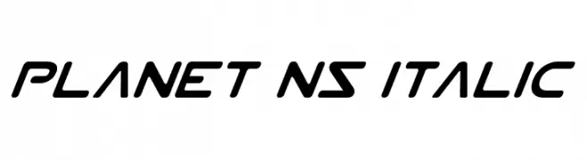
( Fonts by Daniel Zadorozny - www.iconian.com - Free for personal use )
A sleek, futuristic italic font with smooth lines and a dynamic appearance.
![Planet NS Italic font caratteri gratis]() Scaricare 203 Downloads@WebFont
Scaricare 203 Downloads@WebFont -
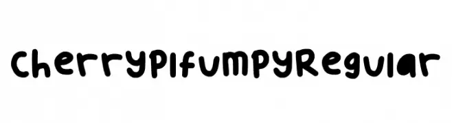
( Fonts by kimwinnie )
A playful, bold typeface with rounded, bubbly characters and a hand-drawn feel.
![Cherryplfumpy Regular font caratteri gratis]() Scaricare 203 Downloads@WebFont
Scaricare 203 Downloads@WebFont -
-
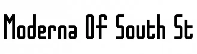
( Southype - southype.com )
A bold, geometric font with a modern and minimalistic style.
![Moderna Of South St font caratteri gratis]() Scaricare 203 Downloads@WebFont
Scaricare 203 Downloads@WebFont -
![mine oh mine font caratteri gratis]() Scaricare 203 Downloads@WebFont
Scaricare 203 Downloads@WebFont -
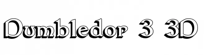
( Fonts by Graham Meade - GemFonts )
A bold, 3D serif font with sharp angles and dramatic flair.
![Dumbledor 3 3D font caratteri gratis]() Scaricare 203 Downloads@WebFont
Scaricare 203 Downloads@WebFont -
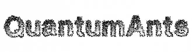
( Fonts by a Max Infeld - XEROGRAPHER FONTS - xerographer.blogspot.com . Personal-use only. For commercial use please contact owner. )
A dotted, textured font with a playful and abstract style.
![QuantumAnts font caratteri gratis]() Scaricare 203 Downloads@WebFont
Scaricare 203 Downloads@WebFont -
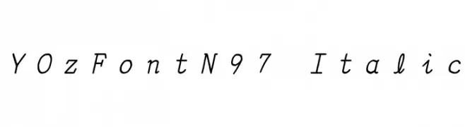
![YOzFontN97 Italic font caratteri gratis]() Scaricare 203 Downloads@WebFont
Scaricare 203 Downloads@WebFont

Quali sono i font più popolari adesso?
Poppins, Roboto, Montserrat, Open Sans e Lato sono molto usati per le forme pulite e l'ampia applicabilità — dall'identità di marca alle landing page e ai poster.
Quali font si usano spesso nei loghi?
Le sans serif geometriche (es. Poppins, famiglie in stile Gotham) sono scelte comuni per un branding pulito e scalabile. Per un tocco personale restano valide script e stili manoscritti. Abbina un display deciso per i titoli a un corpo testo neutro per riconoscibilità ed equilibrio.
Ogni quanto si aggiorna la lista?
Con regolarità, in base ai download e all'attività reale. Torna spesso per scoprire in anticipo le nuove preferite.
💡 Consiglio: aggiungi ai preferiti — le tendenze cambiano in fretta e i font top di oggi possono ispirare il rebranding di domani.