Benvenuto nelle Font Più Popolari — dove popolarità e qualità si incontrano. Qui trovi i font più scaricati e usati dell'anno. Se cerchi scelte sicure per logo, web o social, inizia da qui.
Ogni font top si distingue per equilibrio, leggibilità e versatilità. Troverai sans serif moderne, script eleganti, serif vintage e display minimalisti.
-
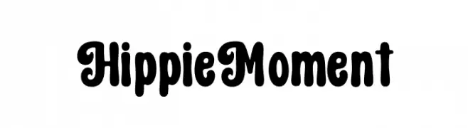
( Fonts by Hoperative )
A playful, retro font with bold, rounded characters and whimsical curls.
 Scaricare 198 Downloads@WebFont
 -
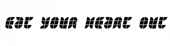
( Fonts by Jacob Fisher - www.pizzadude.dk )
A bold, segmented geometric font with a modern and playful style.
![Eat your heart out font caratteri gratis]() Scaricare 198 Downloads@WebFont
Scaricare 198 Downloads@WebFont -
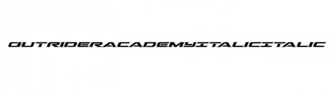
( Iconian Fonts - Daniel Zadorozny - www.iconian.com )
A bold, italicized font with a modern, dynamic style.
![Outrider Academy Italic Italic font caratteri gratis]() Scaricare 198 Downloads@WebFont
Scaricare 198 Downloads@WebFont -
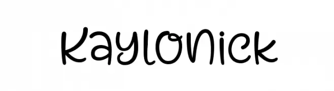
( 7NTypes - Situjuh Nazara - 7ntypes.com )
A playful, hand-drawn style font with rounded, flowing characters.
![Kaylonick font caratteri gratis]() Scaricare 198 Downloads@WebFont
Scaricare 198 Downloads@WebFont -
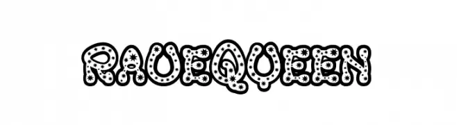
( Fonts by www.fontalicious.com )
A bold, star-patterned decorative font with a playful and energetic style.
![RaveQueen font caratteri gratis]() Scaricare 198 Downloads@WebFont
Scaricare 198 Downloads@WebFont -
-
( Fonts by Grafito Design - dibujosenlinea.ideasintegrales.net )
A bold, angular font with a chiseled, geometric style.
![talacha font caratteri gratis]() Scaricare 198 Downloads@WebFont
Scaricare 198 Downloads@WebFont -
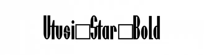
![Utusi Star Bold font caratteri gratis]() Scaricare 198 Downloads@WebFont
Scaricare 198 Downloads@WebFont -
( Font by Jonathan Harris - www.tattoowoo.com )
A decorative font with intricate jewelry-like shapes and classic serif numbers.
![Jewelry Design Shapes font caratteri gratis]() Scaricare 198 Downloads@WebFont
Scaricare 198 Downloads@WebFont -
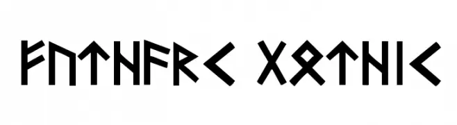
( Digital Type Foundry - www.digitaltypefoundry.com/ )
A bold, angular font inspired by ancient runic alphabets, perfect for historical or fantasy themes.
![Futhark-Gothic font caratteri gratis]() Scaricare 198 Downloads@WebFont
Scaricare 198 Downloads@WebFont -
![Krugovis-Italic font caratteri gratis]() Scaricare 198 Downloads@WebFont
Scaricare 198 Downloads@WebFont

Quali sono i font più popolari adesso?
Poppins, Roboto, Montserrat, Open Sans e Lato sono molto usati per le forme pulite e l'ampia applicabilità — dall'identità di marca alle landing page e ai poster.
Quali font si usano spesso nei loghi?
Le sans serif geometriche (es. Poppins, famiglie in stile Gotham) sono scelte comuni per un branding pulito e scalabile. Per un tocco personale restano valide script e stili manoscritti. Abbina un display deciso per i titoli a un corpo testo neutro per riconoscibilità ed equilibrio.
Ogni quanto si aggiorna la lista?
Con regolarità, in base ai download e all'attività reale. Torna spesso per scoprire in anticipo le nuove preferite.
💡 Consiglio: aggiungi ai preferiti — le tendenze cambiano in fretta e i font top di oggi possono ispirare il rebranding di domani.