Benvenuto nelle Font Più Popolari — dove popolarità e qualità si incontrano. Qui trovi i font più scaricati e usati dell'anno. Se cerchi scelte sicure per logo, web o social, inizia da qui.
Ogni font top si distingue per equilibrio, leggibilità e versatilità. Troverai sans serif moderne, script eleganti, serif vintage e display minimalisti.
-
( Fonts by Des Gomez )
A playful, handwritten font with bold, rounded characters and whimsical special symbols.
 Scaricare 197 Downloads@WebFont
 -
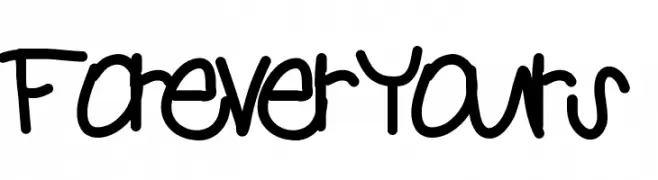
( Fonts by Nate Piekos - www.blambot.com )
A playful, bold, hand-drawn font with a whimsical and organic feel.
![PiranhaSexual font caratteri gratis]() Scaricare 197 Downloads@WebFont
Scaricare 197 Downloads@WebFont -
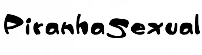
( Fonts by Daegeseage Daisy. Personal-use only. For commercial use please contact owner. )
A playful handwritten font with irregular strokes and a whimsical appearance.
![menlotus font caratteri gratis]() Scaricare 197 Downloads@WebFont
Scaricare 197 Downloads@WebFont -
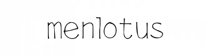
( Fonts by Vladimir Nikolic )
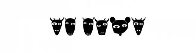
A playful decorative font featuring unique animal face illustrations for each character.
![Nature Regular font caratteri gratis]() Scaricare 197 Downloads@WebFont
Scaricare 197 Downloads@WebFont -
![AndreaKarimealtasybajas-Reg font caratteri gratis]() Scaricare 197 Downloads@WebFont
Scaricare 197 Downloads@WebFont -
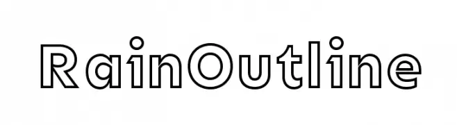
( Fonts by CannotIntoSpaceFonts - KineticPlasma Fonts - Personal-use only. For commercial use please contact owner. )
A modern, geometric sans-serif font with an outline style for bold visual impact.
![Rain Outline font caratteri gratis]() Scaricare 197 Downloads@WebFont
Scaricare 197 Downloads@WebFont -
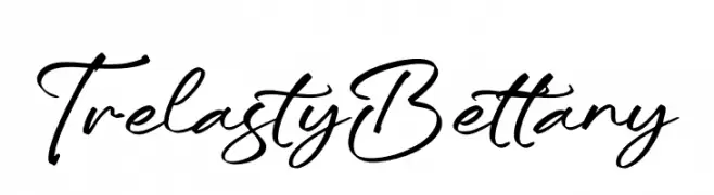
( Fonts by Integritype Studio )
A graceful, flowing script font with a natural handwriting appearance.
![Trelasty Bettany font caratteri gratis]() Scaricare 197 Downloads@WebFont
Scaricare 197 Downloads@WebFont -
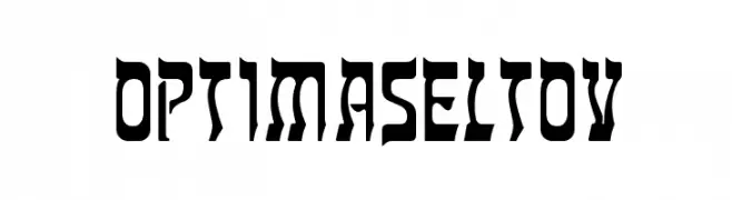
( Fonts by Castcraft Software - opti.netii.net - check the website before use )
A bold, angular font with a futuristic and striking design.
![OPTIMaseltov font caratteri gratis]() Scaricare 197 Downloads@WebFont
Scaricare 197 Downloads@WebFont -
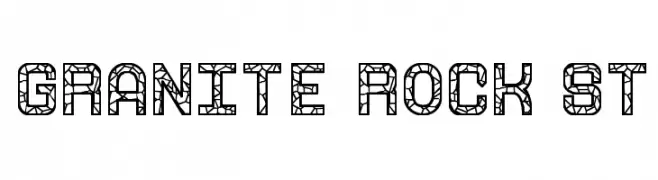
( Fonts by Southype )
A bold, geometric font with a cracked stone pattern, offering a modern and edgy look.
![Granite Rock St font caratteri gratis]() Scaricare 197 Downloads@WebFont
Scaricare 197 Downloads@WebFont -
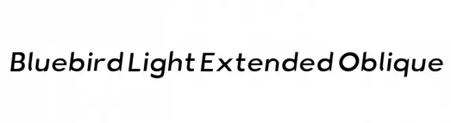
![Bluebird Light Extended Oblique font caratteri gratis]() Scaricare 197 Downloads@WebFont
Scaricare 197 Downloads@WebFont
Quali sono i font più popolari adesso?
Poppins, Roboto, Montserrat, Open Sans e Lato sono molto usati per le forme pulite e l'ampia applicabilità — dall'identità di marca alle landing page e ai poster.
Quali font si usano spesso nei loghi?
Le sans serif geometriche (es. Poppins, famiglie in stile Gotham) sono scelte comuni per un branding pulito e scalabile. Per un tocco personale restano valide script e stili manoscritti. Abbina un display deciso per i titoli a un corpo testo neutro per riconoscibilità ed equilibrio.
Ogni quanto si aggiorna la lista?
Con regolarità, in base ai download e all'attività reale. Torna spesso per scoprire in anticipo le nuove preferite.
💡 Consiglio: aggiungi ai preferiti — le tendenze cambiano in fretta e i font top di oggi possono ispirare il rebranding di domani.