Benvenuto nelle Font Più Popolari — dove popolarità e qualità si incontrano. Qui trovi i font più scaricati e usati dell'anno. Se cerchi scelte sicure per logo, web o social, inizia da qui.
Ogni font top si distingue per equilibrio, leggibilità e versatilità. Troverai sans serif moderne, script eleganti, serif vintage e display minimalisti.
-
( Fonts by 4th february - Personal-use only. For commercial use please contact owner. )
A bold, geometric font with strong, angular lines and a modern aesthetic.
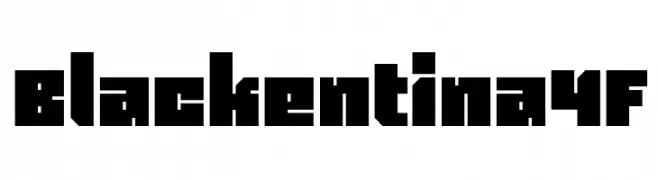 Scaricare 196 Downloads@WebFont
 -
( Fonts by Dieter Steffmann )
An ornate and decorative typeface with intricate flourishes.
![Elzevier Caps Regular font caratteri gratis]() Scaricare 196 Downloads@WebFont
Scaricare 196 Downloads@WebFont -
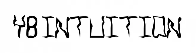
![YB Intuition font caratteri gratis]() Scaricare 196 Downloads@WebFont
Scaricare 196 Downloads@WebFont -
( Copyright (c) 2015, Cadson Demak (info@cadsondemak.com) )
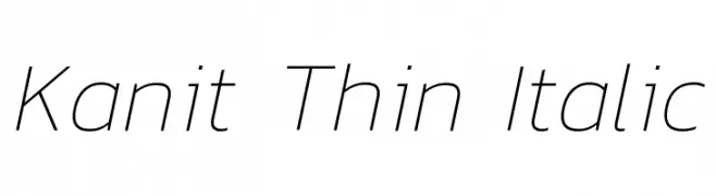
A sleek, modern, and thin italic font with a clean and elegant design.
![Kanit Thin Italic font caratteri gratis]() Scaricare 196 Downloads@WebFont
Scaricare 196 Downloads@WebFont -
( Fonts by MadeType - Personal-use only. For commercial use please contact owner. )
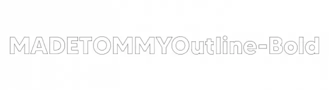
A bold, geometric sans-serif font with a unique outline effect.
![MADETOMMYOutline-Bold font caratteri gratis]() Scaricare 196 Downloads@WebFont
Scaricare 196 Downloads@WebFont -
-
( Fonts by Rich Gast - www.greywolfwebworks.com OFF SITE )
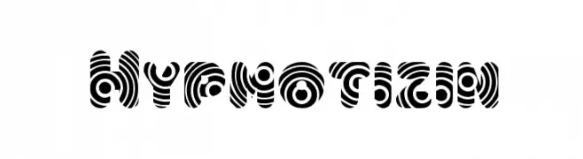
A bold, hypnotic font with swirling circular patterns.
![Hypmotizin font caratteri gratis]() Scaricare 196 Downloads
Scaricare 196 Downloads -
( Fonts by www.fenotype.com )
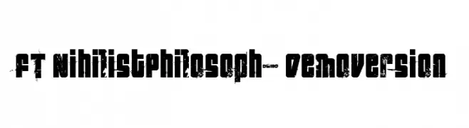
A bold, distressed font with a grunge aesthetic and uniform character width.
![FT NihilistPhilosophy Demoversion font caratteri gratis]() Scaricare 196 Downloads@WebFont
Scaricare 196 Downloads@WebFont -
( Fonts by Apostrophic Lab )
A sophisticated, condensed italic font with a classic yet modern feel.
![Covington SC Cond Italic font caratteri gratis]() Scaricare 196 Downloads@WebFont
Scaricare 196 Downloads@WebFont -
( winty5.wix.com/noahtheawesome )
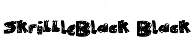
A bold, hand-drawn font with a playful, scribbled texture.
![SkribbleBlack Black font caratteri gratis]() Scaricare 196 Downloads@WebFont
Scaricare 196 Downloads@WebFont -
( Fonts by a Neale Davidson - www.pixelsagas.com. Personal-use only. For commercial use please contact owner. )
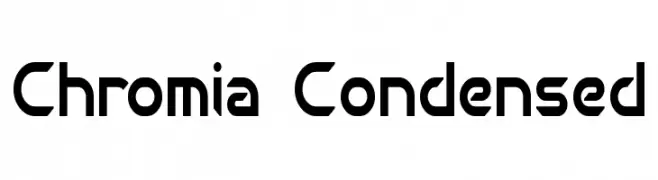
A modern, geometric font with a condensed and angular design.
![Chromia Condensed font caratteri gratis]() Scaricare 196 Downloads@WebFont
Scaricare 196 Downloads@WebFont


Quali sono i font più popolari adesso?
Poppins, Roboto, Montserrat, Open Sans e Lato sono molto usati per le forme pulite e l'ampia applicabilità — dall'identità di marca alle landing page e ai poster.
Quali font si usano spesso nei loghi?
Le sans serif geometriche (es. Poppins, famiglie in stile Gotham) sono scelte comuni per un branding pulito e scalabile. Per un tocco personale restano valide script e stili manoscritti. Abbina un display deciso per i titoli a un corpo testo neutro per riconoscibilità ed equilibrio.
Ogni quanto si aggiorna la lista?
Con regolarità, in base ai download e all'attività reale. Torna spesso per scoprire in anticipo le nuove preferite.
💡 Consiglio: aggiungi ai preferiti — le tendenze cambiano in fretta e i font top di oggi possono ispirare il rebranding di domani.