Benvenuto nelle Font Più Popolari — dove popolarità e qualità si incontrano. Qui trovi i font più scaricati e usati dell'anno. Se cerchi scelte sicure per logo, web o social, inizia da qui.
Ogni font top si distingue per equilibrio, leggibilità e versatilità. Troverai sans serif moderne, script eleganti, serif vintage e display minimalisti.
-
( Fonts by Apostrophic Lab )
A modern, italicized font with a sleek, futuristic style and consistent stroke thickness.
 Scaricare 842 Downloads@WebFont
 -
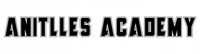
( Fonts by Daniel Zadorozny - www.iconian.com )
A bold, outlined font with a modern, geometric style.
![Anitlles Academy font caratteri gratis]() Scaricare 842 Downloads@WebFont
Scaricare 842 Downloads@WebFont -
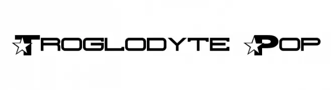
( Fonts by Apostrophic Lab )
A bold, modern font with star motifs and geometric design.
![Troglodyte Pop font caratteri gratis]() Scaricare 842 Downloads@WebFont
Scaricare 842 Downloads@WebFont -
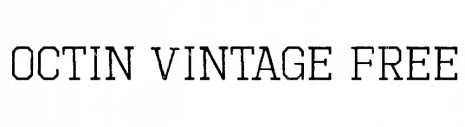
( Fonts by www.typodermicfonts.com - Ray Larabie )
A bold, distressed font with a vintage, industrial style.
![Octin Vintage Free font caratteri gratis]() Scaricare 842 Downloads@WebFont
Scaricare 842 Downloads@WebFont -
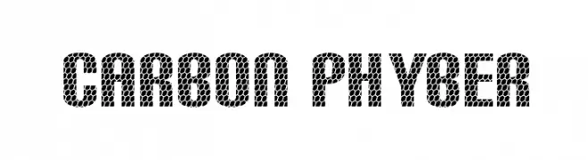
![Carbon Phyber font caratteri gratis]() Scaricare 842 Downloads@WebFont
Scaricare 842 Downloads@WebFont -
![2Toon font caratteri gratis]() Scaricare 842 Downloads@WebFont
Scaricare 842 Downloads@WebFont -
( Fonts by Khurasan )
A bold, playful font with a hand-drawn, dynamic style.
![Ponari font caratteri gratis]() Scaricare 841 Downloads@WebFont
Scaricare 841 Downloads@WebFont -
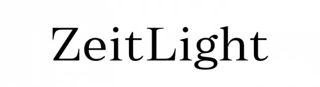
( Fonts by Fenotype - Emil Bertell - Personal-use only. For commercial use please contact owner. )
A refined serif font with elegant, thin strokes and high contrast.
![Zeit Light font caratteri gratis]() Scaricare 841 Downloads@WebFont
Scaricare 841 Downloads@WebFont -
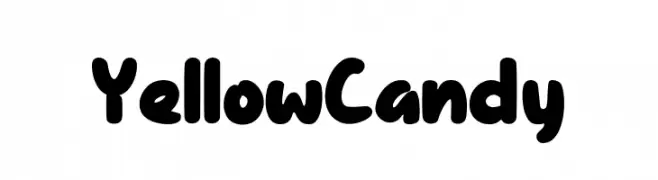
( Fonts by Dacatype Studio )
A playful, bold font with rounded, bubbly characters and a whimsical style.
![Yellow Candy font caratteri gratis]() Scaricare 841 Downloads@WebFont
Scaricare 841 Downloads@WebFont -
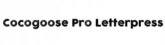
( Fonts by Zetafonts - Personal-use only. For commercial use please contact owner. )
A bold, distressed letterpress-style font with a vintage, rugged look.
![Cocogoose Pro Letterpress font caratteri gratis]() Scaricare 841 Downloads@WebFont
Scaricare 841 Downloads@WebFont -
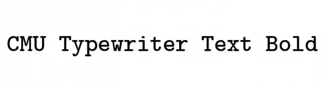
( Fonts by Donald E. Knuth - Personal-use only. For commercial use please contact owner. )
A bold, monospaced typewriter-style font with a vintage aesthetic.
![CMU Typewriter Text Bold font caratteri gratis]() Scaricare 841 Downloads@WebFont
Scaricare 841 Downloads@WebFont -
( Casey Burns - caseyburns.com )
A bold, playful font with rounded, hand-drawn characters.
![Squa Tront! font caratteri gratis]() Scaricare 841 Downloads@WebFont
Scaricare 841 Downloads@WebFont -
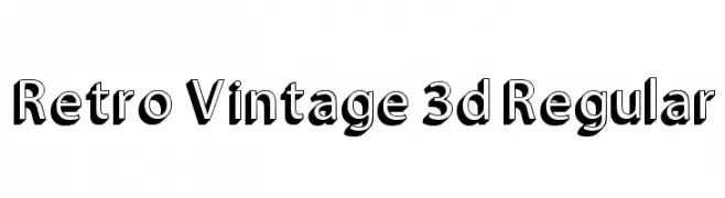
![Retro Vintage 3d Regular font caratteri gratis]() Scaricare 841 Downloads@WebFont
Scaricare 841 Downloads@WebFont -
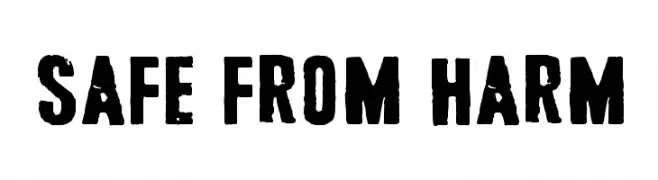
( Fonts by junkohanhero )
A bold, distressed font with a vintage, industrial feel.
![Safe from harm font caratteri gratis]() Scaricare 841 Downloads@WebFont
Scaricare 841 Downloads@WebFont -
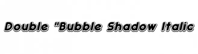
( Fonts by Studio Typo )
A bold, playful font with a double-layered shadow and italic slant.
![Double]() Scaricare 841 Downloads@WebFont
Scaricare 841 Downloads@WebFont -
( Copyright (c) 2011-2012, Martin Sommaruga (martin@estudiotrama.com), with Reserved Font Name 'Rambla' )
A modern sans-serif font with balanced proportions and smooth curves.
![Rambla font caratteri gratis]() Scaricare 841 Downloads@WebFont
Scaricare 841 Downloads@WebFont -
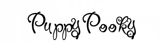
![PuppyPooky font caratteri gratis]() Scaricare 841 Downloads@WebFont
Scaricare 841 Downloads@WebFont -
( Fonts by Arkandis Digital Foundry )
A modern, oblique sans-serif font with balanced proportions and clean lines.
![VeranaSansMedium-Oblique font caratteri gratis]() Scaricare 841 Downloads@WebFont
Scaricare 841 Downloads@WebFont -
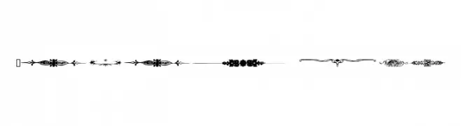
( Fonts by www.houseoflime.com )
Intricate vintage-style decorative dividers.
![Dividers font caratteri gratis]() Scaricare 841 Downloads@WebFont
Scaricare 841 Downloads@WebFont -
( Fonts by Taylor Baybutt - ikon3.com - Free for personal use only )
A hand-crafted, calligraphic font with bold, irregular strokes.
![The Missus Hand Strong font caratteri gratis]() Scaricare 841 Downloads@WebFont
Scaricare 841 Downloads@WebFont -
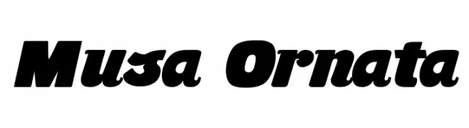
( Fonts by Fernando Carvente - serifdechocolate.wordpress.com )
A bold, dynamic font with thick strokes and a slight slant.
![Musa Ornata font caratteri gratis]() Scaricare 841 Downloads@WebFont
Scaricare 841 Downloads@WebFont -
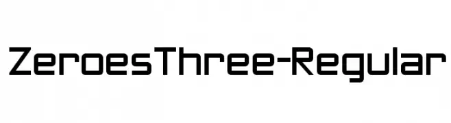
( Fonts by www.typodermicfonts.com - Ray Larabie )
A geometric, modern font with clean lines and sharp angles.
![ZeroesThree-Regular font caratteri gratis]() Scaricare 841 Downloads@WebFont
Scaricare 841 Downloads@WebFont -
![Roar font caratteri gratis]() Scaricare 841 Downloads@WebFont
Scaricare 841 Downloads@WebFont -
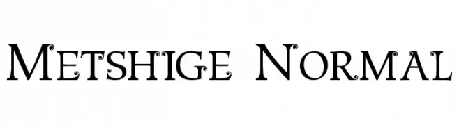
![Metshige Normal font caratteri gratis]() Scaricare 841 Downloads@WebFont
Scaricare 841 Downloads@WebFont -
![Milk Cocoa [sRB] font caratteri gratis]() Scaricare 841 Downloads@WebFont
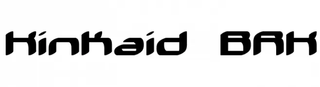
Scaricare 841 Downloads@WebFont -
![Kinkaid BRK font caratteri gratis]() Scaricare 841 Downloads@WebFont
Scaricare 841 Downloads@WebFont -
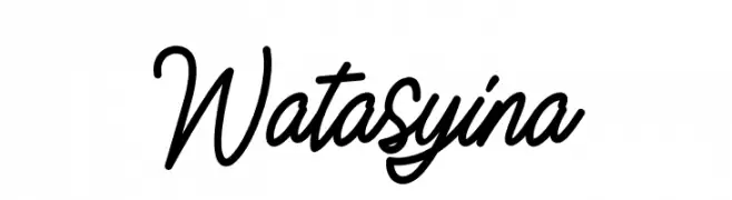
( Fonts by Alif Quentin - Personal-use only. For commercial use please contact owner. )
A cursive, handwritten-style font with smooth, connected letters.
![Watasyina font caratteri gratis]() Scaricare 840 Downloads@WebFont
Scaricare 840 Downloads@WebFont -
( Vladimir Nikolic - www.coroflot.com/vladimirnikolic )
A bold, collegiate-style font with outlined, blocky characters.
![Soccer League College Regular font caratteri gratis]() Scaricare 840 Downloads@WebFont
Scaricare 840 Downloads@WebFont -
( Fonts by Renato Forster - forster.im - Personal-use only. For commercial use please contact owner. )
A sophisticated serif font with high contrast and elegant serifs.
![Voor font caratteri gratis]() Scaricare 840 Downloads@WebFont
Scaricare 840 Downloads@WebFont -
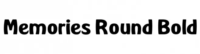
( Fonts by Dan P. Lyons - Personal-use only. For commercial use please contact owner. )
A bold, rounded font with a playful and friendly style.
![Memories Round Bold font caratteri gratis]() Scaricare 840 Downloads@WebFont
Scaricare 840 Downloads@WebFont -
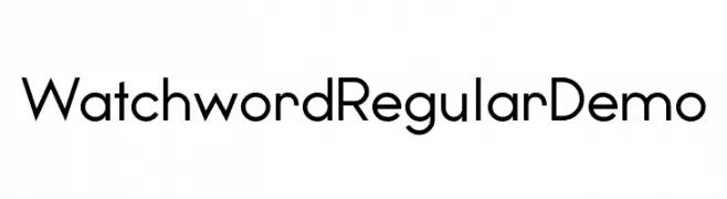
( Fonts by www.studiotypo.com - Personal-use only. For commercial use please contact owner. )
A modern sans-serif font with geometric structure and balanced appearance.
![Watchword Regular Demo font caratteri gratis]() Scaricare 840 Downloads@WebFont
Scaricare 840 Downloads@WebFont -
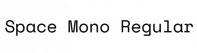
( Copyright 2016 Google Inc. All Rights Reserved. )
A modern, monospaced font with geometric shapes and low contrast.
![Space Mono Regular font caratteri gratis]() Scaricare 840 Downloads@WebFont
Scaricare 840 Downloads@WebFont -
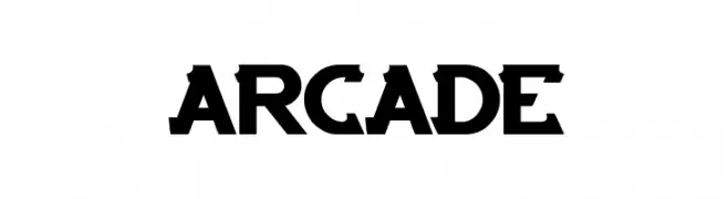
( Fonts by Wino S Kadir - weknow - www.revolge.com/shop/weknow/ - Personal-use only. For commercial use please contact owner. )
A bold, geometric font with a futuristic, arcade-inspired style.
![ARCADE font caratteri gratis]() Scaricare 840 Downloads@WebFont
Scaricare 840 Downloads@WebFont -
![Armata Hairline font caratteri gratis]() Scaricare 840 Downloads@WebFont
Scaricare 840 Downloads@WebFont -
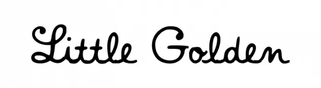
( Fonts by a fontgrill.com. Personal-use only. For commercial use please contact owner. )
A playful, hand-drawn script font with smooth curves and loops.
![Little Golden font caratteri gratis]() Scaricare 840 Downloads@WebFont
Scaricare 840 Downloads@WebFont


![Milk Cocoa [sRB] font caratteri gratis](https://d144mzi0q5mijx.cloudfront.net/img/M/I/Milk-Cocoa-sRB.webp)


Quali sono i font più popolari adesso?
Poppins, Roboto, Montserrat, Open Sans e Lato sono molto usati per le forme pulite e l'ampia applicabilità — dall'identità di marca alle landing page e ai poster.
Quali font si usano spesso nei loghi?
Le sans serif geometriche (es. Poppins, famiglie in stile Gotham) sono scelte comuni per un branding pulito e scalabile. Per un tocco personale restano valide script e stili manoscritti. Abbina un display deciso per i titoli a un corpo testo neutro per riconoscibilità ed equilibrio.
Ogni quanto si aggiorna la lista?
Con regolarità, in base ai download e all'attività reale. Torna spesso per scoprire in anticipo le nuove preferite.
💡 Consiglio: aggiungi ai preferiti — le tendenze cambiano in fretta e i font top di oggi possono ispirare il rebranding di domani.