Benvenuto nelle Font Più Popolari — dove popolarità e qualità si incontrano. Qui trovi i font più scaricati e usati dell'anno. Se cerchi scelte sicure per logo, web o social, inizia da qui.
Ogni font top si distingue per equilibrio, leggibilità e versatilità. Troverai sans serif moderne, script eleganti, serif vintage e display minimalisti.
-
( Fonts by Castcraft Software - opti.netii.net - check the website before use )
A bold, high-contrast serif font with a classic and authoritative style.
 Scaricare 7570 Downloads@WebFont
 -
![Disintegration font caratteri gratis]() Scaricare 7570 Downloads@WebFont
Scaricare 7570 Downloads@WebFont -
( Fonts by a Youssef Habchi - youssef-habchi.com. Personal-use only. For commercial use please contact owner. )
A bold, geometric font with a modern, industrial style.
![SablonUp-Regular font caratteri gratis]() Scaricare 7568 Downloads@WebFont
Scaricare 7568 Downloads@WebFont -
( Fonts by Jose Roses - Personal-use only. For commercial use please contact owner. )
A bold, playful font with exaggerated, chunky letterforms.
![Lapsus Pro Bold font caratteri gratis]() Scaricare 7563 Downloads@WebFont
Scaricare 7563 Downloads@WebFont -
( Fonts by Manjali Studio )
A playful, bold font with rounded, thick strokes and a hand-drawn feel.
![CHICKEN Pie Height font caratteri gratis]() Scaricare 7562 Downloads@WebFont
Scaricare 7562 Downloads@WebFont -
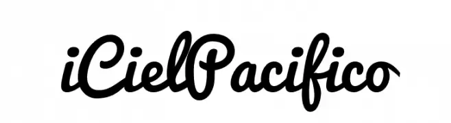
![iCielPacifico font caratteri gratis]() Scaricare 7562 Downloads@WebFont
Scaricare 7562 Downloads@WebFont -
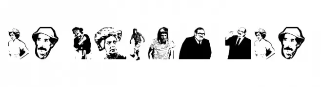
( Fonts by Rodrigo German - RASDESIGN )
A character-based decorative font using illustrated portraits instead of standard letterforms.
![EL CHAVO DEL 8 font caratteri gratis]() Scaricare 7560 Downloads@WebFont
Scaricare 7560 Downloads@WebFont -
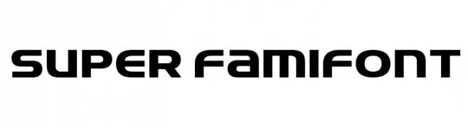
![Super FamiFont font caratteri gratis]() Scaricare 7557 Downloads@WebFont
Scaricare 7557 Downloads@WebFont -
( Copyright 2015 The Mina Project Authors, with Reserved Font Name 'Exo' )
A bold, modern sans-serif font with clean lines and strong presence.
![Mina Bold font caratteri gratis]() Scaricare 7553 Downloads@WebFont
Scaricare 7553 Downloads@WebFont -
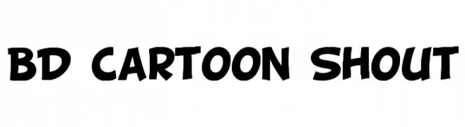
![BD Cartoon Shout font caratteri gratis]() Scaricare 7547 Downloads@WebFont
Scaricare 7547 Downloads@WebFont -
![AMCAP Eternal font caratteri gratis]() Scaricare 7544 Downloads@WebFont
Scaricare 7544 Downloads@WebFont -
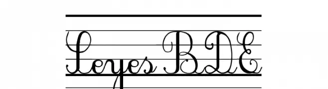
![SeyesBDE font caratteri gratis]() Scaricare 7544 Downloads@WebFont
Scaricare 7544 Downloads@WebFont -
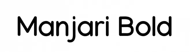
( Copyright 2018 The Manjari Project Authors (https://github.com/smc/manjari )
A modern, rounded sans-serif font with a bold weight and friendly appearance.
![Manjari Bold font caratteri gratis]() Scaricare 7543 Downloads@WebFont
Scaricare 7543 Downloads@WebFont -
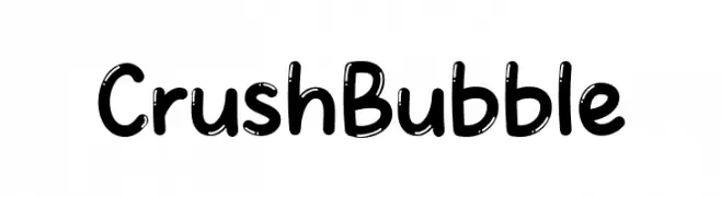
( Fonts by MJType )
A playful, bubbly font with rounded, thick strokes and a whimsical touch.
![Crush Bubble font caratteri gratis]() Scaricare 7540 Downloads@WebFont
Scaricare 7540 Downloads@WebFont -
( Fonts by Rob Villareal )
A bold, distressed font with a rebellious, grunge aesthetic.
![Misfits font caratteri gratis]() Scaricare 7540 Downloads@WebFont
Scaricare 7540 Downloads@WebFont -
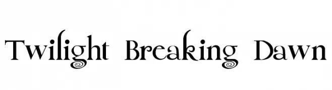
( Fonts by www.alphabetype.it )
A decorative serif font with elegant flourishes and a dramatic style.
![Twilight Breaking Dawn font caratteri gratis]() Scaricare 7538 Downloads@WebFont
Scaricare 7538 Downloads@WebFont -
![Duo-Line Regular font caratteri gratis]() Scaricare 7534 Downloads@WebFont
Scaricare 7534 Downloads@WebFont -
( Copyright (c) 2010-2016, Khaled Hosny (
A bold, classic serif font with strong, authoritative strokes and elegant serifs.
![Amiri Bold font caratteri gratis]() Scaricare 7532 Downloads@WebFont
Scaricare 7532 Downloads@WebFont -
( Fonts by www.26plus-zeichen.de )
A bold, modern sans-serif font with clean lines and strong readability.
![Melbourne-Bold font caratteri gratis]() Scaricare 7529 Downloads@WebFont
Scaricare 7529 Downloads@WebFont -
( Copyright (c) 2014, Erin McLaughlin (hello@erinmclaughlin.com). Digitized data copyright 2010, Google Corporation. )
A bold, modern sans-serif typeface with strong, thick strokes.
![Khula ExtraBold font caratteri gratis]() Scaricare 7528 Downloads@WebFont
Scaricare 7528 Downloads@WebFont -
( Fonts by Get Studio - Personal-use only. For commercial use please contact owner. )
A dynamic, cursive script font with expressive, fluid strokes.
![Quentin font caratteri gratis]() Scaricare 7526 Downloads@WebFont
Scaricare 7526 Downloads@WebFont -
![Florida Project Phase One font caratteri gratis]() Scaricare 7523 Downloads@WebFont
Scaricare 7523 Downloads@WebFont -
![20 CENTS MARKER Bold font caratteri gratis]() Scaricare 7521 Downloads@WebFont
Scaricare 7521 Downloads@WebFont -
![Oktoberfest font caratteri gratis]() Scaricare 7513 Downloads@WebFont
Scaricare 7513 Downloads@WebFont -
![RADAGUND font caratteri gratis]() Scaricare 7511 Downloads@WebFont
Scaricare 7511 Downloads@WebFont -
( Font by kingthingsfonts.co.uk )
A festive, decorative font with snowflake and star motifs, perfect for holiday themes.
![Kingthings Christmas 2 font caratteri gratis]() Scaricare 7506 Downloads@WebFont
Scaricare 7506 Downloads@WebFont -
![AbcKids font caratteri gratis]() Scaricare 7504 Downloads@WebFont
Scaricare 7504 Downloads@WebFont -
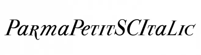
( Fonts by Manfred Klein - manfred-klein.ina-mar.com )
An elegant serif italic font with moderate contrast and refined style.
![ParmaPetitSCItalic font caratteri gratis]() Scaricare 7501 Downloads@WebFont
Scaricare 7501 Downloads@WebFont -
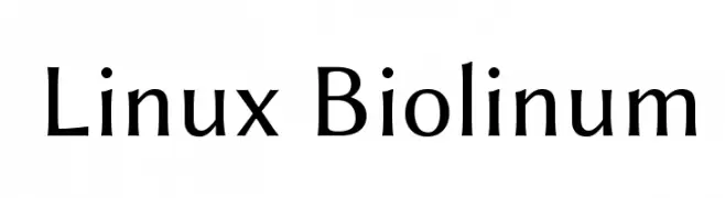
![Linux Biolinum font caratteri gratis]() Scaricare 7495 Downloads@WebFont
Scaricare 7495 Downloads@WebFont -
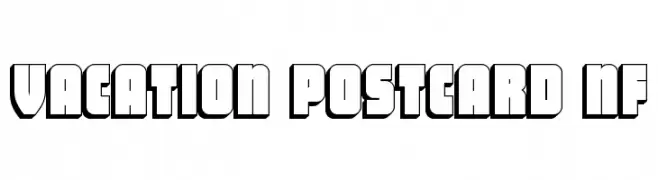
( Fonts by Nick Curtis - www.nicksfonts.com )
A bold, retro-style font with a three-dimensional effect and thick outlines.
![Vacation Postcard NF font caratteri gratis]() Scaricare 7495 Downloads@WebFont
Scaricare 7495 Downloads@WebFont -
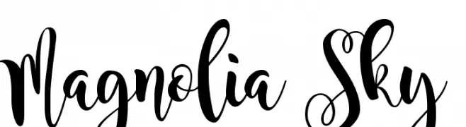
![Magnolia Sky font caratteri gratis]() Scaricare 7494 Downloads@WebFont
Scaricare 7494 Downloads@WebFont -
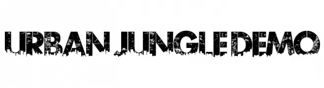
![Urban Jungle DEMO font caratteri gratis]() Scaricare 7489 Downloads@WebFont
Scaricare 7489 Downloads@WebFont -
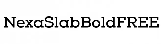
( Fonts by a www.fontfabric.com. Personal-use only. For commercial use please contact owner. )
A bold slab serif font with geometric structure and strong serifs.
![NexaSlabBoldFREE font caratteri gratis]() Scaricare 7488 Downloads@WebFont
Scaricare 7488 Downloads@WebFont -
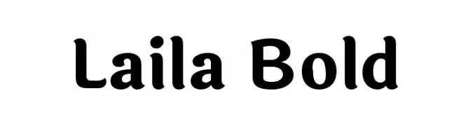
( Copyright (c) 2014, Indian Type Foundry (info@indiantypefoundry.com). )
A bold, rounded font with smooth curves and a friendly appearance.
![Laila Bold font caratteri gratis]() Scaricare 7482 Downloads@WebFont
Scaricare 7482 Downloads@WebFont -
![Anson font caratteri gratis]() Scaricare 7481 Downloads
Scaricare 7481 Downloads


Quali sono i font più popolari adesso?
Poppins, Roboto, Montserrat, Open Sans e Lato sono molto usati per le forme pulite e l'ampia applicabilità — dall'identità di marca alle landing page e ai poster.
Quali font si usano spesso nei loghi?
Le sans serif geometriche (es. Poppins, famiglie in stile Gotham) sono scelte comuni per un branding pulito e scalabile. Per un tocco personale restano valide script e stili manoscritti. Abbina un display deciso per i titoli a un corpo testo neutro per riconoscibilità ed equilibrio.
Ogni quanto si aggiorna la lista?
Con regolarità, in base ai download e all'attività reale. Torna spesso per scoprire in anticipo le nuove preferite.
💡 Consiglio: aggiungi ai preferiti — le tendenze cambiano in fretta e i font top di oggi possono ispirare il rebranding di domani.