Benvenuto nelle Font Più Popolari — dove popolarità e qualità si incontrano. Qui trovi i font più scaricati e usati dell'anno. Se cerchi scelte sicure per logo, web o social, inizia da qui.
Ogni font top si distingue per equilibrio, leggibilità e versatilità. Troverai sans serif moderne, script eleganti, serif vintage e display minimalisti.
-
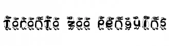
Caratteri di TorontoZoo. For commercial use please contact the owner.
 Scaricare 815 Downloads@WebFont
 -
( Fonts by Ingo Zimmermann - www.ingofonts.com )
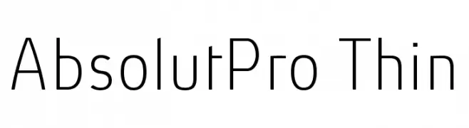
A modern, thin sans-serif font with a sleek and minimalist design.
![AbsolutPro-Thin font caratteri gratis]() Scaricare 815 Downloads@WebFont
Scaricare 815 Downloads@WebFont -
( SDFonts. http://www.angelfire.com/scifi2/sdfonts/index.html )
A bold, modern sans-serif font with a strong, geometric design.
![Paolo font caratteri gratis]() Scaricare 815 Downloads@WebFont
Scaricare 815 Downloads@WebFont -
( Fonts by Ruben Prol - www.ipanemagrafica.com )
A bold, modern sans-serif font with clean lines and strong presence.
![Milocha font caratteri gratis]() Scaricare 815 Downloads@WebFont
Scaricare 815 Downloads@WebFont -
( Free for a personal use. For a commercial use please visit www.kevinandamanda.com )
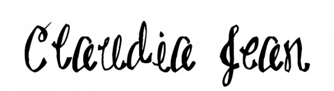
A whimsical, bold handwritten font with a playful and dynamic style.
![Claudia Jean font caratteri gratis]() Scaricare 815 Downloads@WebFont
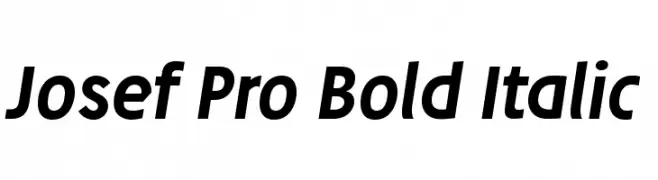
Scaricare 815 Downloads@WebFont -
![Josef Pro Bold Italic font caratteri gratis]() Scaricare 815 Downloads@WebFont
Scaricare 815 Downloads@WebFont -
( Fonts by Graham Meade - GemFonts )
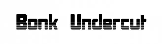
A bold, futuristic font with horizontal stripes and geometric shapes.
![Bonk Undercut font caratteri gratis]() Scaricare 815 Downloads@WebFont
Scaricare 815 Downloads@WebFont -
( Fonts by www.aenigmafonts.com )
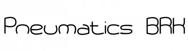
A modern, rounded font with a futuristic and streamlined design.
![Pneumatics BRK font caratteri gratis]() Scaricare 815 Downloads@WebFont
Scaricare 815 Downloads@WebFont -
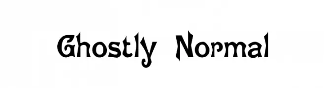
![Ghostly Normal font caratteri gratis]() Scaricare 815 Downloads@WebFont
Scaricare 815 Downloads@WebFont -
( Fonts by Apostrophic Lab )
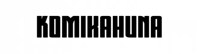
A bold, decorative font with blocky, geometric characters and low contrast.
![Komikahuna font caratteri gratis]() Scaricare 815 Downloads@WebFont
Scaricare 815 Downloads@WebFont -
( Fonts by Altsys Metamorphosis )
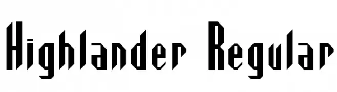
A bold, angular font with a geometric style, perfect for striking headlines.
![Highlander Regular font caratteri gratis]() Scaricare 815 Downloads@WebFont
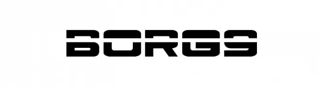
Scaricare 815 Downloads@WebFont -
![Borg9 font caratteri gratis]() Scaricare 815 Downloads@WebFont
Scaricare 815 Downloads@WebFont -
( Fonts by Dan Steinbok - Out Of Step Font Company - outofstepfontco.com - Personal-use only. For commercial use please contact owner. )
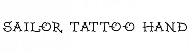
A decorative, hand-drawn font inspired by traditional sailor tattoos.
![Sailor Tattoo Hand font caratteri gratis]() Scaricare 814 Downloads@WebFont
Scaricare 814 Downloads@WebFont -
( Fonts by Cooper Hewitt Smithsonian Design Museum )
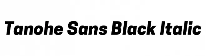
A bold, italicized sans-serif font with a modern and dynamic style.
![Tanohe Sans Black Italic font caratteri gratis]() Scaricare 814 Downloads@WebFont
Scaricare 814 Downloads@WebFont -
( Noto is a trademark of Google Inc. Noto fonts are open source. All Noto fonts are published under the SIL Open Font License, Version 1.1 )
A bold, clean, and modern font with strong, uniform strokes and geometric shapes.
![Noto Sans Ethiopic Bold font caratteri gratis]() Scaricare 814 Downloads@WebFont
Scaricare 814 Downloads@WebFont -
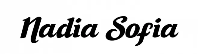
![Nadia Sofia font caratteri gratis]() Scaricare 814 Downloads@WebFont
Scaricare 814 Downloads@WebFont -
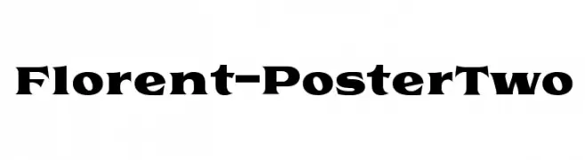
( Studio Sun - Cahya Sofyan - www.behance.net/studiosun )
A bold, impactful font with strong strokes and sharp edges.
![Florent-PosterTwo font caratteri gratis]() Scaricare 814 Downloads@WebFont
Scaricare 814 Downloads@WebFont -
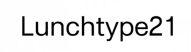
( Fonts by Michel Martinsson - lunchtype.com - Personal-use only. For commercial use please contact owner. )
A modern, clean sans-serif font with uniform strokes and balanced spacing.
![Lunchtype21 font caratteri gratis]() Scaricare 814 Downloads@WebFont
Scaricare 814 Downloads@WebFont -
( Fonts by CannotIntoSpaceFonts - KineticPlasma Fonts - Personal-use only. For commercial use please contact owner. )
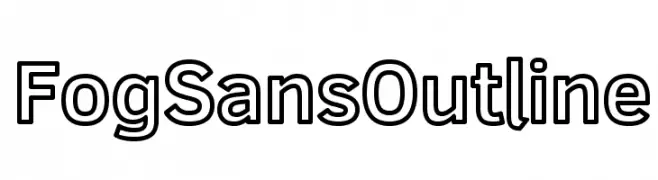
A modern sans-serif outline font with clean lines and balanced proportions.
![Fog Sans Outline font caratteri gratis]() Scaricare 814 Downloads@WebFont
Scaricare 814 Downloads@WebFont -
( Fonts by Chequered Ink )
A bold, distressed font with a grunge, dripping effect.
![Moist font caratteri gratis]() Scaricare 814 Downloads@WebFont
Scaricare 814 Downloads@WebFont -
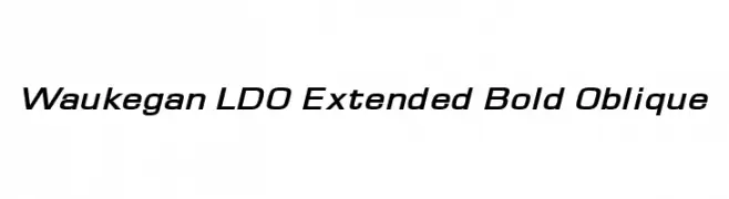
( Fonts by Luke Owens - Personal-use only. For commercial use please contact owner. )
A modern, bold, and oblique font with extended width and high contrast.
![Waukegan LDO Extended Bold Oblique font caratteri gratis]() Scaricare 814 Downloads@WebFont
Scaricare 814 Downloads@WebFont -
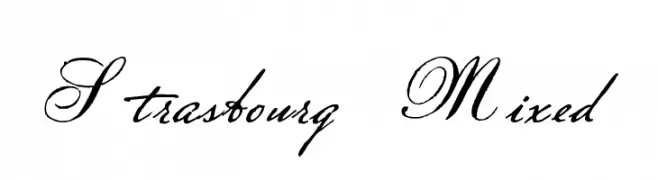
![Strasbourg Mixed font caratteri gratis]() Scaricare 814 Downloads@WebFont
Scaricare 814 Downloads@WebFont -
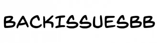
( Fonts by www.blambot.com )
A bold, handwritten font with a playful and dynamic style.
![BackIssuesBB font caratteri gratis]() Scaricare 814 Downloads@WebFont
Scaricare 814 Downloads@WebFont -
( Fonts by Daniel Zadorozny - www.iconian.com - Free for personal use )
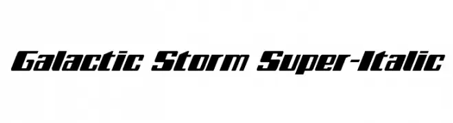
A bold, italicized font with a futuristic and dynamic style.
![Galactic Storm Super-Italic font caratteri gratis]() Scaricare 814 Downloads@WebFont
Scaricare 814 Downloads@WebFont -
( Fonts by Luedecke Design Font Co. - ldfonts.weebly.com )
A playful, hand-drawn font with a bold, 3D doodle effect.
![Villa font caratteri gratis]() Scaricare 814 Downloads@WebFont
Scaricare 814 Downloads@WebFont -
![WLM Idea Play Alt font caratteri gratis]() Scaricare 814 Downloads@WebFont
Scaricare 814 Downloads@WebFont -
( Copyright (c) 2011 by Brian J. Bonislawsky DBA Astigmatic (AOETI) )
A classic, medieval-style font with rounded characters and pointed serifs.
![UncialAntiqua-Regular font caratteri gratis]() Scaricare 814 Downloads@WebFont
Scaricare 814 Downloads@WebFont -
![Crom font caratteri gratis]() Scaricare 814 Downloads@WebFont
Scaricare 814 Downloads@WebFont -
( Fonts by Florian Bambhout - www.bambootypes.net )
A modern, geometric font with rounded edges and consistent stroke width.
![Bambhout Connect Trial font caratteri gratis]() Scaricare 814 Downloads@WebFont
Scaricare 814 Downloads@WebFont -
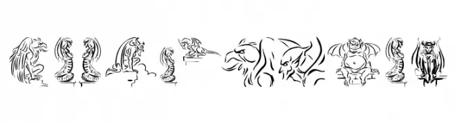
( Fonts by Manfred Klein. Free for private and charity use. Free for commercial with donation to organizations )
Ornate font with gargoyle illustrations as characters.
![Gargoyle font caratteri gratis]() Scaricare 814 Downloads@WebFont
Scaricare 814 Downloads@WebFont -
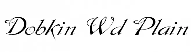
( Fonts by David Rakowski )
An elegant script font with flowing, calligraphic letterforms and intricate swashes.
![Dobkin Wd Plain font caratteri gratis]() Scaricare 814 Downloads@WebFont
Scaricare 814 Downloads@WebFont -
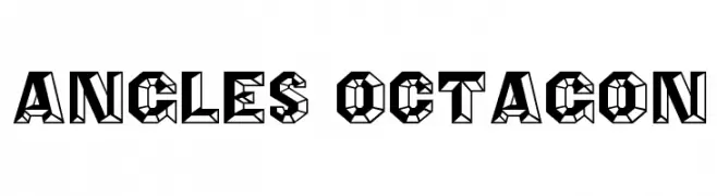
( Fonts by Rick Mueller )
A bold, geometric font with an angular, octagonal design and a three-dimensional effect.
![Angles Octagon font caratteri gratis]() Scaricare 814 Downloads@WebFont
Scaricare 814 Downloads@WebFont -
( Fonts by Manfred Klein - manfred-klein.ina-mar.com )
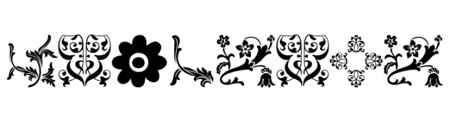
Ornamental dingbat font with floral and botanical motifs.
![Floralia font caratteri gratis]() Scaricare 814 Downloads@WebFont
Scaricare 814 Downloads@WebFont -
( Fonts by mizike )
A bold, handwritten font with a playful and energetic style.
![mizike font caratteri gratis]() Scaricare 814 Downloads@WebFont
Scaricare 814 Downloads@WebFont -
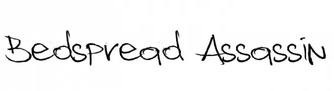
( Fonts by billyargel.blogspot.com - Billy Argel )
A lively, handwritten font with irregular strokes and a casual style.
![Bedspread Assassin font caratteri gratis]() Scaricare 814 Downloads@WebFont
Scaricare 814 Downloads@WebFont


Quali sono i font più popolari adesso?
Poppins, Roboto, Montserrat, Open Sans e Lato sono molto usati per le forme pulite e l'ampia applicabilità — dall'identità di marca alle landing page e ai poster.
Quali font si usano spesso nei loghi?
Le sans serif geometriche (es. Poppins, famiglie in stile Gotham) sono scelte comuni per un branding pulito e scalabile. Per un tocco personale restano valide script e stili manoscritti. Abbina un display deciso per i titoli a un corpo testo neutro per riconoscibilità ed equilibrio.
Ogni quanto si aggiorna la lista?
Con regolarità, in base ai download e all'attività reale. Torna spesso per scoprire in anticipo le nuove preferite.
💡 Consiglio: aggiungi ai preferiti — le tendenze cambiano in fretta e i font top di oggi possono ispirare il rebranding di domani.